The Magic of UX Design: Why User Experience is Important?
This is the fourth lesson of our Ultimate Gutenberg Editor Learning Course. If you want to get the full educational plan – follow the link and subscribe for the course.
- What is UX design?
- How do you create great user experiences?
- Apple: an example of excellent UX design
- Conclusion
User experience (it is also called UX) is, far and away, the most significant part of your software product. Whether it’s a website, a web app, or a mobile app, the importance cannot be overstated. Often software products fail because of a lack of planning for the user experience. Clunky UI and poor UX design cause a myriad of problems that the only surface late into software development. Software engineers sometimes fail to think of the end-users that will be using the product. That’s what is so challenging about UX; it’s not really tangible until your product is ready for launch.
Creating amazing user experiences, therefore, requires that you think about the end-users at the very beginning of the design process. It's difficult to think about end-users during the entire process, especially when you're working out software issues such as paring down the complex code. This is exactly what you need to do, however, in order to create good UX design.
What is UX design?
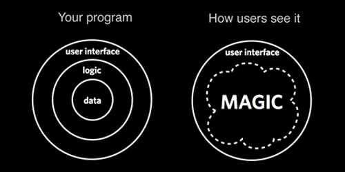
Most of the time users interact only with the user interface (or, otherwise, UI), but that is just the visible layer of UX design. You can think of your UI as a decorative wrap. And beneath that colorful paper is the user experience. UX design is carefully built to make the usage of the software product as intuitively and as understandable as possible. The user experience, ideally, is to have the customer has absolutely no questions when using a program. The software product is so natural to use and so clear that the user inherently understands how to employ the product to meet their needs. Obviously, this perfect kind of usability is rare. But, ultimately, it serves to underscore the goal of UX design - to make software products that are efficient, accessible, and pleasurable to use.
How do you create great user experiences?
It's hard to pinpoint what makes UX design good or bad. It's a component of software that is simply felt and cannot be easily explained. It's in all the little details, the thousands of decisions that software engineers make during the development. It's more than just the visual design of the application. It's important to have buttons positioned in the correct place. It's important to have a flow of events that makes sense. It's important to have color combinations that are pleasing the eye. Let me give you a few pieces of advice that will be useful for beginners who only started their way to the UX design job of their dream.
Focus on experience
Quite obvious, huh? It is curious that people do not always remember information, but they always remember how the information made them feel. Advertising agencies focus on selling ads to the hearts of people, so why shouldn’t app makers do so? The most important thing is not the information you provide, but how your users are emotionally affected by the information. This is the reason why UX design has become a very vital part of mobile app development. App design should efficiently combine graphics, texts, layouts, and interactive components to make sure users get a better experience, not just some informational view. With all the quantity and complexity of information that is available, differentiation matters a lot. If you scan through the interfaces of apps today, they have more story, visual, and emotion to show why they are outstanding from their competitors.
The tip: do the A/B testing. That is the testing when you offer your users two variants of design and check which one they loved more. Test your UX design on friends, relatives and via the special tools (like Optimizely or FiveSecondTest).
Make it scannable
Make your website or app scannable. Most users do not read the content of an app or site the way they read other material. Users only get to read the content of the site or the app when they find it interesting after scanning through it. So, making the interface of your app or website scannable will help make your app much friendly for your users.
The tip: highlight the most important information with different color or bigger font. Make sure that the highlighted text will be short and perfectly clear. And, of course, that text shows the user something interesting and encouraging to interact with.
Clarity and simplicity
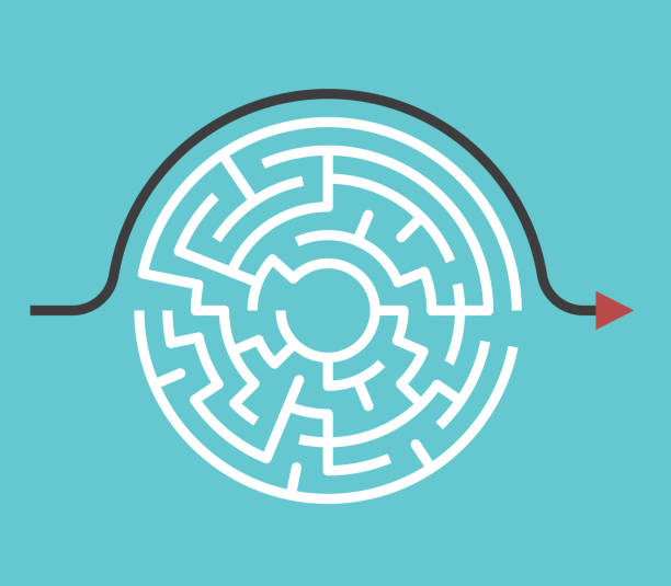
It doesn’t take more than 30 seconds for visitors to figure out if they are interested in an app or not and the same thing applies to a website. So, the design of your product should clearly state what it wants visitors to do. The “preferred actions” of interfaces should be as evident as possible. Users should not wonder how to do things on your app or site. Consider what you can do to your application or website that will make it easy for your users to use. For instance, a form can provide a default value that most users will choose instead of making a bunch of options available.
Your app design should focus on the majority, and you should enable the discovery of extra functionality needed. Consistent design for your app or website is much more straightforward for users because it reuses behaviors, elements, aesthetic, and colors to minimize the need for users to rethink. Users are already conversant with most of the features used in apps, so following the same pattern will make your app clearer and more straightforward to users.
Common designs vs creative UX design
Be careful with creating new user interface patterns. Believe me, you don’t want your users to think too hard about where to find common elements. Users are already familiar with most interfaces, for instance, links should appear as links, buttons should appear as buttons, company names and logos appear at the top left, while login access appears at the top right of the screen. Getting too creative with simple patterns is not advisable. You can do something non-traditional, but that does not mean you should do something that is not really usable. Creativity and usability must be balanced. The placements of URLs, navigations, and button should focus on usability before design aesthetic.
The tip: do not overdo and, once again, do the testing. If you are going to apply a creative layout idea to your blog’s UX design – make sure the users will understand how to use it.
Apple: an example of excellent UX design
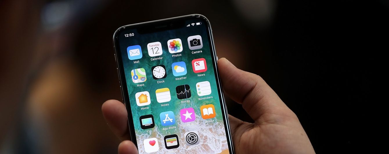
To create an app that every user will love you have to study from software applications making companies that have mastered user experience. For example, take a look at the software products of Apple. Apple has received criticism from a lot of companies, consumers, and the tech industry in general because of its low-powered hardware and bloated software. But what does Apple have that many other tech companies do not? Apple has an unparalleled understanding of the user experience. Apple understands that a software product should do what it claims to do with minimal explanation. Apple products are accessible and leave the user feeling pleased.
Conclusion
Creating great user experiences is something that requires a great deal of patience, hard work, and revision. It's not something that can be created in a day or by making minor modifications to the shell of your software. You must be rigorous and your study and in your practice of creating good design.
Great UX design pays dividends. Investing in exceptional user experiences will reap incredible rewards. Massive companies like Apple have put UX design on the forefront of their priorities. Apple has won the loyalty of millions by adopting the UX-first approach.
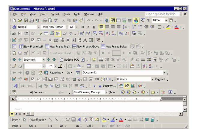
When you're creating a software product, you must keep the intention of the user experience in mind. Cut out all excess, cut out as much complexity as you can, and listen to users about what they want. Ultimately, it’s all about what the users want and how you can best serve them. With the proper dedication, you could get close to uncovering the real magic of UX design.
UI Tips For Web Design Enthusiasts [Free Ebook]
By clicking the button you agree to the Privacy Policy and Terms and Conditions.
Read Also
65 Web Design Trends of 2019 – Complete Edition
Wireframes and Prototypes: Key Elements of UX Design Strategy
What UX And UI Design Practices Make The Best Website Application?
10 Best Design Tools for UI/UX Designers
Don’t miss out these all-time favourites
- The best hosting for a WordPress website. Tap our link to get the best price on the market with 82% off. If HostPapa didn’t impress you check out other alternatives.
- Monthly SEO service and On-Page SEO - to increase your website organic traffic.
- Website Installation service - to get your template up and running within just 6 hours without hassle. No minute is wasted and the work is going.
- ONE Membership - to download unlimited number of WordPress themes, plugins, ppt and other products within one license. Since bigger is always better.
Get more to your email
Subscribe to our newsletter and access exclusive content and offers available only to MonsterPost subscribers.





Leave a Reply
You must be logged in to post a comment.