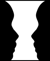
Negative Space
Negative Space is the use of empty or open area between and around the main object. It’s a space between graphics, images, columns, margins, text and other elements. Positive space instead has something in it. The main purpose of negative space is to add focus to the subject. It allows the subject pop. Negative space is a powerful design element. It offers a visual room to breathe around the subject and enhances the objects appeal. Moreover, depending on the design it can actually become a positive space.
A properly implemented negative space directs a viewer’s attention and adds value to the overall experience. It can be used for emotional impact or for preventing too busy and cluttered design. Thus, with the help of white space, it’s possible to highlight certain visual cues. With other words, negative space allows organize and define the way the viewer interacts with the content in the positive space.
There are two levels of negative space:
- Macro space is a distance between major page/subject elements. It is a white space between a site’s header, navigation, content, and footer.
- Micro space is empty areas between all elements of design. These are paragraph margins, individual lines of type, space between images, columns, etc.
Both of them play a significant role in contributing to the effective readability of the context
There are numerous ways to apply negative space to a design. The only rule - Less content, more negative space. There are no defined or certain rules to remember. That is because of negative space we understand what is positive. Keep in mind, negative space has nothing to do with minimalism.
The Perfect Type
Leading plays a critical role in arranging a beautiful typography. Leading means the amount of space between lines of text. It enhances type and makes it more legible, easier to read. Negative space has weight and impact. Leading together with negative space compose a dynamic image of what you see.
Figure, Ground, Shape Around the Subject
A design that competes for positive and negative space in a way that causes a hidden image is an effective tip for creating more lifelike designs. A figure-ground reversal means negative space or the ground can become as positive shape. Instead of positive space or the figure can be read as negative shape. There is always a relationship between the figure and the ground.
Negative space is also used for the creation of a clever logo with the main purpose to stick in the minds and complete the shape by your own.
Related terms: color wheel, CMYK, gradient, accent colors.
References and further reading:
- Negative Space
- EEffective Use of Negative Space in Web
- Art Worksheets
- The Role of Negative Space in Web Design
- Negative Space
- A Guide. Negative Space in Webpage Layouts
- Elements of Art Shape

