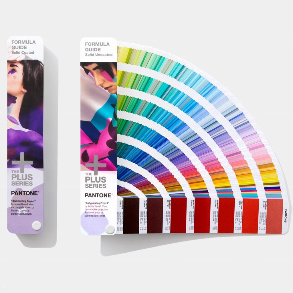
Pantone or Pantone Color Matching System
Pantone Meaning
Known as a system that helps in color identification and matching, Pantone meets the needs of graphic designers who want to use a solid spot in their designs. This sole internationally recognized system that ensures the color remains consistent as possible regarding of the device/medium performed. These spot colors, each with its unique allocated number allow different manufacturers worldwide refer to the Pantone Color Matching System to ‘color match’ specific tons. So, what’s the real benefit, you ask?
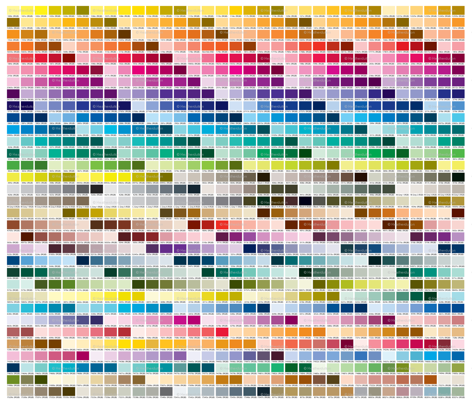
To begin with, this system is widely used in the printing industry, by artists, designers, and printers to specify exact shades of a color. It shows a specific Pantone number for each color created. These unique numbers assure you get the accurate color of printed or manufactured items anytime. The Pantone color chart contains thousands of color swatches created by mixing colors with much more precision. The Pantone Formula Guide contains ink mixing recipes that printer follows to create the accurate color needed. Well, what makes sense.
Pantone Palettes
- The widely used colors are in the Pantone Solid palette with 1,114 colors in it. With the purpose to help printers and designers ensure the visual identity, this palette is second to none in the graphics, print and publishing industries.
- The Pantone Process palette contains over 3,000 process colors which simplify the choice of 4-color CMYK printing.
- Another Pantone Textile palette comprises over 1,900 colors designed for the fashion, textile and apparel industries.
- The full Pantone Plastic palette comprises 735 transparent and 1,005 opaque plastic color chips used in the manufacture of plastic materials and products. Each chip comes with three levels of thickness to showcase different levels of transparency.
- The recently introduced Pantone Goe palette offers 2,058 new solid colors in a new matching and numbering system.
- The Hexachrome Pantone palette uses a 6-color high-quality printing process to expand the color spectrum.
Why Use Pantone?
- Pantone colors are best suited for exact solid colors for an accurate color representation. The best way to achieve a color consistency for a brand, logo, identity set, etc.
- The Pantone system can generate more color variations that can’t be produced with CMYK used for printing. This goes for navy blue and bright orange. The PMS is capable of creating metallic and fluorescent color effects.
- The Pantone is the best option to achieve a solid consistent look for a printed document (booklet or catalog) from page to page.
- The PMS performs well on large areas of a solid ink color when the consistency is important.
Anyway, PMS colors can streamline the printing process and cut down on cost.
Related Terms: Accent colors, CMYK, drop shadow, gradient, color wheel, complementary colors.
References and further reading:
- Pantone. Color Chart, Guides and Books
- Pantone. Color and What I Wish I Had Known
- Pantone. Wikipedia
- A Lesson Learned
- Color
- PMS Ink Colors in Commercial Printing

