7 Web Design Lessons You Can Learn By Watching Star Wars
Are you a Jedi? I don’t mean a real one with midichlorians in their bloodstream, a lightsaber and Force training, but if the company you are currently working at was a Temple, would you be able to call yourself a Jedi? Are you a skilled professional that is able to complete every task and learn something new in any circumstance?
A Jedi learns the Force not from specialized books, but from real situations. If you want to reach mastery, you also should try to learn from everything that surrounds you, including films. The Star Wars saga is full of wisdom which you can use in all spheres of life, including web design. So, follow me, young padawan, and I’ll show some Star Wars designing tricks. I hope you will find them useful in your web design templates career (if they did, I hope to hear from you via comments in the section below).
Bold graphics
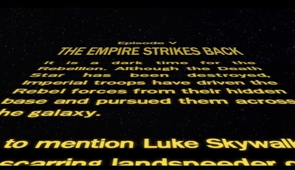
I don’t think there are many people who have never seen those huge letters slowly floating away with the sounds of the pompous intro Star Wars theme. The design first tip I have for you comes from the first seconds of the film – important things should be marked with BIG letters. People instinctively pay attention to the notable text, and bold fonts are hard to ignore. However, you shouldn’t overuse bold. If the text is huge, no specific words or phrases will stand out, this means that you can freely use big letters only for the most sufficient parts of a website.
Simple navigation
“Always two there are; no more, no less. A master and an apprentice.” That’s pretty simple, isn’t it? The Sith Empire was ruled only by two people, which makes it an effective organization. You can use your own “rule of two” for the website menu. The more options you give the visitor, the more confused will they feel. Only online stores need a detailed mega menu to show all the products, and you should create a simple menu. The user that gets lost among your pages or fails to find the necessary information will just leave your website.
Adaptability
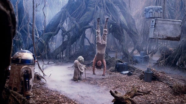
Throughout the saga, Jedi show skills to pilot all vehicles, including ground, air and space shuttles, and they even repair machines, treat the injured, pick locks, and adapt to all circumstances. In deserts, mountains, tropical forests, and swamps, Jedi will survive and finish their mission. Your website should adapt to the devices that visitors use to access it. People tend to enter the internet via smartphones while going to work or home, so it would be wise to make your web page responsive.
Depth
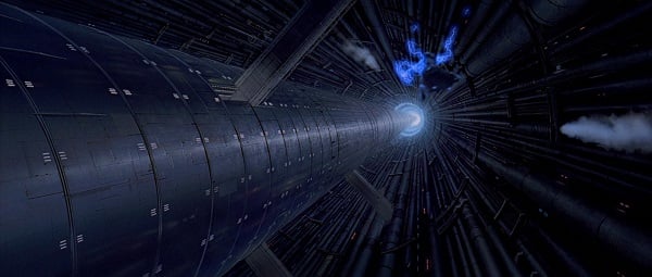
The whole Star Wars saga is filled with huge spaces. The space battles, different planet landscapes, and big spaceship inner chambers make you enter that colorful world. The website design that makes your visitors explore the website is a win. Place a landscape photo into the background and add the parallax effect. Make some elements go out of the borders. Insert videos and dynamic effects. Internet users like live websites that encourage interaction, so give them what they want.
Contrasting colours
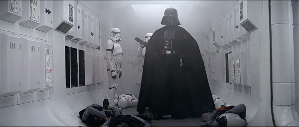
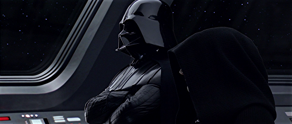
Star Wars uses lots of different tricks to make a viewer focus on something. One of the most obvious is contrasting details. For example, Padme Amidala’s complicated white and red makeup, or Darth Vader in black clothes surrounded by white stormtroopers. On your website, you can mark some words, special icons, and pictures with contrasting colors to attract attention. That will help elements to stand out.
Symmetry
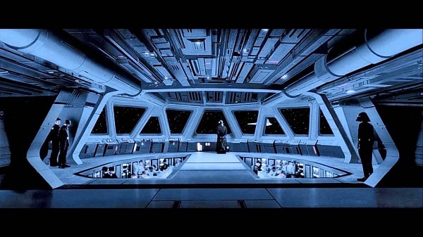
Lots of scenes in the movies show ideally symmetrical pictures; for example, Padme Amidala’s palace on Naboo, or starship bridges. Symmetry is a powerful tool if you know how to use it. Symmetric structure looks more accurate and clean, and it calls to the feeling of right order and solidity. On the other hand, asymmetry can also make an interesting effect. Try to make the page symmetric and check the look – you and your visitors could be really pleased with the result, and the navigation could become much simpler.
Repetition
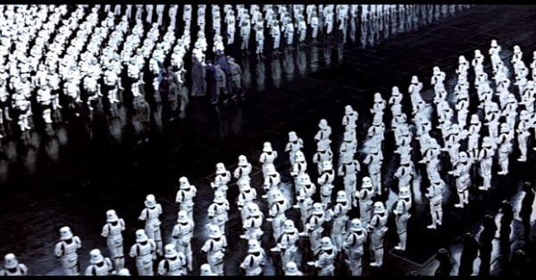
The ideal line of imperial stormtroopers or droids definitely looks impressive. Besides that, if something steps out of the line, it becomes apparent. You can use this feature for your infographics. If you want to make a picture to show that 88% of adults don’t eat healthy food, draw 100 human figures and paint 88 of them in a different color – that will be very illustrative.
Conclusion
Star Wars movies are a treasure chest for an attentive web designer. That means that you have an endless mine of inspiration within reach.
I’m sure that Star Wars has a much wider range of tricks than what I have included in this article, so if you know other Star Wars tricks for web design, you are welcome to share them in the comments section below.

Read Also
5 Darth Vader Mistakes That Can Ruin Your Website
Star Wars Tribute: 15 Free Fonts From The Far, Far Away Galaxy
Let Your Profession be Your Passion! [30+ Funny Web Design Puns]

A passionate WordPress monster since 2018. Loves professionally built website templates, is Elementor Page Builder fan and becomes extremely curious when it comes to trying some new site creation tools. Quora account
Get more to your email
Subscribe to our newsletter and access exclusive content and offers available only to MonsterPost subscribers.

Leave a Reply
You must be logged in to post a comment.