The Best Font for PowerPoint Presentation: A Champion’s Guide
- How to choose the best font for PowerPoint
- Serif or Sans-Serif Type?
- The most common errors in choosing the best font for PowerPoint presentations
- The best fonts for different types of presentations
- The best ways to use fonts
- How to Embed Fonts in PowerPoint
- Best 10 Fonts for PowerPoint Presentation
- Conclusions
Need the best font for powerpoint? PowerPoint is one of the simplest computer programs for understanding and learning. It is the number one program worldwide for creating presentations. It is difficult to imagine any conference without a few presentation reports. PowerPoint is used in any field to convey information in the best possible way. With the help of PowerPoint, you can easily convey any message, with any amount of complicated information.
The presentation can be easily customized to the corporate style of the company by inserting a logo and applying one of the many TemplateMonster themes.
How to choose the best font for PowerPoint
Choosing the perfect font is half the battle in creating an impressive PowerPoint presentation. After all, the font determines how the audience will perceive the presentation and the information that you are trying to convey in it. Therefore, this is really a very important part of making a presentation. In turn, we want to give you a list of tips to help you find the perfect font. Pay attention to the following tips:
- Only standard fonts? In most cases, yes! Because if you want to make a presentation with fantastic and funny fonts, in some situations it may not be appropriate. In addition, some fonts may not be readable, and as a result, automatically change the slides’ appearance. To prevent this unpleasant situation, it is better to use standard fonts. If your goal is to create a presentation for children, then use cool fonts, but don't forget to check your presentation carefully!
- The interaction between font and background. Remember! The higher the contrast between the font and the background, the better the readability of the text. This is probably one of the main rules of font selection.
- Using different fonts. Another tip is to use different fonts for titles and marked text. This makes it more interesting and better perceived. You can also highlight text in bold or italics (but moderately).
- Try to avoid using calligraphic, handwritten, or gothic fonts. They are often difficult to read.
- Font size. This is also an important point. The most common lettering size for presentations is font size 24. This not only helps to fill in the slides but also prevents the use of large amounts of information, which is not appropriate or necessary for general presentations.
- The length of the text line. Short lines are easier to read than long lines. In this way, the texts are perceived better. The acceptable length of the string is 45-90 characters on average, taking into consideration gaps. Choose fonts that will help you to create the desired string length.
Serif or Sans-Serif Type?
This is also one of the helpful presentation tips regarding fonts. It’s a very important component of choosing the perfect font for PowerPoint presentation.
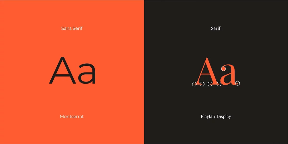
Basically, all fonts are divided into two groups–Serif fonts and Sans-Serif fonts. Notches are elements that protrude from the end of the letters and symbols in the font. It is believed that these notches make the letters more legible. And this makes it easier to perceive the text. Serif is widely used in printed materials. And Sans-Serif is very popular on the web. This interesting fact is why fonts with serifs are associated with the classics, and fonts without serifs are looked at as something modern. This is worth paying attention to when you have to choose a font.
Remember! Serif has to be chosen for general information, or, for example, a presentation about the company's history, while Sans-Serif, in turn, is used for an innovative product or introduction of online materials.
The most common errors in choosing the best font for PowerPoint presentations
Very often, when you create a PowerPoint presentation there are a few problems and some errors. In most cases, these are errors related to font choice and text editing afterwards. In this part of the post, we would like to focus on errors in font selection.
Among the most common mistakes are:
- using more than 2 fonts
- using strange, inappropriate, and narrow fonts (You can use them, of course, but in small quantities and not permanently)
- choosing a complex font (These fonts are mostly hard to read. And if all the text is in this style, the audience will not be able to perceive the necessary information normally), check our post 10 Popular Fonts You Should Absolutely Avoid Using In Presentations;
- font selection that is based on appearance only (If you like the font, it does not mean that it is perfect for the purpose of your presentation).
The best fonts for different types of presentations
Of course, different types of fonts should be used for different types of presentations. We suggest you focus on the more common fonts, which will all be appropriate for any type of presentation.
- Calibri. This is a font with rounded corners, which are well visible in large sizes. These rounded elements have the best effect on the readability of the text.
- Cambria. This font is characterized by the length of the letters and has notable notches that distinguish this font from others.
- Arial/Helvetica. These are quite ordinary and common fonts. Arial is considered very similar to Helvetica. But there are some differences. They appear when comparing the letters "a", "G", "Q", and "R". The differences are really almost imperceptible. Now, in most cases, computers may not have Helvetica fonts on it. So you can use Arial. Or you may download Helvetica from the internet.
- Bliss. This is another example of a common font. It is somewhat similar to Myriad. So you can use these two fonts without a second thought.
- Merriweather. This is a great font. It is an ideal font with a serif that can be perfectly read from the screen.
- Inconsolata. This one is a monospace font. Of course, typing all the text in this font is not worth it, but Inconsolata will help to refresh the slide and will bring a little extravagance to your presentation.
- Roboto. This is an improved font that looks great on your presentation. And it will be quite appropriate for nearly any presentation topic.
- Karla. This font helps to give the presentation a flair of individuality. And of course, the font is full of different interesting symbols.
Here is a list of fonts that can be used as a second font or supporting font for a presentation. For example, with their help, you can write a title, highlight an important part of the text, make various captions, etc.
- Chilanka. This is a pretty unusual font that can be used for entertaining presentations. It shouldn't be used too much as the readability is quite complicated.
- Modak. This is a bold and attractive font. It looks beautiful and original. We are sure that it is perfect for presentations for children, or any kind of children's goods.
- Saira Stencil One. This example font is well suited for bright headlines. You can safely use it for both entertaining and more serious PowerPoint presentations.
- Dancing Script. This one is a delicate italic font. It is elegant and refined enough. Perfect for creative presentations.
- Pacifico. Here is an original handwritten font. Be careful not to use it too much in your presentation.
- Fondamento. This is a calligraphic font that is perfect for headlines. It is a bit like a handwritten font so it will add originality to your presentation.
- Barrio. This is an example of a fairytale font that is suitable for children's presentations. It is quite cute and unusual. Again, we advise you not to overdo it.
We are sure that these fonts are really the best for any PowerPoint presentation!

The best ways to use fonts
Since we have already discussed the choice of font and the errors in this choice, we suggest you consider where you can use these fonts. TemplateMonster offers a huge number (more than 2000) of PowerPoint presentation themes and templates on any topic!
With TemplateMonster themes you can create both business presentations and easy presentations for any other project. The most popular templates for PowerPoint presentations are:
- Business Infographic Presentation
- Complete Business Presentation
- Business Pack PowerPoint Template
- MaxPro - Business Plan
- Perfect PowerPoint Template
- Construction Company PowerPoint Template
- Modern Design PowerPoint Template
- Marketing Agency PowerPoint Template
- Social Media Marketing Slides
- Business School PowerPoint Template
- Provision Creative Presentation
- ONE - Modern PowerPoint Template
It can be said that these PowerPoint presentation templates can be used and reworked for any of your purposes. Almost every template includes the following features and capabilities:
- a large number of unique, fresh and modern PowerPoint slides
- animation options
- a huge variety of color schemes for every taste
- different variations of charts, diagrams, tables, charts, comparison tables, business models, and customizable maps
- sliders, galleries, and video library
- availability of professional designers
- easily editable and customizable design
- an abundance of slide layouts
- multifunctionality
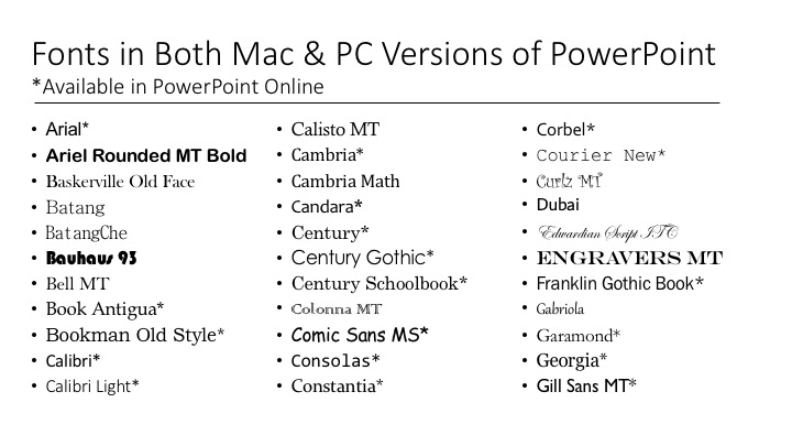
Most templates include Google fonts. This, in turn, gives access to an incredibly large number of fonts that you can freely use.
You can also use this link to browse through more PowerPoint presentations. We are sure that you will find what you need!
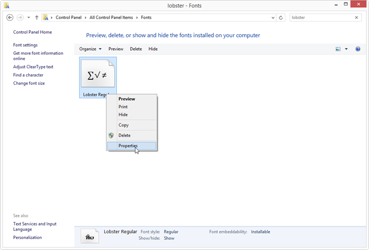
How to Embed Fonts in PowerPoint
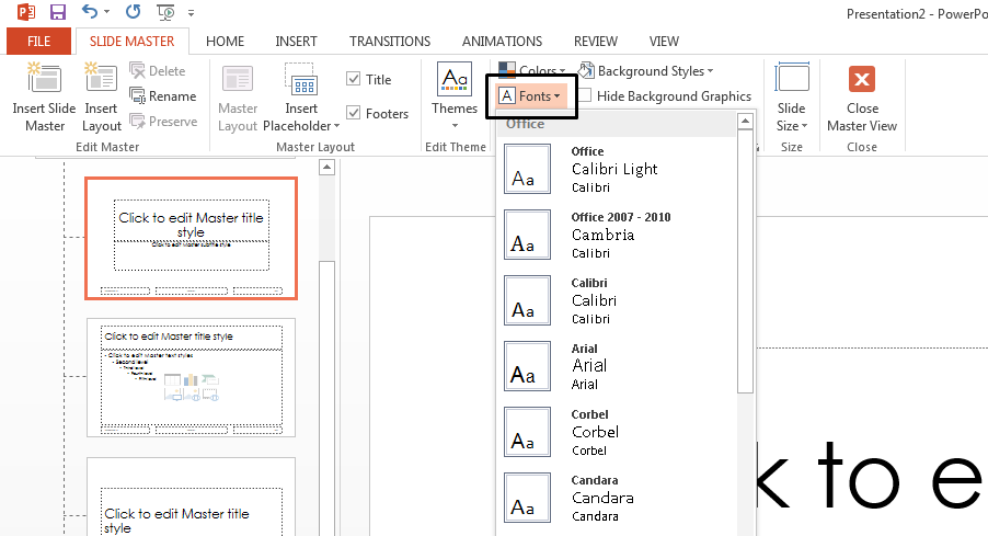
We’ve created detailed instruction on how to set font in powerpoint, please, check!
Best 10 Fonts for PowerPoint Presentation
If you want something more extraordinary than Google Fonts, then you need custom fonts. There are many websites with free and premium fonts for presentations. TemplateMonster marketplace has such also, and there are plenty of them. That is why I picked 10 best fonts for PowerPoint presentations. All of them are easy to read and eye-catching at the same time. I would recommend using them for titles to highlight the most important information.
Bakersville - Font
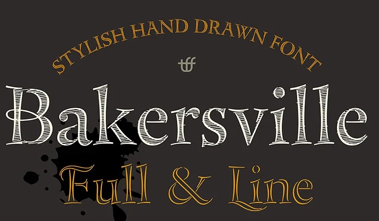
Bakersville is a set of two vintage fonts by Type Faith Fonts. It is the perfect combination of vintage and industrial styles with square symbols and soft corners. Bakersville can be combined with other fonts to create an authentic and catchy look at your presentation. This hand-drawn font includes 2 styles: Full and Line. Therefore, you can use them for headlines and for body text.
Bright, catchy font, perfect for large numbers, emotional slides, and headlines. Stylish alternative caps are also included. They can be used for a title slide.
Happy Sweety Font
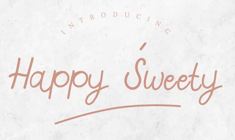
The Happy Sweet font is hand-drawn by Edric's Studio. The font is charismatic and catches the eye of the viewer. Looking at such a text, most involuntarily see the simplicity of words. The purpose of your presentation will be simple, nothing fancy. This monoline script has multi-languages international glyphs. It is presented in three formats OTF, TTF, and WOFF.
Imperfect handwriting font gives the font a zest, creates ease. It works well in headlines and titles.
BecauseOfYou Font
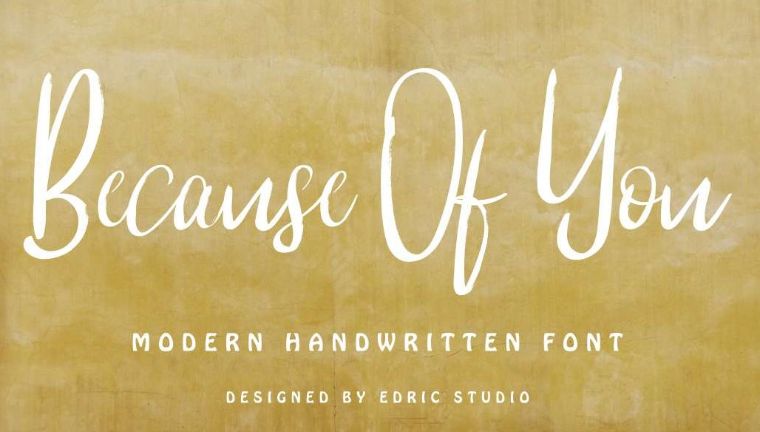
“Because of You” is a handwritten font whose letters are written with a wet brush. Font author is also Edric's Studio. A rounded font that gives the presentation a friendly and calm tone. It contains two styles: regular calligraphy and textured brush. Also, this font presents great glyphs set. With this font, your presentation will look natural and creative. "Because of You" font works great as for body text as headlines.
Seren Script - Font
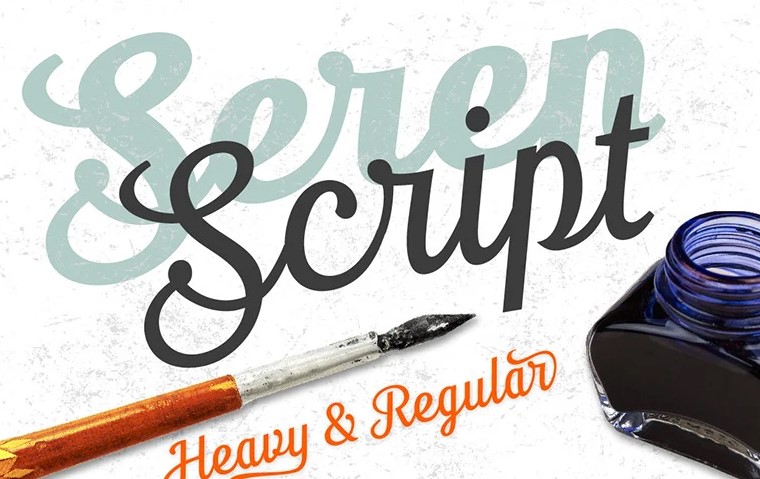
Seren Script consists of two fonts Regular and Heavy. This set has created Type Faith Fonts agency. The authors were inspired by retro motives. A classic style suitable for impressive headlines, and logos. Seren Script is a professional font that comes with support for many languages based on Latin and Cyrillic. Also, this set includes lower and uppercase characters. This set is really exclusive and offers tails, symbols, punctuation, finals, and ligatures to make your presentation memorable.
Smoking Typeface + Illustration Font
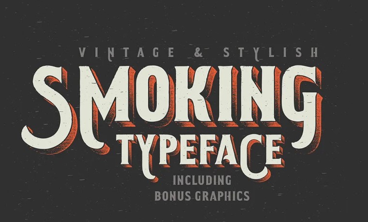
The western font Smoking Typeface was created by Gleb Guralnyk. The font can be used to design headlines at presentation, posters for various events, invitations, and the website since there is the WOFF format. Additionally, it includes OTF, TTF files, and bonus graphics. Each letter gives a vintage charm to your text.
Serif font, originally created for use in headings and titles. It forms a conservative style, able to focus on the premium product and causes a feeling of luxury.
MyIllutions Font
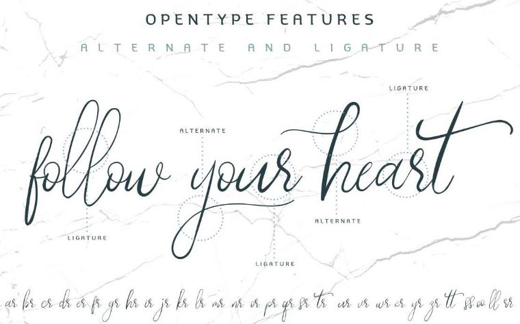
My Illutions is a linear, calligraphic font developed by Edrick Studio. It was handcrafted from Bandung. Handwritten letters contain stylistic touches in alternative versions, so you can present many projects using this font. It suits clothes, branding or other marketing topics.
Also, My Illutions font includes alternates and ligatures. Buying this font, creators offer support via email and other instructions.
The font contains multilingual characters and supports PUA. This set is available in OTF, WOFF and TTF formats. To edit you can use Photoshop, Illustrator or even MS Word.
Whiskey Label + Design Elements Font
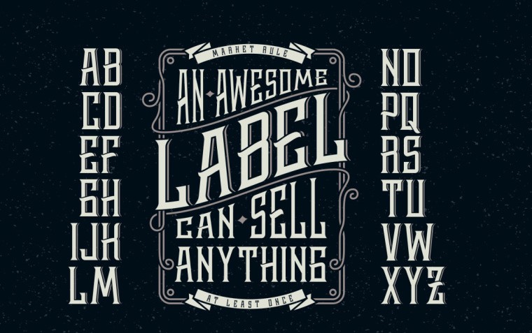
The next best font for PowerPoint is another creation of Gleb Guralnyk. Whiskey font has a vintage style. The font includes basic punctuation, an illustration of Icarus, frames, texture, and ribbons. Vintage look and unusual serifs are the latest trends in designer typography. Therefore, you can use it for any project.
This monospaced font is highly readable and looks great in titles and headings. I would use it also for highlights too.
Whiskey font presented in OTF format and WOFF. It costs only $17 or for free if you have ONE membership.
Lost in Space Font

If you are a fan of a futuristic topic, try this futuristic font "Type in Space".
This typeface was created by Gleb Guralnyk too. It was not created on the basis of another font, but written from scratch, with a special structural logic: a combination of pure geometry and optical balance. The font presented with German letters and basic punctuation. There are two formats OTF and TTF.
The beauty of the vintage font "Type in Space" is that it retains its sharpness even with a small size. That's why this font is great for text in the body of a presentation too.
Golden Brush Font
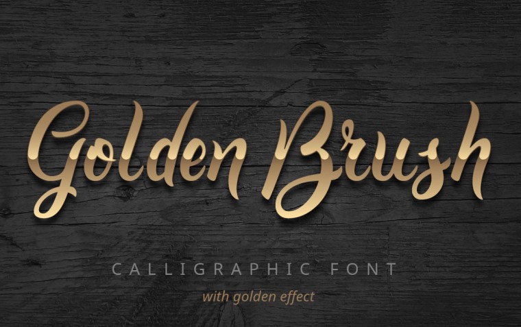
If you think that the best fonts for PowerPoint are calligraphic ones, then I have Golden Brush for you from Gleb Guralnyk. It is a modern trendy font with a golden effect that has been carefully written with gentle bends and laid-back lines. It contains a full set of lowercase and uppercase letters, a large set of punctuation marks, and numbers. Ideal for adding elegant and unique touches to the creative presentation of projects.
The creativity that this neat typeface embodies is enough to liven up your presentation. It will add brightness, without distracting from the essence.
The Golden Brush will suit as for headlines as for the body text because it includes two font files. PSD and AI samples are included with a golden effect.
Hickson's Script + Bonus Font
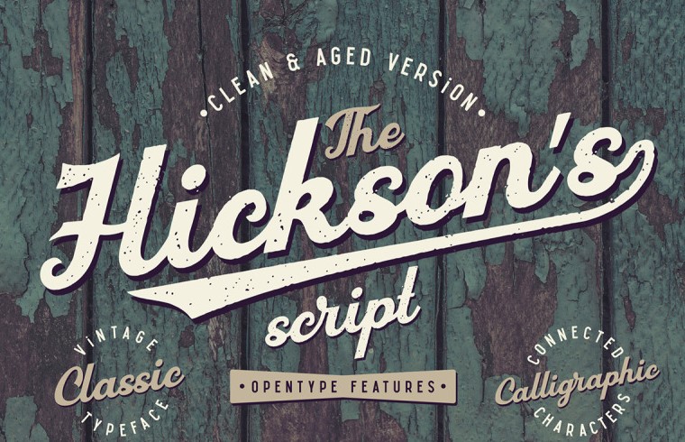
The last set that I find interesting for PowerPoint presentation will be is Hickson's script in two versions — clean and aged. This font is also calligraphic and created in vintage style. All letters are in a bold style and light italics.
Hickson's script is a brand-new font from Gleb Guralnyk. It has two variations and lots of OpenType features. This font has except basic characters also ligatures, swashes, and alternates. This font is a great way to express yourself in clothing, branding, marketing, and web design.
Buying this font, you will get OTF and TTF formats and, as a bonus, 6 JPG photos in high quality.
Conclusions
In the final part of the post, we would like to share with you the conclusions and simple principles for creating a perfect presentation.
- Say no to slide overload! Add text to slides, but know the extent. It's not pretty when there's a lot of text on a slide, even if the font is nice enough. Limit the slide to a small amount of text and add some pictures or diagrams that can convey important information.
- Do not add text to each other. This is ridiculous enough to ruin your presentation. Even if it is done professionally.
- Use no more than two fonts. This will make the information easier to read and make the presentation original.

Presentation fonts FAQ
Letters in serif fonts have special little lines on the edges of the letter, which are called “serifs”.
Pay attention to the fact that your slides have to be clear and easy-to-read even from the distance. It will be better to choose a font that won’t make the general look messy.
There are plenty of websites that offer free fonts. Besides that, you can visit the TemplateMonster marketplace.
Try to choose as the main - clear font where letters have serifs and clear outlines. The most common fonts are Arial, Calibri, Times new Roman, Verdana and Tahoma. If you need to highlight a keyword or title, you can use more "creative" fonts: Freestyle Script, Gigi, Monotype Corsiva and others.
The best font is the font that will be perfectly readable and compatible with all elements of the presentation. Readability is one of the main aspects of any presentation. After all, no matter how great the font is, it will not look impressive if it cannot be easily read.
Read Also
10 Popular Fonts You Should Absolutely Avoid Using In Presentations
PPT Tutorial: How to Embed Fonts in PowerPoint
Stunning Presentation With no Design Skills? We'll Show You How!
100 Best Business Presentation Templates 2019. Cool! Great! Awesome!
Get more to your email
Subscribe to our newsletter and access exclusive content and offers available only to MonsterPost subscribers.

Leave a Reply
You must be logged in to post a comment.