The Dystopian Union of Comic Sans and Papyrus
- Some Ideas Should Never Be Brought Into Reality
- How and Why?
- The Inception of Hate
- The Height of The Popularity
- In conclusion
Some Ideas Should Never Be Brought Into Reality
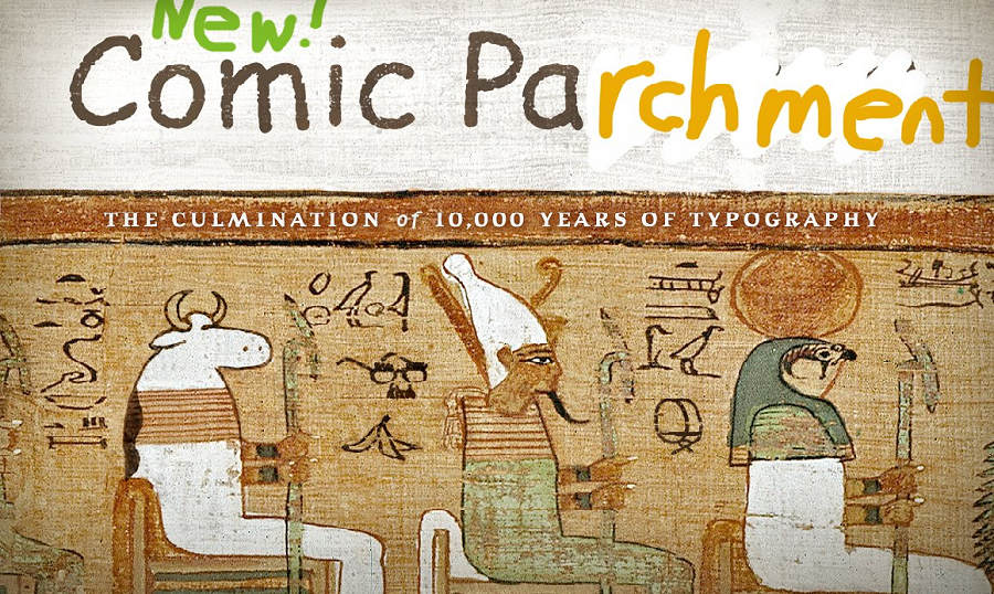
By joining Papyrus and Comic Sans, a web designer named Ben Harman is responsible for creating a Comic "Parchment" Font. This combination between two of the most infamous fonts in the history of typography is an act so shocking, you can’t ignore it. Why do these fonts have such a strange reputation? Why did they have a brief history of becoming an Internet sensation? Who created them? Why did they become so popular?
Let’s find out!
Also don't forget to have a look at our premium fonts.

How and why?
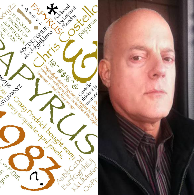
Papyrus is a font designed by Chris Costello in 1982. He got the idea to create it when he was studying the Bible extensively during his college years. Costello said that he wanted to show how the English language would have looked if it were written on Papyrus 2000 years ago.
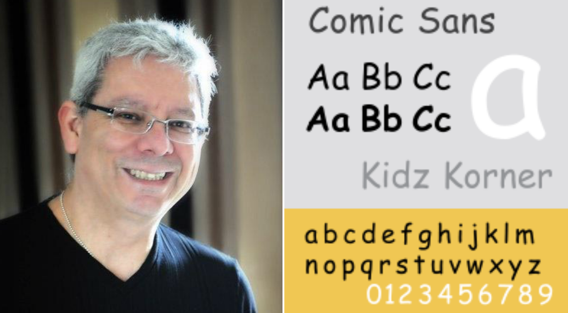
Comic Sans is the creation of Vincent Connare and was released in 1994. Connare said that he wanted to make a child-oriented font that mimicked the style of comic books, particularly “The Dark Knight Returns” and “Watchmen”.
The Inception of Hate
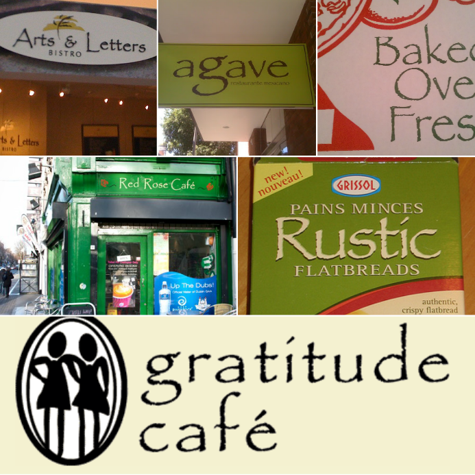
Since its release, Papyrus has become one of the world’s most overused fonts.Every small business owner and amateur designer was using it to make their product/building seem cool and sophisticated. This led many people to become infuriated whenever they saw this font in their daily life.
Comic Sans has a similar history. The font became overused in official documents which angered many people all around the world. The childish nature of the font and its complete incompatibility with any text that tried to maintain a serious tone led many to consider the font worthless.
The Height of Popularity
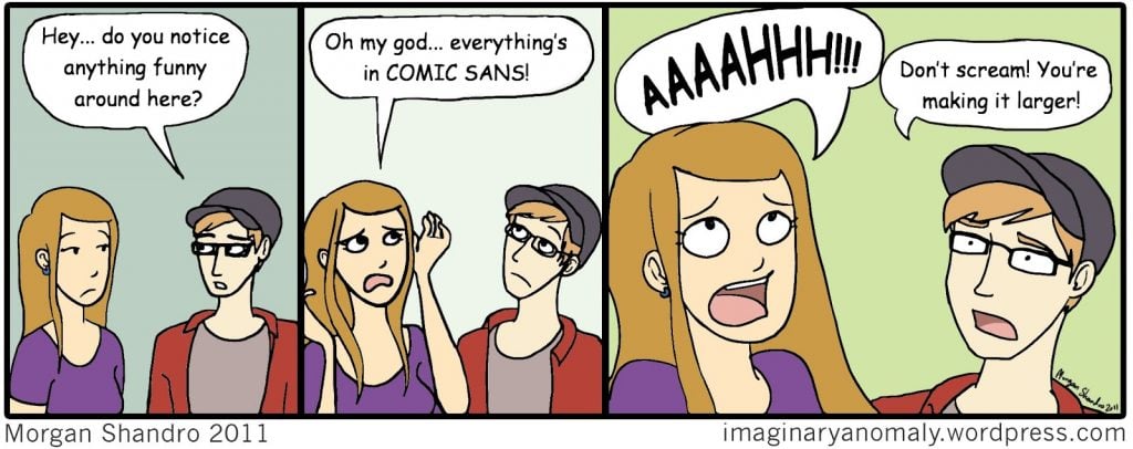
People who continued to use the fonts were largely satirized. Comedic anti-papyrus and anti-comic-sans websites were formed to spot the fonts “in their natural habitat” and “help” those who were unfortunate enough to see them without knowing.
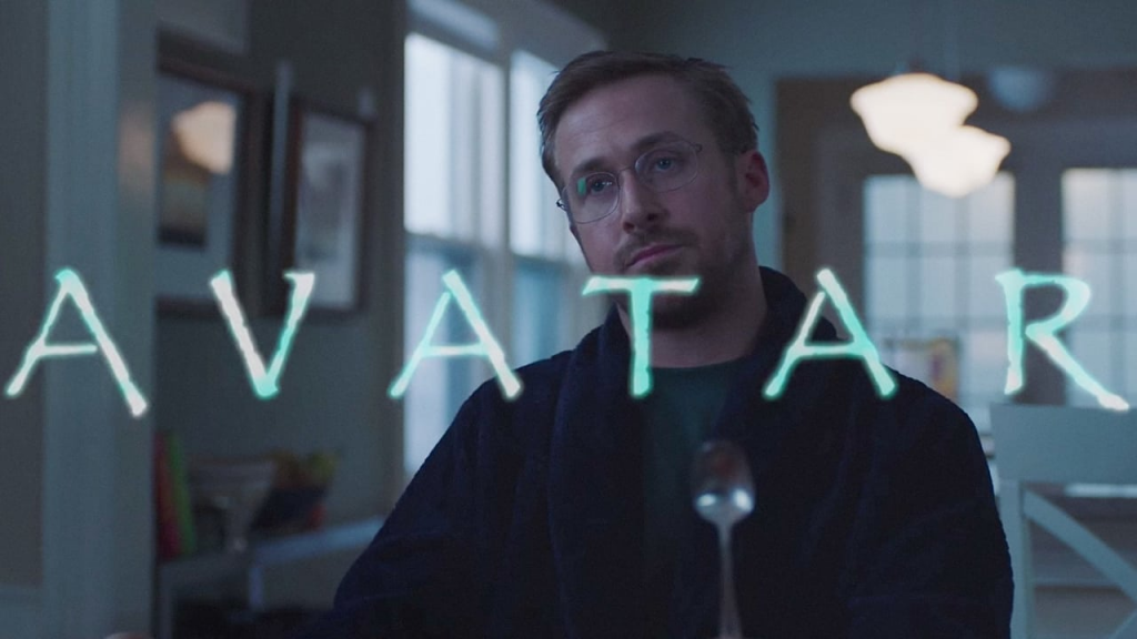
Papyrus became notorious for being used as a logo for the highest grossing film of all time, Avatar.
This has since become an Internet meme and even earned a sketch on Saturday Night Live, starring Ryan Gosling.

Two of the characters from “Undertale”, a cult classic RPG video game, were named after the fonts.

In conclusion
Now, you know why using these fonts creates such a toxic environment. Be sure NEVER TO USE them and always remember the crazy history behind them.
To know more about the incredible world of information technology, you can visit our blog.
Read Also
Comic Sans And Other Fonts For Dyslexic Users
Back to Everyday Concerns: Comic Strips About Web Design
Rules for Creating the Best Typography
Examples Of Top 10 Beautiful Typography Design Trends 2018
12 Basic Elements Every Graphic Designer Should Know

Get more to your email
Subscribe to our newsletter and access exclusive content and offers available only to MonsterPost subscribers.

Leave a Reply
You must be logged in to post a comment.