Comic Sans And Other Fonts For Dyslexic Users
Comic Sans dyslexia.
The Comic Sans dyslexia font

In 1994 Microsoft designer Vincent Conner, while working on a new product for the company, noticed something amiss. The product, Microsoft Bob, designed for school children, gave the impression of being overly serious. The picture, according to Conner, was spoiled by the pragmatic font used by the program, namely Times New Roman, with which Bob looked like another product for mature computer users. Simply put, Bob threatened to become boring for young users and therefore unpopular and unprofitable. Being a fan of comics, Conner decided to bring a piece of their charm to the product. Inspired by the bubbles, which are usually used for the speech of the characters, Vincent created the first prototype of the new font, with rounded characters incorporating a touch of playfulness.
So Comic Sans appeared.
In Microsoft Bob, the font wasn’t included for technical reasons. And, quite possibly, it became one of the main reasons for the complete failure of the product. But Comic Sans was later adopted as one of the default fonts for the successful Windows Movie Maker and later it was implemented in Windows 95. Comic Sans looked as if it were written by hand, devoid of strict lines and seriousness. All of this contributed to its extreme popularity, and the font began to be used both in advertising campaigns and humorous ads.
However, even now the Internet hasn’t stopped arguing whether it’s necessary to have such a non-standard font in Windows. Comic Sans has a whole army of opponents. Their arguments are simple: Comic Sans is too frivolous and its use in promotions and headlines forces customers to think that they are being teased. However, this font has positive sides. One of them is that the font still has an important practical goal.
According to a study of experts from Barcelona, it’s perceived by children and adults with dyslexia better than all others.
The Dyslexia disorder
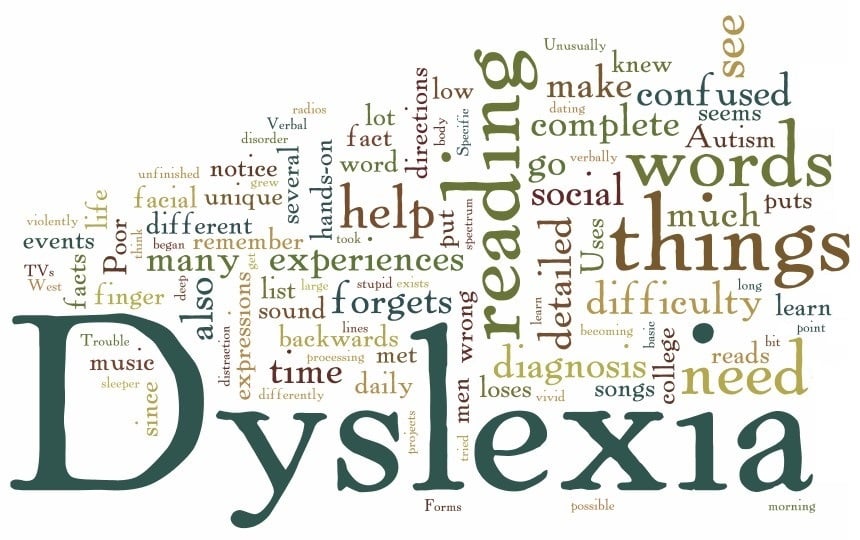
The term dyslexia was first introduced by the ophthalmologist Rudolf Berlin about 130 years ago. It was he who first described the disorder in which a person with normal intellect and vision is not able to learn to read and write, despite normal physical and intellectual abilities. Later, neuropathologist Samuel Orton systematized these cases and began to investigate this phenomenon. Since then, although interest in dyslexia hasn’t died out, there’s still no consensus on the reasons for its development. The only thing science knows for sure is that dyslexia is not a disease.
Dyslexia can be described, in a simplified manner, as a violation of the connections between the right and left hemispheres of the brain. Put a mirror in front of a book page and try to read the text in the reflection. Now you can understand what the dyslexic person sees every time, instead of the usual lines. He’s not sick and doesn’t suffer from developmental disabilities, he simply perceives the signs familiar to everybody in a different way. This is a person who is slightly disoriented in space.
This small disorientation is enough to complicate the perception of two-dimensional letters, words, phrases, and texts in general. The brain reads incorrectly, it turns letters and words upside down. And the person has to pay extra attention to turn them back the right way. Try to learn to read the mirror reflection, write with your left hand or do inverted inscriptions and you will understand approximately the essence of educational suffering of a dyslexic person.

Some fonts for dyslexics
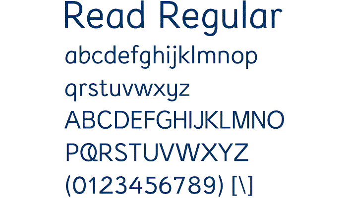
In this regard, possible good fonts for dyslexic people are sans-serif fonts (since serifs make it difficult to read letters), with well-marked remote elements, so that the word form is easier to read. As we can see, Comic Sans corresponds to all of these requirements. According to dyslexic.com, in addition to Comic Sans, the relatively good premium fonts include Arial, Trebuchet MS, Myriad Pro, and Geneva. However, some font designers are developing fonts specifically for dyslexics:
- The Read Regular font produced by the Dutch is available on request.
- The Dyslexie font, also Dutch, is likewise available on request.
- The Lexia Readable font from K-Type is available for British pounds. The font is used by McMillan Publishing.
- Free font Delicious from exljbris Font Foundry has generated some good feedback from dyslexic users.
Related Posts

Being a part of the TemplateMonster team is a great pleasure. I write about templates, marketing secrets, presentation tips, and different CMS. Hope my articles will be useful to you. If yes - please leave me a comment. Besides that, you can also meet me on Quora.
Get more to your email
Subscribe to our newsletter and access exclusive content and offers available only to MonsterPost subscribers.

Leave a Reply
You must be logged in to post a comment.