5 Super Easy Elementor Tips and Tricks 2020
Elementor Tips and Tricks are here! Do you want to enjoy your work creating websites, focus on complex tasks, and deliver projects faster? An Elementor page builder is here to help. It allows you to forget about the need to change the site code manually. Instead, you can devote more time to crafting more interesting and useful parts of the design.
Today we will check out five super easy Elementor tips and tricks. It will be especially useful for people who recently started using Elementor. This is a fast Elementor tutorial that will help everyone who wants to learn a bit more about the page builder. You will find these five small tricks that can improve your page and make it look more interesting and very stylish. All you need is a free version of the Elementor page builder and nothing more. To demonstrate these hacks, we used a beautiful collection of WordPress themes from TemplateMonster marketplace. Moreover, you can find a ton of other products in the marketplace for successful website building.
Gradient Button: Elementor Tips and Tricks
Since a button is a vital element in creating smooth communication between the user and the application, it is worth paying attention to its design. Using a gradient (a smooth transition of color) when creating individual elements of a web page allows you to highlight these details and attract the users’ attention.
The Elementor button widget is required to create an interesting gradient effect of the button.
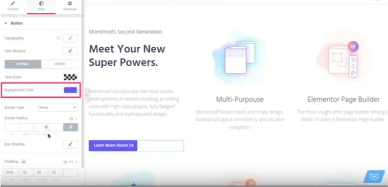
- Go to the Style tab to adjust the necessary button settings.
- The Button section of the Style tab allows you to choose the Background Color.
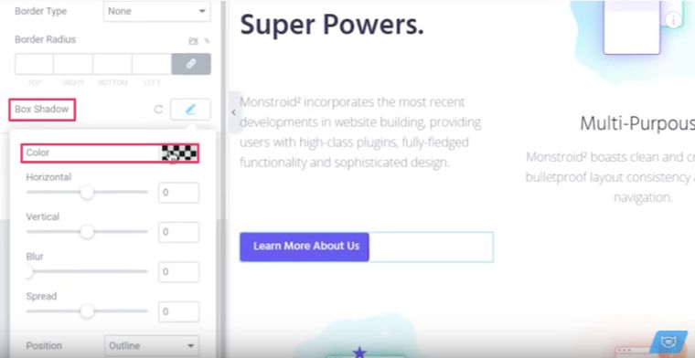
- Proceed to the Box Shadow and pick up the color.
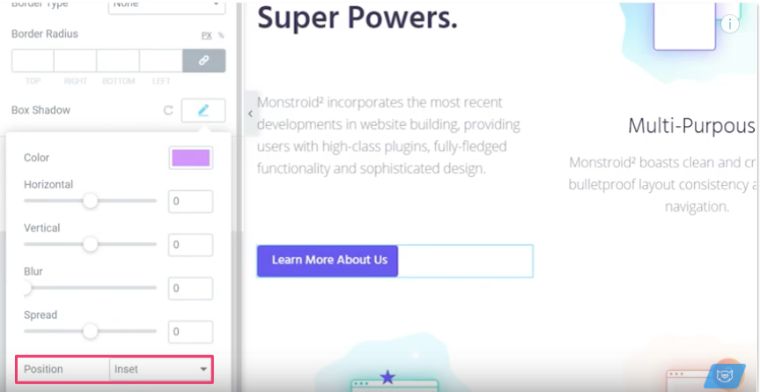
- Once the color is set, navigate to the Position and choose Inset there.
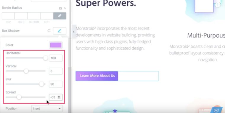
- Now you can adjust the position and blurriness of the gradient.
You can combine any colors to create a gradient.
Inline Text Styles: Elementor Tips and Tricks
Inline text styles are super effective when you want a visitor to the web page to pay attention to a certain part of the text and emphasize certain words. Playing with text styles is still a powerful tool to express and deliver a message in web design. You can combine text and visual components, which will help you be able to reach the visitor. Do not miss the trick below.
- In the Heading widget settings, go to the text input field and type the title.
- Wrap the words you want in angle brackets to visually emphasize them, and write the styles for properties you want to edit.
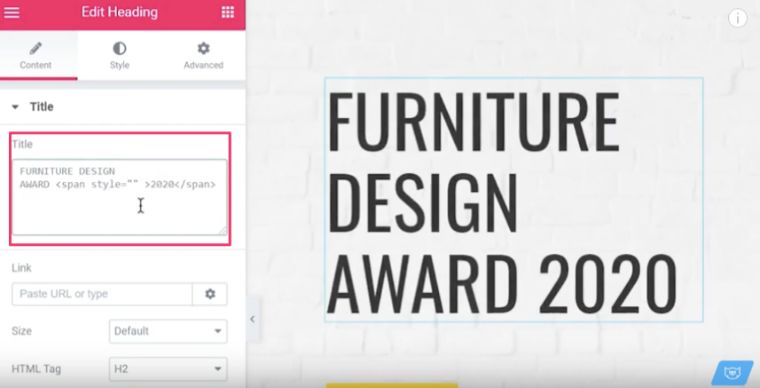
You can change colors, fonts, or any other property you want to edit.
Negative Margins: Elementor Tips and Tricks
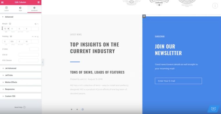
Learn how to use negative margins to create an appealing overlapping effect. Keep in mind, you can do this trick using various elements and make them look amazing. Make sure you do not ignore usability. This powerful technique will help you improve the layout.
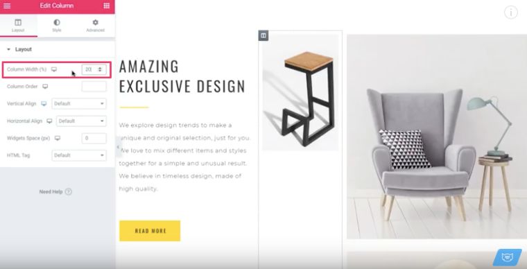
- Choose the Column widget > Layout tab and start adjusting the Column Width.
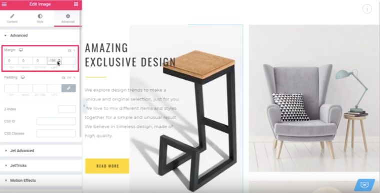
- Go to the Advanced tab to add a negative margin. You will see the two columns overlap.
- Let’s take two columns of the same height and add some margins on the top. You can add either positive or negative margins to get different designs.
Vertical Dividers: Elementor Tips and Tricks
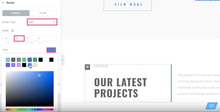
The visual divider is a layout element that helps separate pieces of content into clear groups, sections, options, or parts. This way it helps a designer organize the page according to the typical patterns of visual perception and make the layout clearer and more digestible for users.
Once you need to separate two elements, you can go to the settings of one of your columns to adjust the following values.
- Go to the Border section and choose Solid for the Border Type.
- Adjust the Width.
- Pick up the preferable color for the vertical divider.
Fixed Image Scroll: Elementor Tips and Tricks
This section shows how to make a fixed image scroll in Elementor fast and easy. This effect is quite nice and easy to implement. The background image does not move when you scroll the page.
The easiest way to add a parallax effect to your web page is to simply add a background image and change the attachment to Fixed.
- Go to the Style tab of the Section widget and pull up the Background section.
- Change the Attachment value to Fixed.
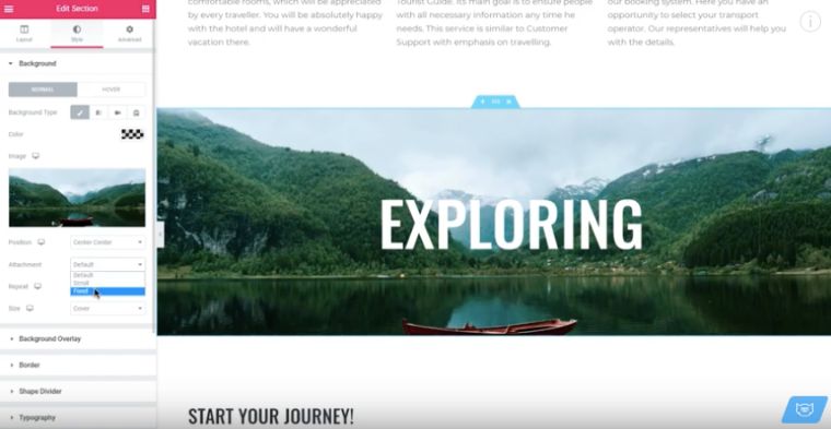
Now, when you scroll the page, the image will stay completely fixed.
Conclusion
Once you install the Elementor page builder, you have the ability to create web pages by adding various ready-made blocks (widgets). You can forget about touching the code since you will now be able to visualize your website with a few clicks of the mouse.
Hopefully, you have found these five Elementor hacks helpful for your web design journey. Such easy Elementor tips are great for people who have just started using Elementor and those who want to speed up their website.
Read Also
Tutorial on How to Create Sticky Sections Overlap Effect with Elementor Pro
How to Create an Animated Scroll Down Arrow with Elementor Free and Pro
Elementor Motion Effects: Best Practice to Liven Up Your Website
How to Set Up Blog Post Lists with Elementor Page Builder
Don’t miss out these all-time favourites
- The best hosting for a WordPress website. Tap our link to get the best price on the market with 82% off. If HostPapa didn’t impress you check out other alternatives.
- Monthly SEO service and On-Page SEO - to increase your website organic traffic.
- Website Installation service - to get your template up and running within just 6 hours without hassle. No minute is wasted and the work is going.
- ONE Membership - to download unlimited number of WordPress themes, plugins, ppt and other products within one license. Since bigger is always better.
Get more to your email
Subscribe to our newsletter and access exclusive content and offers available only to MonsterPost subscribers.

Leave a Reply
You must be logged in to post a comment.