eCommerce UX Tips: How to Seduce Visitors to Buy
Making customers stay and buy from their stores is the ultimate goal of any eCommerce store owner. UX is the main ingredient that wins customers heart. Getting UX right from day one is not easy.
But, who said it is impossible? It is possible with these 10 eCommerce UX tips designed to wow customers and to make them stay longer and buy more from your online store.
1. Zippy fast loading speeds
On an average, websites take about 4 to 5 seconds to make their content visible to visitors. But, for eCommerce stores 4 to 5 seconds of loading time is expensive.
A loading speed of under 3 seconds is what ticks visitors.
40% of customers would rather ditch an online store than wait for it to load completely, offers Ray Grady, EVP of CloudCraze.
Pumping up your page loading speed by redefining your code structure, compressing images and using CDN is mandatory if you want visitors to buy from your store.
Secondly, make your online store responsive to mobile and other smaller screen sizes. A fast loading online store that is easily accessible from a mobile device is a sure recipe for maximum conversions.
How to find your website loading speed?
There are tons of free tools like GTmetrix, Google’s own PageSpeed Insights, WebPageTest and so on that give instant feedback about how fast your website is.
2. Hone to your homepage attractiveness
People evaluate the worthiness of any website, including an eCommerce store from its Homepage. Ideally, the homepage of an online store must talk about its products and offers in a subtle way.
You must sell, but don’t stuff it onto customers and make them feel wary. Unnecessary popups, flashy banners, auto-playing adverts are a huge turn-off.
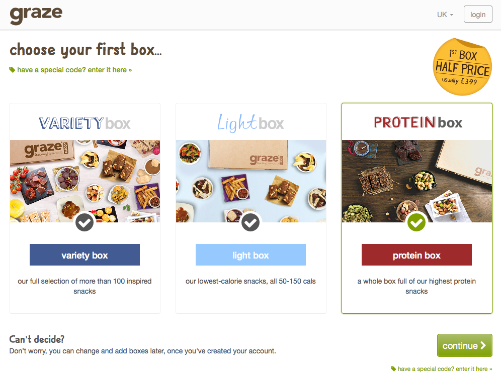
If you are selling a single product or service, follow a sleek and utilitarian design like the one Graze followed to win customers.
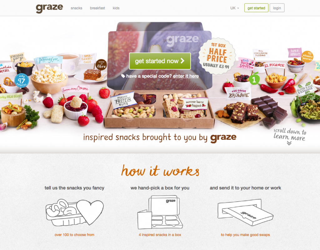
The Homepage of Graze is simple, yet gives complete information about how to buy their products.
Click on the try option, and you will be redirected to another page where you get to see their available snack box options prepped with vivid imagery, a fetching tagline and a call-to-action that is hard to miss.
3. A search button that one doesn’t have to search for
Do you know? A large portion of customers skip the product category page and use the search option directly to find products. It is easy, straight-forward and takes less time.
So, keeping the search button easy to find and easy to access is a good move to help customers and win them over.
Some pointers to make search work for you.
- Keep the Search box on top and accessible even if customers scroll down
- If your store has more than 20 products, use Faceted search
- Provide advanced search and dynamic filters like color, size, price range, etc. to help customers find their choices easily
Ao got it right by placing its search bar perched above everything else on the homepage.
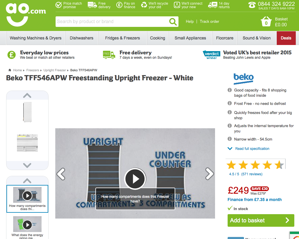
If customers are not able to find what they want, it is easy to get what they want by typing it into the search bar.
4. A to-the-point product layout
A typical customer thinks like this:
I want jeans.
But I don’t want them to be baggy.
It should be super skinny and should feel like leggings, but Jeans!
And it should be of a good brand.
Seems like Asos thought out ts product layout by thinking from the customer perspective. Their homepage is so simple yet to-the-point that buying is so easy than in a retail store. It is a clear case of UX win.
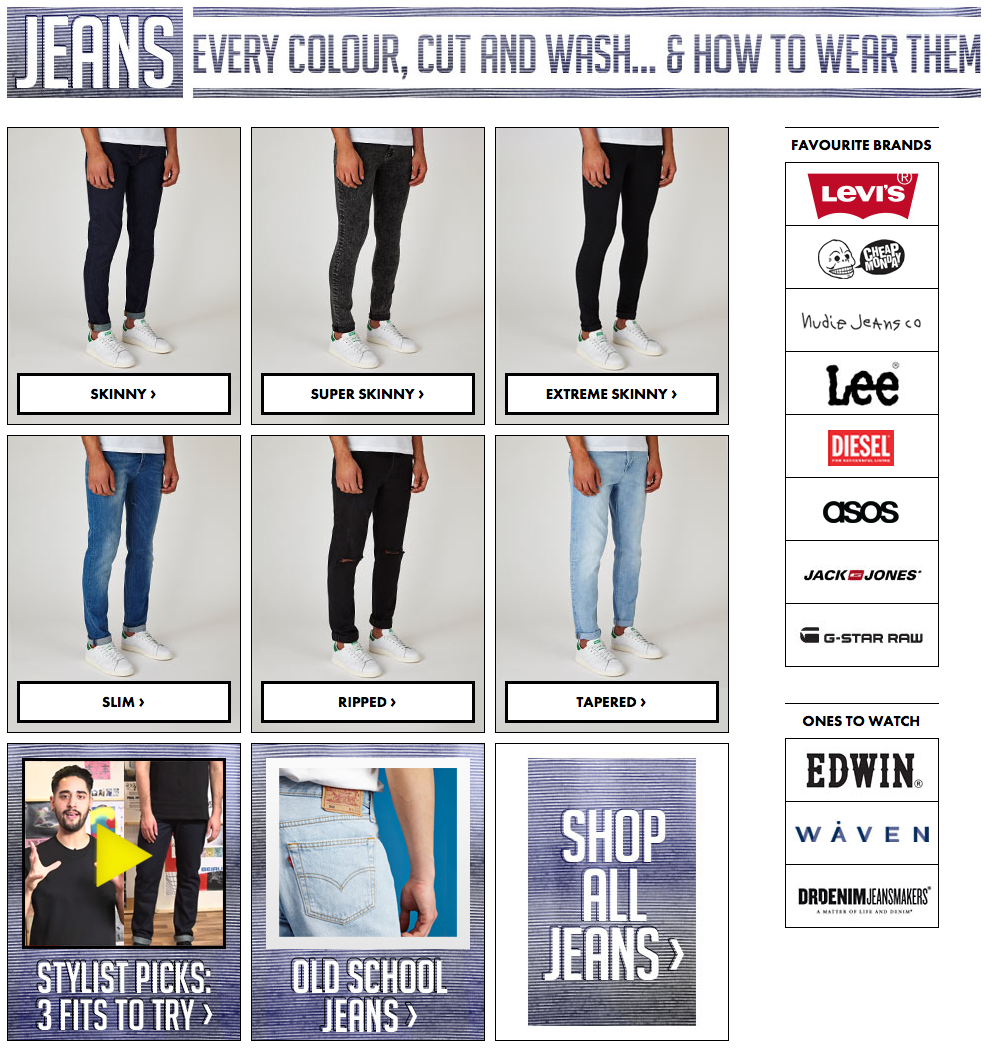
The product layout shows the various types of jean types followed by a huge call to action to explore other varieties.
This detailed showing of product categories helps sell easier without letting customers go round and round searching for the perfect choice.
The takeaway: Cut the fat and serve the meat. Avoid clutter while designing the product layout.
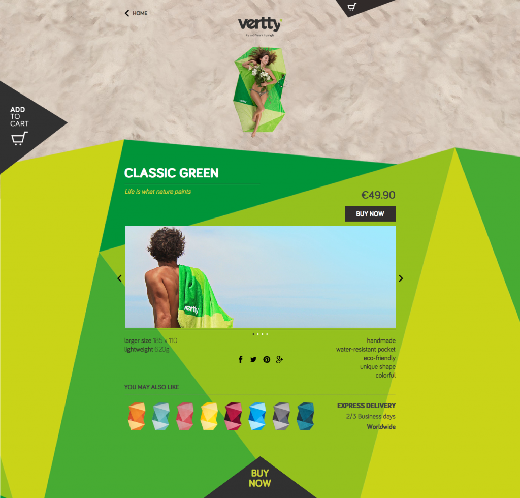
5. Play with colors, but don’t overdo it
Colors, hues, and tones play a major role in enticing customers to make a buy. The entire idea of color psychology is stemmed from the fact that certain colors can invoke emotions in customers thus making them more prone to spending.
However, as Matt Tomaziefski, web designer with Miles Technologies says: “using too many colors will dilute results you're trying to obtain.”
As a thumb rule, don’t use more than 3 color variations on your website. Of course, your products can have any number of colors. However, the website layout and its creatives must have a common color theme or color band that is welcoming and not distracting.
Check out how Vertty, an online towel selling store makes customers eager to buy with its playful colors:
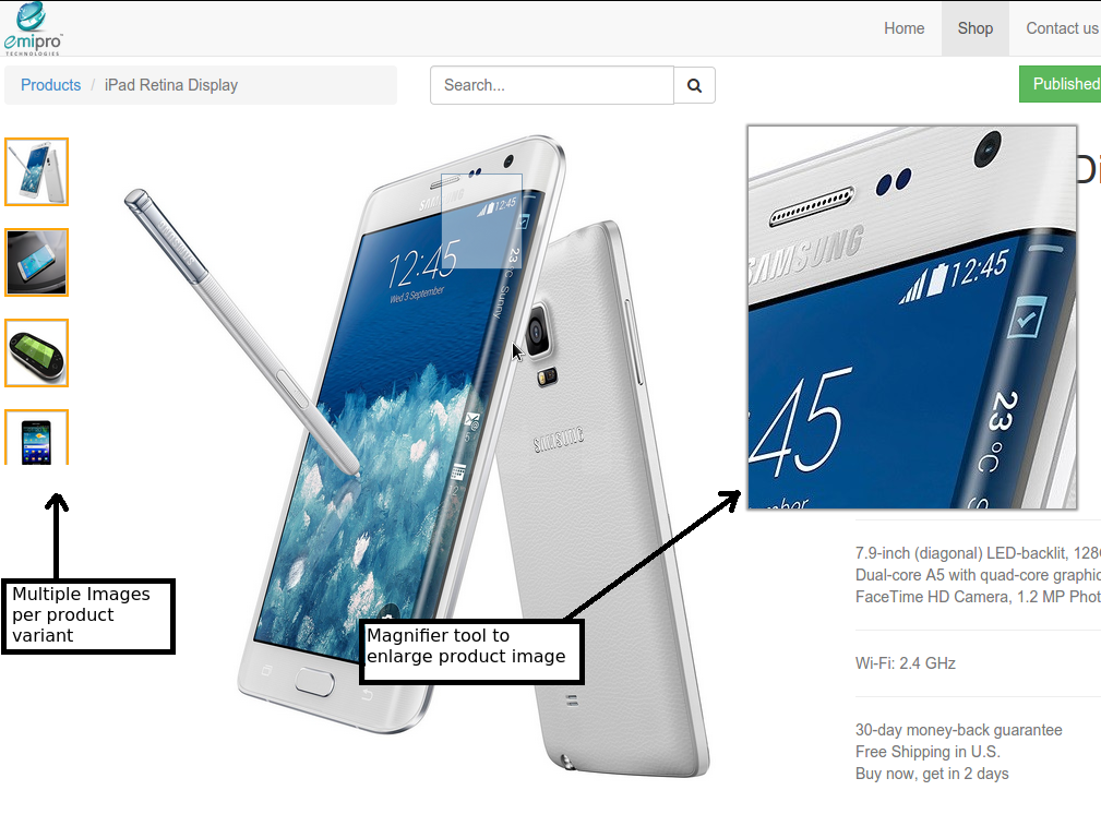
6. Multi-angle Product images
In eCommerce, product images provide the same effect what window shopping does in real-world. The only difference is that they are virtual and cannot be felt.
But, that is not a shortcoming as such, since it is always possible to give customers an up-close view of the product through zooming options. Also through product photography, a complete roundabout view of the product.
Multiple angle images alternated by zoom can help convince customers about the quality and finishing of the product.
7. Simplified navigation that also delights
Let’s assume your online store has plenty of product categories and variants. For customers, wading through these endless product categories and variants can be a pain.
We already described above, how product layout can be a game changer. But, above product layout, the navigation schema of the website can also turn around the ship.
There are things you must consider while designing the navigation of the website:
- It should take people to where they want as quickly as possible
- The number of scrolls, clicks or taps must be minimal
- The process should be simple and effortless
- There should be a provision to take a step back easily if required
Integrating a breadcrumb navigation on the website will also go a long way to make things easy for customers.
How to know if all this works? Use a heatmap of user behavior and identify spots where they spend much time or skip to fine tune them specifically.

8. Security as paramount priority
You must be wondering how security can be related to user experience of a website. As a matter of fact, they are correlated in a big way.
User experience is how a user feels when he or she is on your website. Do they feel fear or insecurity while shopping on your website? Then it is a matter of concern.
Security in an eCommerce website is a major factor that customers consider before making a purchase. They would rather miss a great offer than compromise their personal information, including banking and credit card credentials.
The solution is to migrate HTTP to HTTPS. You can do it by setting up an SSL certificate on your website. They encrypt the information sent and received thus ensuring that the business, as well as its users, are in the safe zone at all times.
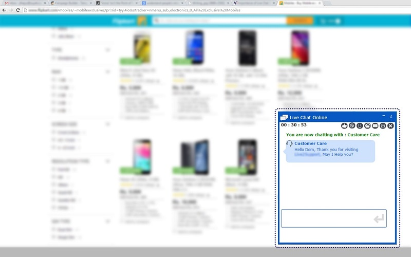
9. Online chat system or virtual support
Live chat bubbles that connect customer care representatives to customers are a boon for troubled customers. They can seek immediate clarification on delivery dates, refund statuses and so on.
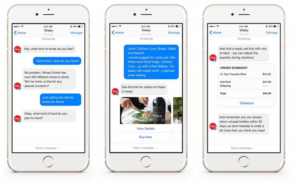
Going a step ahead, your online store can also consider integrating a chatbot super-charged with Artificial Intelligence and machine learning. They eliminate the need to employ customer care personnel and take care of the entire customer onboarding and continued assistance tasks.
Chatbots can help customers learn how to use a product, check the status of their orders or even know what size to pick for a product variant effortlessly.
Here is how Vinery helps its customers with chatbot assistance:
10. Perfect the checkout process
Two things are bound to happen at the checkout page of an online store.
- Customers pay up, or
- They leave instantly abandoning the cart
Why do customers abandon carts?
SmartInsights came up with this statistic explaining the various reasons why customers could be abandoning carts:
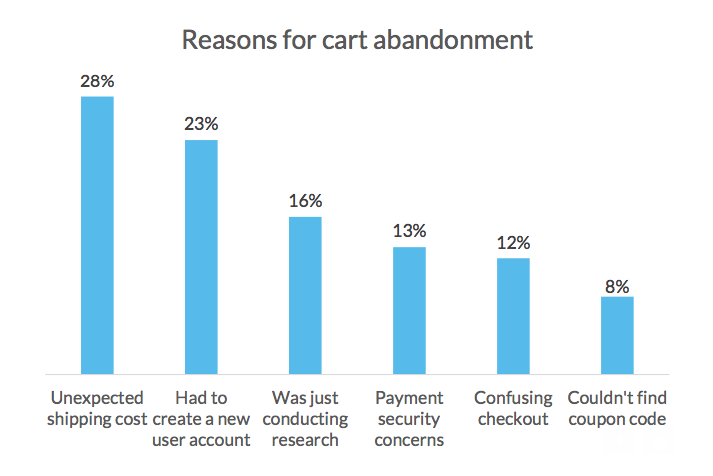
These are not the definite reasons, but among the top reasons why customers leave. There are plenty of other reasons like asking too much of information that is not needed to make a purchase.
So, design your checkout page in such a way that customers would actually not hesitate to buy the product instantly by considering the above-mentioned factors.
Finally
These are 10 ways how you can elevate the user experience of your online store and give it a whole new face of selling.
Remember, good user experience can be addictive. It can bring back customers without having to hard sell.
Have any more thoughts on selling better through user experience? Let us know.
Related Posts
Good eCommerce UX Gives Shoppers What They Want Without Them Knowing It
I Want to Start an Online Store
How to Choose an eCommerce Platform
Trust Signals for eCommerce Websites and How to Use Them
Top 6 Backlink Building Tricks For eCommerce Stores
P.S. Just to make sure you will get Ecommerce Templates in the right place.

Get more to your email
Subscribe to our newsletter and access exclusive content and offers available only to MonsterPost subscribers.

Leave a Reply
You must be logged in to post a comment.