Good eCommerce UX Gives Shoppers What They Want Without Them Knowing It
Think back to the last time you got excited about a purchase. Maybe it was something you’d been planning awhile; maybe it was a spontaneous surprise for a friend. Either way, you received a joy completely independent from the product itself (though influenced by it). It was the experience, that gave you that shopping rush.
What if you could market that experience and use it alongside your product range?
In a nutshell, that’s the goal of eCommerce UX design: creating the environment that allows and encourages this kind of enjoyment, to the point where the experience is part of your online store’s appeal. The opposite is much worse. A bad online shopping experience drives customers to your competitors, who are just a few clicks away.
In this article, we’ll explain how to package and sell that fun “shopping experience” in your eCommerce UX, to give your online store a draw beyond its products.
The “Shopping Experience”: Why UX is Vital to eCommerce
Designing user experience is essentially the skill of streamlining a website to make it easier for the user to accomplish what they need to, with as much enjoyment as possible, and without interfering with the site stakeholders’ goals. A successful UX is as much about avoiding pain points as it is about giving users a reason to smile.
For eCommerce, this means creating an interface that makes it easy to shop online: browsing, comparing, finding what you’re looking for, etc., and of course a quick and painless checkout. It’s the online version of the “shopping experience.”

Source: Negative Space
While physical stores might have attention-grabbing displays and thoughtfully organized sections, eCommerce UX relies on visual screen design, site navigation, screen layouts, text copy, direct interactions, and general site usability.
Good eCommerce UX is like shopping in a luxurious, well-lit store with a friendly staff. Bad eCommerce UX is like shopping in a dark, run-down warehouse.
“If our products are good and our prices are good, it doesn’t matter what our site looks like, right?” Not quite. While it’s true that the main appeal of any store is the products (and their cost), the quality of the shopping experience has more of an impact on sales that you might guess.
And considering that the average rate of cart abandonment is close to 70%, eCommerce stores need every advantage they can get to convince shoppers to actually complete their purchase.
Gender Difference on Shopping and eCommerce UX
Knowing the “user” is half of “user experience.” That means good UX design for a site used by middle-aged men would be ineffective and even detrimental to a site used by teenage girls. Different user groups have different preferences, pain points, shopping styles, and problem-solving methods.
Even within a certain demographic, different user segments exist. Not every middle-aged man or teenage girl behaves like one another, so you’ll have to narrow in on your specific type of user as accurately as possible.
This is easier for niche sites than general all-in-one sites, but in either case, it’s beneficial to conduct actual user testing to determine exactly what type of person is shopping at your store. This lets you fine-tune your interface to your customers, with keen insights into both design choices and marketing strategies.
While specifics are useful for determining the details, there are some general observations on user types for broader strategies. Although not 100% accurate, on the most basic level you can divide user preferences by gender.

Viewing UX design through the lens of gender is a good way to explain just how influential seemingly minor design decisions can be.
- Men are slightly more inclined to make purchases on mobile devices. Business Insider reported that in 2013, 22% of men made a purchase on mobile devices, compared with 18% of women. For UX purposes, sites with more male shoppers should accent their mobile version.
- Women are more likely to use coupons, according to the StarTribune. This could have an enormous effect on marketing strategies — with implications that women respond better to email marketing — but also affects UX. For example, sites with predominantly women-shoppers should both offer coupons and advertise them in the most visible screen areas.
- In the brain, women have a thicker corpus callosum than men, leading to different styles of thinking when it comes to shopping. Glossing over the science, the results are that men tend to take a task-oriented approach — find the right product and buy it as soon as possible. Women, on the other hand, are more open to discovery, and willing to divert from their initial goals if there’s a good reason to. The implications on UX are that secondary features and adverts — such as sidebar and “related products” windows — are more effective with women shoppers.
- The same article describes that women enjoy shopping more than men. For site navigation, this is directly applicable to UX: the option to meander from page to page is good UX for female shoppers and poor UX for male shoppers (who want it done as quickly as possible).
It’s not always so clear-cut as gender differences, nor can you assume these rules for all women or men. The more you know about your target customer-base, the more you can customize the site design to cater to their idea of a good shopping experience, right down to their favorite color.
That said, there are some universal rules to good eCommerce UX.
5 Universal Ways to Improve Your eCommerce UX
Let’s talk about some sure-fire UX tips that work on every eCommerce site, regardless of the type. These broad guidelines stem from common UX mistakes you may not be aware of, and general best practices.
Don’t Ask for Too Much Information
Simplicity is the name of the game for improving UX. The more obstacles and distractions there are, the harder it will be for your user to complete their tasks. Good UX is smooth and efficient with no redundancies or excess. Cognitive overload — making the users think too much — is the sworn enemy of UX.
For eCommerce, the biggest culprit is too many forms. Checkouts, payment info, sign-ins… every task that involves manually entering information drags down your UX. A joint study between Econsultancy and TolunaQuick in the UK revealed that two major deterrents in completing a purchase are “The process takes too long,” and “Difficulty in filling in forms.”
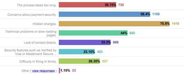
Source: Econsultancy
Since the tasks themselves are often unavoidable, the best way to handle them is to ask only what is necessary and look for ways to consolidate information.
So, if you don’t need their email address, don’t ask them for it (at least not during checkout — after the sale is a good time). If you don’t need their number, don’t ask. As a rule of thumb, every form field you add increases the chances of cart abandonment ever so slightly… so make sure new additions are worth it.
Trimming the fat works at avoiding bad UX, but if you want to take your site to the next level, you have to go above and beyond. Exceptional UX designers discover new ways to remove steps for their users, and the effect is appreciated.

For example, The Home Depot only asks for your zip code, and then calculates the city and region on its own. These small micro-interactions are the key to good UX and give the entire shopping experience an intuitive and fun atmosphere.
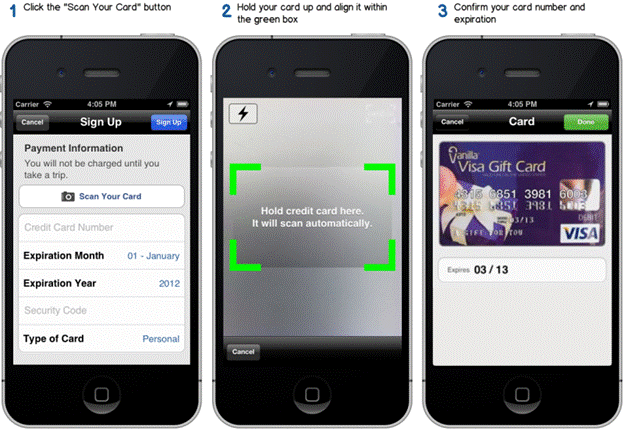
Source: Uber Newsroom
As we explained in the article eCommerce Checkout Flow: What You Need to Increase Conversions, innovations like these set you apart from your competitors. Uber changes the game with a feature that renders the entire credit card entry form obsolete. That’s a UX choice that spares the user a lot of annoying steps.
Allow Guest Checkout
Guest checkouts are a best practice for eCommerce, more of a necessity than a luxury. The statistics speak for themselves. The same Econsultancy-TolunaQuick study mentioned above also record that needing to register would cause 25.65% of shoppers to abandon their cart.
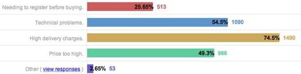
Source: Econsultancy
(You’ll also notice delivery charges are an enormous factor, which we discuss below.)
The registration problem is easily solved with guest checkout. Anonymous checkout options alleviate the apprehension of having to give up your personal information — especially for a new or unfamiliar site. In the LemonStand software, all of our responsive themes come with guest checkout built-in.
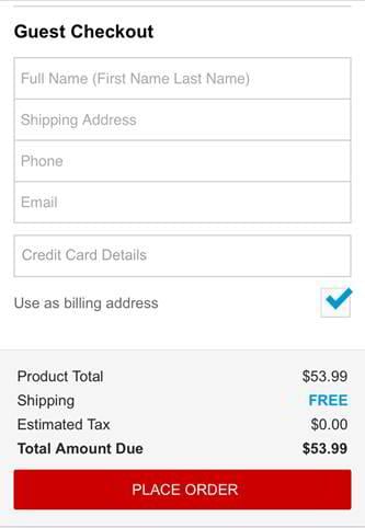
Source: Mobile Strategies 360
According to Carissa Ganelli, the CEO of LightningBuy, Staples has “the absolute best mobile checkout in the whole world,” and part of the reason is their streamlined guest checkout. The screenshot above is all there is, adhering to our first point about only asking for the necessary information.
Visual Hierarchy and Compositional Flow
Visuals are probably the most important tool in UX, not just working alongside usability, but governing it. When used properly, your visuals will dictate how to use the site and even influence what your customers notice.
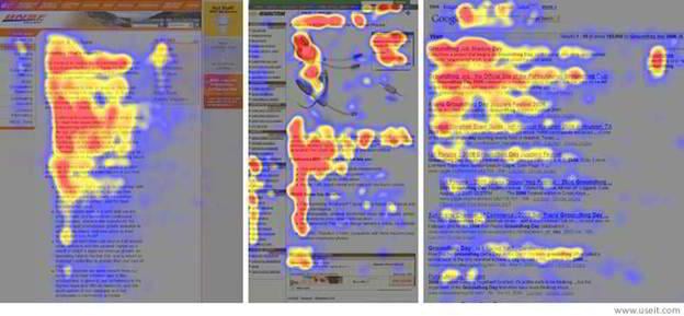
Source: Nielsen Norman Group
The behavior of the human eye is surprisingly predictable. Color schemes, composition, element sizes, negative space, and motion/animation all fit together to attract and repel attention, allotting designers a degree of control over what gets seen and when.
In UX, visual design has a lot of practical applications, namely that it can show usability and functionality without wasting time actually saying it. Visual design is a time-saving tool, so subtle it’s often not even noticed, but so effective it’s all you need. Some of its best uses include:
- presenting all the elements the user needs in a way that’s instantly comprehensible
- suggesting the next step in a task, in case the user is confused
- drawing attention to specific features or products that benefit the brand
- adding delight to the experience with fun visuals
In direct terms, the visual hierarchy and compositional flow determine where your shoppers’ eyes go.
Visual hierarchy is the rank of what gets noticed in what order: a large red button might be at the top of the hierarchy since it attracts attention, while a little legal description in the footnotes might be at the bottom.
Compositional flow has more to with layouts: arranging elements in a way that guides your user’s sight along a controlled path, as gutters control where rainwater goes.
These are both advanced concepts that we can’t do justice here. If you’d like to learn more, you can read this article on improving design and usability with compositional flow.
Display Your Shipping Policies Up Front
Shipping is crucial to eCommerce. As the Econsultancy-TolunaQuick study showed above, 74.5% of consumers would abandon their cart because of surprise delivery charges. On the other side of the spectrum, delivery offerings can help you. According to Wharton, shoppers will spend 30% more when shipping is free.
This makes shipping a powerful factor in the shopping experience — for better or worse. That’s why good UX doesn’t shy away from delivery fees, it displays them openly. Shipping policies are what the customers want to see, so making them readily visible will improve their experience.
Obviously, if you offer free shipping, you want to advertise it. Using the visual hierarchy techniques mentioned above, display your free shipping in a way that’s sure to be noticed. This eases your shopper’s concerns, and also entices more sales, just like advertising a discount would.
However, even if you don’t have free shipping, you still want to be upfront about your policy. It’s on the shopper’s mind right from the start, so ignoring it only prolongs their anxiety. If your shipping is unsatisfactory, your customer won’t go through with it, either way, so trying to hide it only irritates them, wastes their time, and makes it less likely they’ll return.
The above study cites that shoppers abandon their cart because of hidden shipping charges. It’s not always just about the price; sometimes it’s above feeling taken advantage of.
Highlight Social Proof
When it comes to eCommerce, the lines between web design, UX design, and straight sales tactics all blur together. The methods for increasing both customer comfort and sales are accomplished through thoughtful site design. With this in mind, highlighting social proof is just good business — a technique that improves UX, sales, and usability at the same time.
From a UX viewpoint, shoppers want to see what others like them had to say about a product. Just look at these statistics from FounderU:
- Before making an online purchase, 46% of shoppers read reviews and blogs.
- Around 13% of shoppers said that a blog post had inspired their purchase.
- Among all online shoppers, 84% referred to at least one social media outlet for recommendations beforehand.
The concept of social proof has been a known sales tactic for centuries; however, in eCommerce, the old rules are changed by the accessibility of social media and proliferation of customer reviews. Your appearance in the social arena has a direct impact on sales, so you’ll want to take these two areas very seriously.
Assuming that you’re selling a quality product worthy of good feedback, the difficulty with customer reviews for eCommerce brands is in getting customers to write them. It’s not always easy to get a client to return to a site after purchase, so you’ll have to put in some extra effort.
One of the most successful strategies is to send an email eliciting a review, timed around when the delivery arrives. In this period, the customer is most excited about their purchase and more likely to gush about their enjoyment.
The other technical concern is that reviews are readily available. Product reviews should be easy to find on every product page. We suggest a rating system in the initial description at the top (such as “4 stars out of 5”), with complete textual customer reviews at the bottom of the page where they won’t take up vital screen space.
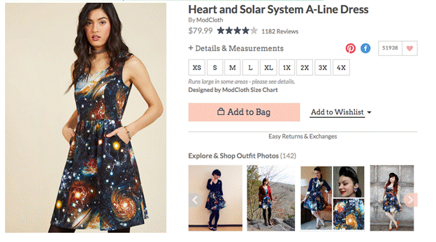
Source: ModCloth
ModCloth has a great customer review system. For starters, they display the client's rating right at the top, next to the title and price, and even have their own Like/Wishlist options with the heart — another way to demonstrate social proof.
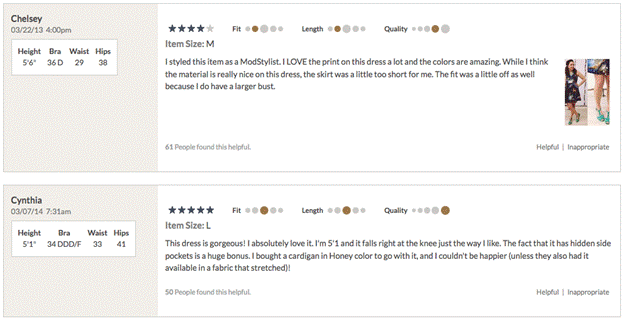
Source: ModCloth
At the bottom of the product page are the customer reviews, written in a community forum style of environment. ModCloth goes the extra mile by providing “Fit,” “Length,” and “Quality” metrics, along with the commenter’s dimensions. Shopping for fit is one of the greatest difficulties in clothing eCommerce, so this means of comparing body types to people who’s worn it is an ingenious workaround.
As for social media, that’s a whole other category of UX we don’t have room to explain fully here. However, you can read these helpful installments in the content strategy series from LemonStand. They explain the intricacies of social media, blogging, and onsite copy through a lens specific to eCommerce.
Takeaway
Like we said, user experience is to the user… and that’s just another way to say it’s about people. UX is the bridge between the cold and sometimes mechanical process of web design, and the human, emotional aspect that draws a person in. You can have the best numbers in the industry — prices, product specs, delivery times — but you won’t land a sale unless you can appeal to your shopper’s heart.
What’s your personal best experience in UX design? What’s your personal best experience as a shopper? Share your stories and experiences with us in the comments section below.
Choosing the Best eCommerce Platform [Free eBook]

Get more to your email
Subscribe to our newsletter and access exclusive content and offers available only to MonsterPost subscribers.

Leave a Reply
You must be logged in to post a comment.