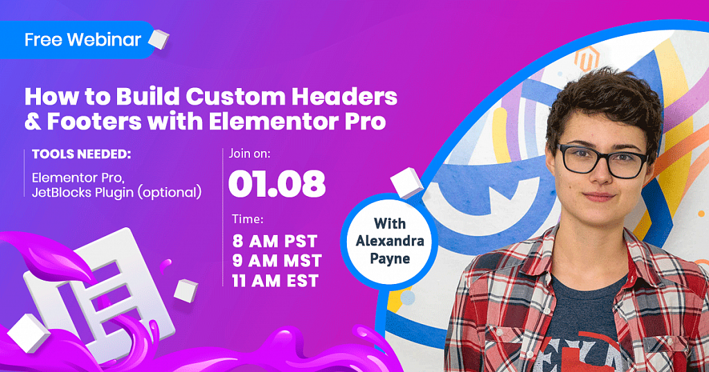
How to Build Custom Headers & Footers with Elementor Pro [Free Webinar]
With Alexandra Payne you will learn how to create custom headers and footers using Elementor Pro. Also this tutorial covers elementor transparent header topic.
Having a custom header is important because you can modify it as per your needs by adding custom-built menu, mega-menu or even removing it completely making use of the canvas layout. The same story goes about the footer you can use it to present any possible content or just giving it a minimal look without cramming it with links.
In our webinar you'll learn how to:
- create a custom header or footer for your theme;
- create complex and creative headers with JetBlocks plugin;
- create a transparent sticky header;
- make your headers mobile-friendly.
By clicking here, you may watch the useful webinar that will definitely help you in creating headers and footers!
Elementor Tutorial: How to Create Custom Headers with Elementor Pro
Elementor Tutorial: How to Create Custom Headers with Elementor Pro
Full transcript of the video
Yes, as I have said it's our second webinar and we are planning on doing it every week. We are gonna pick a topic that you guys might be interested in. And if you have any suggestions, maybe any ideas for our future webinars, for the next week or something, just type it in the comments or just contact us in our social channels, like Facebook or Instagram or whatever, whatever social channels you are following.
So, also if the audio is good, if the video quality is good, just let me know in the live chat, just type that like a "plus" or something that you can hear what I am saying. So it is gonna be a great help. So I know that the technical setup is okay.
So, should I start? I think, yeah, enough talking and yeah.
So, the first step that you should do if you want to create a header - let me show you the setup that I am starting with. And yeah, here I am using the types of standard, uses standard types. So, it is, you know it consumes..,it consumes less memory and you know just Chrome runs faster, because I am using Google Chrome. Just like this page load and then later we are gonna proceed to creating the headers over here. And here I would just show you my home page. And it is loading a little slowly, because of this stream, but I mean what can I do. And.. So, this is kind of what we got over here. You can kind see the header already, here it is. This is the, like the default header that you get on clean WordPress, without any custom headers that you might create with Elementor Pro, without any custom header templates, without any other plugins. So, this is the like clean, core WordPress header. So nothing in it.
I had some templates created before, but I deleted them. So we can start from scratch and the same applies. Okay, loads kind slowly, because of the stream, because we are now live, and you know stuff happens. And this is the header. Okay, this was the header, and this is the footer, because you know. Okay, let's scroll back. So this is kind of what we are starting with. Then if we go here, and to access the interface that allows you to create header templates. What you should is go to “Templates” and go to the “Theme Builder”. So the Theme Builder is kind of the library of your templates for headers, footers, single page templates and archive templates. So, in order to start creating your first header, it is pretty intuitive, you have to click here the type. You leave it as “Header”. And then called it “Header Template” whatever. And then you can start creating.
Oh, hi, I see we have an one person in the chat, so hello. I am sorry, I will not try and pronounce your name, because I really, really afraid of making mistakes. So, I pronounced it in the wrong way, yeah sorry. I just really have to see there hi.
And if you have any questions along the way, if any questions appear, just let me know, just type them in the comments, and on the live chat. I am monitoring the live chat, and I have the second monitor here. So just if you have any questions or if you want me to clarify something, maybe I am, you know maybe wants to, you know maybe wants me to go into more detail about some things that I am doing, just let me know in the live chat.
Okay, so right away, right from the stored, Elementor offers you to select a template and start working with it. But, but since we are doing the custom type of thing, so let's just do it ourselves. Okay, so this is like pretty much a normal Elementor page. The section that you have to work on it is gonna be right here, and what you should do is to create a new section.
First, we are gonna work with the Elementor tool set, like the standard Elementor Pro tool set for recreating headers. So, Elementor Pro you get a site of widgets that allows you to create headers. And later in this tutorial…later in this tutorial…I see more people in the chat, hi their. And so, later in this tutorial starting this sentence the third time, okay, and later we are gonna have a look at the more extended pack for creating headers, which is going include more widgets, that gonna allow you to make more complex and more functional headers, like such as log in, and register links, login forms.
Okay, let me just scroll really quickly. Jetblocks! So, this is this plugin, that this is set of widgets for creating custom headers. And this is an additional plugin. This is an add-on for Elementor, and it works with Elementor free as well. And..Yeah, if you get it in, for example, Monstroid2, which is a great theme and it goes in.. out of the box with possibilities to create custom headers and footers. And you don't need Elementor Pro as you keep working with Elementor free. But I am drifting away, I am sorry, I know my bad.. And “Jetblocks”. Having a look at it later. Just get it for Elementor Pro, if you are gonna create better headers and footers. But about Jetblocks later. This is an optional tool and we are going focus too much on it in this video. This video is mostly about creating headers with Elementor Pro.
The third kind of section, third part of this video is gonna be a creating sticky headers. So, how to make a header sticky, how to make it change color, like if you create a elementor transparent header, you want it to be transparent there at the top, one is at the top. But when you scroll down you want it to have a solid background, solid color as a background. So we are gonna look at that,as well.
And the fourth section is responsive headers. How to make your headers adjust you the mobile layout. So, they look nice, they function properly and you know, it works overall pretty good. Because as you know a lot of traffic now goes for mobile devices and it it important to optimize your layouts for mobile.
All right, so much talking, right. Okay.
Now, let's create a layout. What I wanna do is to create a really simple header. Okay, this is the latest one. To create a really simple header layout and just show you the basic site of tools that you usually need for creating headers. And if you have a project, that you want to recreate yourself, you just go and do it using this widgets.
So, first what you usually start with is the “Site logo”. And we are gonna just drag it here and drop it into this section. And a site logo is like, this is the widget that functions a little bit differently from the image widget. Like you see here you might think, that somewhere here I have to use select the image to put it in place of this placeholder, right. But it doesn't work that way. What we should do is to go to the Customizer and actually pick a logo for your website through the Customizer. This is kind of the faster way and let's do that, let's just do that. I went to my home page, and I know got to the Customizer menu. And now we are gonna see how we can add the actual logo to our website.
So, Elementor knows what logo our website has. This is like a sort of a global setting that you, you know, that you work with here. You add a logo to your entire website and not just to this specific header.
Okay, let it load. This might take a while, because of this stream, because we are now online on YouTube, so it might take a little bit of time for it to load. But let me just scroll down and find where the actual logo is.
So, this one seems like it and let's select it. Now it allows us to crop the logo. We are gonna need the full logo, the entire image. And now we crop, and now we save this as our website logo. Here you can also change the title of your website. And now let's click publish. So, it saves our changes in the Customizer, and we now have a logo for our website. Now as it publishes the changes and saves everything, let us get back to our header. And here let just,okey, let's try and refresh. So, all the changes that we have applied back there in the Customizer I now applied here. We can see our logo in the actual header, inside of this placeholder.
Okey, let's give it a second to load and I keep monitoring the chat and if you have any questions, I know that what we are doing right now is not rocket science or anything like that, it is not super hard, and it's pretty intuitive, but this is the live stream and if you have any questions regarding what we are doing right now, regarding you know dealing with headers and widgets for headers, the widget set that you get with Elementor Pro, that you have here under the site app.
If you have any questions, maybe you how any suggestions, maybe you want me to try and do something here with this header, just type it in the live chat, I am monitoring the chat constantly. So just like let me know.
Okey..now here let me check. Okey, so now our logo is published. We have it right here, and let just try and add that site logo. We should one more time and if it doesn't work probably we should, probably refresh the page one more time, I know. Maybe that didn't have enough time to catch up. Oh, here it goes, now we have it. Here's the logo and you can align the logo like the way you want, write the caption, custom URL, custom URL could be.
Okay, it could be an your homepage, as you usually do. Again, the site URL it is also an option that you can change in the Customizer. You can also link to a media file, so it opens in the lightbox or just set it to “None”, so it is not do anything.
Thanks, I see the message, it says thanks in the live chat, so thank you for being here, thank you for watching this live stream, and thank you for joining in. If you have any questions, maybe you have any suggestions for me to show you in this stream, just let me know.
Alright. So, what are we doing next. Okay. Okay, now let's go to the “Style”. And in the “Style” what we can change is the width of the logo. Let's just make it a little bigger. Okay, then the width which is pretty to your setting. Then the state on “Normal”, state on “Hover”, “Border Type”, of you want to add any border around your logo. Then what we can do here is to adjust the size of the sections and proceed to the next widget.
Okay, the next widget it can also be the “Site Title” , if you want to add the “Site Title” to your page, the page title, it is.. It might look something like breadcrumbs, when you add it. So, you see the title of the page in the actual header not in the page. But in the header it might look something like the breadcrumbs. And now the “Search Form”. We gonna finish with the navigation menu, so I will skip it for now. The ‘Search Form” which is gonna allow you, not you, but your visitors to search across your website. So, you can select the “Skin”, like this is the type of design. Something like that. “Classic” gives you a little bit more settings and also a button. And the “Full Screen” is a really interesting feature, because once you click on the button you have the full screen like this pop-up, this Search pop-up, that opens up and you can type in your search query here.
Alright, and I am not really going to put this “Search” widget in my header. We could, but not this time. And this “Sitemap”. “Sitemap” is something that shows you, okay let me just. Let show it to you. The ‘Sitemap” is something that shows you all the pages and all of the categories on your website. I do not have much, because I just installed this theme for its testing and for tutorials. So, this is what it looks like, and this are all clickable. So, once you click on one of these, you gonna be redirected to that exact page category or a post or whatever.
Now the last one navigation menu. Let's just drag it here. And see what settings we have for the navigation menu. First off, as you know you can edit menus with. If you got to that, if you got to appearance menus and you can edit them there, or you can access pretty much the same settings, if you go to, if you go back to the Customizer, and if you go to menus. And here you select the menu that you want to add it or you create any menu. Then you see your actual layout and this indicate that these are the sub items of the menu item. So this, in the actual header it creates a drop-down menu. And you can also sign them to locations.
Okey, here, here we are and here we select the menu that you want to display here. There goes, there is the actually drop-down. And it's created automatically and you can later style and apply some style setting to it. You can change the layout which is horizontal, vertical or drop-down options. So, that is look something like that for a vertical layout.
If I have useful for creating a vertical pattern, can you, can you call the header really, if it is vertical. It's rather something like a “SiteBar”, but when you have it on your left from your right and have a menu in there and follows you as you scroll down the page, which is a pretty interesting concept. So, this is where you could use the vertical menu. And now that “Drop-down”. The drop-down is a sort of a hamburger menu, that opens out right here, like a huge drop-down. And you could later adjust its look and its styling, like that. And it takes up the width of the entire column. So, if you want to make it more narrow, you just have to resize the column, but we are going to tools, to go the header horizontal style with the regular one. And we want to align to the right. You have also a number of animations here, which is underline, overline. We gonna go over those they are just, they look very nice, look like that, and different types of hover animations. Then the “Submenu indicator” is this little thing, this little icon next to the drop-down menu, next to the parent item on the sub items. So, just changes the look of this icon. So, nothing extraordinary. And they look inside the “Breakpoint”. So, for the tablet and for the mobile, and this “Breakpoint” indicates at which size of the page this header actually resizes into the mobile version of the header.
Okey, I hope it is clear and now let's say we wanted to resize on this 768. It is gonna be nice. Stretch the drop-down of menu to full width. No, let's not do that. Then “Align”. This is actually the setting for the mobile drop-down. So, when it, let me show you. So, something like that. We are gonna get back to designing and styling the mobile headers a little bit later. But is this here this is what happens when it reaches the breakpoints, when it reaches the 768 pixels. Something like that. You can change the look of the “Toggle Button” in the alignment of the actual toggle, like this. And the alignment of the items in your menu. And even the drop-down menu also works in this mobile version of your menu. And here it doesn't do much. Let's see on desktop. Okay, this option is not clearing for me right now. Okay, hold on, if we do that and if we turn this option on, what we gonna have is the full width drop-down menu. So, this is what it is for. This works not on mobile layout, but this works on the desktop layout, but when you select the drop-down option right here. All right.
Now we have spent enough time with talking about the navigation menu. Here is the styling settings which pretty intuitive, pretty simple. There is a normal set of style settings, that usually have an Elementor and you are gonna see anything new in here if you are used to working with Elementor. Let me just give it a little bit of style here, some style settings. Wanna just a little bit. Okay, now the width of the “Pointer”. It is gonna be the size of this little thing, that you have underneath, like that. I think this animated once you hover over your item. So, if you want to get back to default, just erase any value that you have put in here. The “Horizontal Padding” it is something like add some space between the items. “Vertical Padding” it does the same thing but between the item and the like a borders of the section that this item is in. And the “Space Between” the widgets. Again to get back to the default value let just erase everything from there. Alright, 15. Okay, now some style settings for the drop-down.
Like I am gonna go really in detail about style settings, because you know they are pretty easy to figure out yourself and we are better gonna focus on some other feature of Elementor Pro header editor, that might not be that obvious. So, for now let me just add a little, a little accent color there.
Okay, we have pretty much site with the header, let's see. There it is right down with the layout. It could be different layout, it could be like something more rich. You could add also social icons there. Some people do that. If you look for icons here that social icons. You just add one more column. Just click with the right mouse button on this column I do here. And we have add new column option, which gives you one more column here in the layouts, like that. And you just go and hold on and you. You drop the social icons right there and you have them in your layout. But let's not so that. Let's really not focus on the simplest layout. And let's click “Publish” and see how we can add this header and make it appear on our actual website. Hold on. What have you click here is ‘Add condition” . Obvious right. And this is the interface that you get and it allows you to customize on what parts of your website this header is actually gonna be visible. If you choose entire site it is gonna appear everywhere on the home page, on 404 page, on all your posts and pages on your website, literally, everywhere. Unless you set opposite, unless you set the setting that size the opposite. Like here we have include, which means that this place, this like, this type of the page, here it is included in the list of pages that show this header. I am sorry, a little, little thirsty. And if you want to exclude the page, if you do not want this header to be shown on this particular page, you just select exclude and you go an you select one of these items here. So, let me explain. “Archives” are the archives of posts, categories, tags, and formats. Let's not go really in detail on this topic. And if you are interested in learning more about what archives, what archive templates are, what simple page templates are and how to work with them using Elementor Pro, how to customize the layout just let us know in the live chat, let us know on the social channels if you follow any, if you still don't just go and follow. Oh, go and follow Template Monster in Facebook or Instagram, or whatever social media platform that you find comfortable using. And so, all archives work. You can also select singular, if you want to exclude a specific page or a specific post. So let's go here. Post and if you don't select anything here and just leave it as all, it's gonna mean that it is gonna be like not visible this header, and it is going to be not visible on all of the posts on your website. Or let's, let's have a look at the more realistic case.
Okay, hold on. “Pages”. Now pages and here you start typing the name of the page. Let's say maybe it's for of or maybe it's contacts. Okay, there we go. I don't have that many pages on the website. So, if you have a huge selection of pages here. So, we select “Contacts” and it means that this header is not going to be displayed on this particular page, because it says “Exclude” here. You have the same number of settings here as well. So, you can only show this header on, let's set on the post archive pages or something, or only when the user views your products, if you also have WooCommerce, for example, or when the user views posts. And this option, this interface, this, this way to manage your headers additional allows you to create different headers for different parts of your website, which is a great technique. So, you can create multiple header templates and apply them to different parts of your website. But let's set it back to entire site. And we don't need to click anything here anymore really. And let's click “Save” and close. And I am kind of covering the button, I'm sorry.
So, we are done with the header. Now what we could do is go and see it on our website. Just refresh your website. Let it load right now and see how it looks on the actual homepage.
Next we are gonna proceed to have a look at the set of widgets that we get with Jetblocks plugin and I am also going to share the link to this plugin to our live chat.
I see a new message. I see a message in the live chat. Hello! It's okay, it's not too bad if you have missed the first part, because you can a later rewatch it. And thank you so much for the compliment, I was a little bit nervous and okay, I am a kind of a little bit more relaxed right now, since we are okay. It's going quite okay. And thank you for this message, because you really cheer me up a little bit. I am going to try my best to really explain this to you in the most clear way. If you are new to Elementor, if you are new to Elementor Pro, if you are new to creating headers and working with headers templates and applying them to your website and really managing the theme parts with the Theme Builder by Elementor.
So, here we have our… Let's close the Customizer. Why did I have it open?! So, this is our homepage and as you see the header is now applied to our page and okay, let it load. Okay, and while it's loading.
So, now it is not a sticky header, it is a simple normal header and how our drop-down menu here. And we could, we could actually adjust the width. All this items would work and style it a little bit more, but I don't want to spend so much of my time and your time here on adding it's in the styling settings. So, let's just, let's just leave it like that. It looks okay, or looks okay, kind of bearable.
So, now the next step I want you touch upon in this video is the Jetblocks plugin, which is an optional plugin that allows you to expand the number of widgets that you have in Elementor Pro. And that is specifically for working with headers. Let's scroll down, where is it. Here we go, Jetblocks plugin. Let me just, let me just share this with you. So, while I am talking about this plugin you could go follow this link and read about it yourself. Give me a second. So, this is the Jetblocks plugin. Yeah, so you can follow this link and you can see what it is all about, you can see the live demo, because I don't want to really spend a lot of time showing this to you on my screen here. Let's better focus on the function of the actual widgets. So what we can do right here.
Okay, should I delete this one.. Okay, yeah, let's delete this one. Let's delete this one and create a new one with the Jetblocks plugin, with this tool set. As you see here some of these widgets.. they, they are kind of the same widgets that you have with Elementor Pro, but with a little bit different settings. And where the “Site Logo” its a little bit different. The work flow of adding the site logo is a little bit different. Let this load. Okay. So, this is what it gives you from the start. Just the title of the page. It pulls out the title from the global settings that you have site for this page. And in the logo tab you can set text, image, or both text and image. And here you can upload the PNG or JPEG file. If it doesn't have the transparent background, it could be JPEG, well. But whatever you can, you can upload the image file here or you can upload the SVG file here. So, it is the right in version of your logo. So, when the page is being resized by the user, the logo doesn't lose its quality. And let's go here. You can choose one of two options. Either an SVG file or the image. Like whatever, whatever you prefer.
Oh, we have another, we have another message in the live chat. Hi there and thank you so much for the heart!! I am, I am so glad, but more people are coming, more people are watching and commenting. Thank you so much, it is really nice to hear, because there is, as I have said a little nervous about this and yeah, I really hope I can deliver the rights, you know the right way of working with this plugin. And it's really nice getting this kind of comments, really appreciate that guys, thank you so much!
So, we have just added the logo. You see the workflow a little bit different. Before you had to got to the Customizer, in order to add the global, in add the logo in global settings, but now we have to do is just add the image here. Like..like you doing with the images widget or something like that. Okay. And in the settings here the “Linked Logo”, which simply means that is gonna redirect you to the homepage. So, once you click on it is gonna be like, like the normal function of the logo. Once you click on it you are taken to the homepage, to the main page of your website. If you don't want this logo to be linked, when you are on the homepage, because you think it wouldn't make sense, so just switch this option on. And it is not gonna be clickable, when you are on the homepage. So, now this style settings is simply the alignment. And if you have any text in this widget, this is gonna be the “Typography” setting and the “Color settings”. So, it was the logo in a JetBlocks plugin. We have just seen the difference and we are gonna go over the Jetblocks plugin pretty quick. So, if you are just sick around and later we are gonna proceed to creating, tell me, to creating sticky headers. How to make these headers sticking, how to make it follow as you scroll down the page and how to create responsive headers for mobile devices, and tablet devices. So it all looks nice and clean.
So, now, we are done with the header. Let's create one more column, add new column. So let's resize it, because here a little bit more space for the menu. Now, go back to the elements. Scroll down to find Jetblocks. And let's have a look at those widgets, that you don't have in Elementor Pro. These are “Authorization Links”, “Breadcrumbs”, “Login Form”, “Registration Form”, “Search”. “Search” you have, you have Search.. You have Search in Elementor Pro widgets site,just saying. And the “Hamburger Panel”. We are gonna look at the Hamburger Panel a little bit later. Before let's do authorization links. These are simply delineates that allow you to..allow you visitor to login into your website or to create an account on your WordPress website. And let it load. And let's see how it looks. Okay, here it is. So, it is looking pretty nice. It gives you the text layout that you can also change. You can change the prefix here. So it would say something else. Like you know. And the icons for both actions, for both links login and register. And also inside the URL here. So the user, ones the user clicks on the link, he or she is gonna be redirected. It is gonna be redirected to this URL. Then, “Logout link”. So you see changes here. And you can customize the look of it.
Then the “Register link”. So, you have pretty much the same number of settings for each of this links. And it is like “Login”, “Logout”, ‘Register” and “Registered’. And here you can change the order of the links here, change the layout a little bit. Something like that. And yeah, if you change the order you are gonna have to change the text prefix. Okay, let's just get the normal order back here. And in the “Style”, this is as usual alignment. And the styles for the links. So, you can change color, the typography settings, and all that jump. Deleting this one.
Next widget. I really want to go over this pretty quickly, because the next part of our video is sticky headers, which is a pretty fun thing. And I also have a nice trick for you, that you can do. You can change the color of the background here. You can make it transparent or make it solid color, which is pretty nice feature.
So, what's next. “Login form”. Pretty much the same as the registration form. So, I am just gonna drop it in here and we are gonna stop at the registration form, which is gonna have a look at the login form. They are essentially pretty much the same thing. But they have a different function, but they have pretty much the same set of settings. So, to not waste our time, let's just at one of these forms. So, you see change the labels. At the lost password, at the lost password link here, and the change the style settings. The style settings for for the fields, the style settings for the buttons and a typography settings for the text layout. So, we are pretty much done with this form. This is a pretty cool feature that allows your visitors to like login in and register on your website. And you should not add it to your header, but you should add it to that page to which you are gonna redirected your user by that link, that is login or the register. So the user clicks on that link and they are being followed. They are being, sorry, they are being redirected to that page on which you have this form. And it is gonna allow your user to register or login to your website. Where is that,okay. Here we go.
And the last one. The last one before we proceed to the hamburger panel pretty interesting one.”Breadcrumbs”. Let's see what breadcrumbs actually is. And what you usually wanna to do is add breadcrumbs to a new section here. So it is kind of, okay, keeps loading. Loading a little bit slowly, because of this stream. But let's be patient, let's give it a little bit of time. And there we go. Usually I want to do something like that. You want to grab this widget and want to place it in here. So, it is kind of underneath the actual header, like that. And let's usually, let's leave it here, it is pretty nice. And “Show on Front Page”. Front page means the homepage, usually don't need the breadcrumbs. Okay. If you, if you don't know, if you are not familiar with the breadcrumbs thing, this is kind of, we can it shows you path, that you have, that you.. you know, you have followed on the website. Like the home is the main page, and then when you went to contacts it is gonna show home, then it is gonna show contacts or it is gonna show the name of the post that you have in currently. And it would be like home, blog, and the name of the post, something like that. It really the way it is gonna look really depends on your settings that you apply to this specific functionality. So, show on the front page. If you want it to be shown on the front page, switch the toggle on. “Show Page Title”. If you want you could enable this. “Show Prefix” and the custom prefix here. The custom prefix for the breadcrumbs. It is really an optional thing to do. The type of the separator and the alignments. Now, the style settings. Also mostly the typography settings and the paddings, and the settings for the separator icon. So pretty normal and usual set, nothing extraordinary, nothing like rocket science or something. Okay.
We are now at Jetblocks back again. So what I want to do is add the navigation menu right there. But before I do that let's drop the “Hamburger Panel” here. And what actually the hamburger panel does is just pretty much. It as the hamburger icon, but what's special about it is that it doesn't open unlike the navigation menu in the default Elementor site. It doesn't open your menu in the drop-down. It opens this, this thing, this like, this panel here. Let's call it the panel. It opens this panel here. That is might lie down from the right, from the left. And you could put any type of content in here. It couldn't be just menu, like, such a boring thing is just menu. You could put images here, videos, banners, contact forms, you know, any type of content, because what is here is defined by the template that you put here. So, here you have choose template. And you have a huge selection of templates, that you have on your website or you can create any one. I have premade one template. Okay, I show you creating simple template with a menu, but let's try and insert something, something more complex and here, like a form. I hope this, this must be a contact form. Something like that. But when creating this template, you have to worry about the layout, that you are creating. Let's just go to the style. In the style tab you can actually make this panel wider. Like this. So, the layout looks a little bit better. So, as you see here this is, okay, hold on. This is a hamburger panel. Once you click on it, you open pretty much. Any type of content, you could put any type of content in here, because it is all editable through the templates. A pretty nice thing. And let's go back and just select, where is that menu template, that I have created. There it is. So, it could be either menu or something more creative, something more interesting, interesting. So there is the menu and here, so it looks a little better. Let's make it a little bit more narrow. So, it looks nice and clean. So this is really suitable for more creative designs. If you want to make your header really minimalistic tiny logo here, and tiny hamburger menu here. And this wide, this not really wide panel, sliding in looks really clean, looks modern. In the settings we can change this side. So here we have the actual hamburger. This little hamburger icon. And we want it to slide from the left, so it is not cover the actual Icon. Something like that. And you could also change the style settings of the table. Oh sorry, not the table, of the panel, and of this icon here. You can change this style settings, the typography settings, the normal stuff in, align it and remove the text. So, it is just the icon. Something like this, which already makes your header look a lot more creative. Plus it saves some space in the header, it makes the page more clean.
And let's delete it. Let's delete it and proceed to.. Let's scroll down “Navigation Menu”. Navigation menu is pretty much the same thing that you have in Elementor Pro set. But it is a little bit different in settings, a little bit different in the layout here. Okay, there we are. Let's choose this menu. Also change the layout horizontal or vertical. The look of the drop-down icon, alignment. The mobile trigger. Here is no setting for the breakpoints. And we have the mobile menu layout. And let's see what that is. So, on mobile... Let's see how it look on mobile. Let's align the icon here. So, there it is.
Later we gonna get back to editing the header layout on mobile devices. So, do not really, do not mind that now it kind of looks weird and it doesn't really look it. We are gonna get back to it a little bit later at the end of the tutorial. This is the last section of today's video. We are going to be creating the responsive headers.
For now, let me just, just what. So, once you click on it, you here it opens in the drop-down. But there is also an option to make it open. Okay, not this one, because default is obviously the full width. The full width, yeah. So, like this.
So, you also have sort of a sliding panel. Slide from the left side, or slide from the right side. It is gonna be a similar layout, but it just gonna be sliding from the other side. So, in here the drop-down menu also works pretty fine. So, this was the, the mobile trigger. How it is called, how it is called here in my water. I am sorry. And yeah, I have template monster mug.
And what should be done..Let's style it, let's style the header, the header menu. So, we can proceed to creating sticky headers. I hope you guys are not bored with this Jetblocks overview. If you are just let me know in the live chat, just talk to me, talk to me in the live chat, please. So, what we can do here. Let's change the typography settings. So it looks a little bit better. Let's do something like that. Make it bigger. Then change the weight. So these are the normal settings, that you usually have in pretty much all of the modules on Elementor. So, and also the hover effects are here. They are a little bit different from the ones, that you have in the default, default navigation menu widget, that you have in Elementor Pro. They are a little bit different. But here there is also a hover effect. Right, let's not edit the drop-down menu to not spend too much time on it. And there are pretty much set. Let's now update. So our progress is saved and if we now go to the homepage we are gonna see, we are gonna see this header applied to our homepage. Let me just go back here and see how it looks on our page.
And the next section, the next step in this tutorial is gonna be finally creating sticky headers. That is gonna follow you as you scroll down the page. And let it load. Not really good on doing this. So, here we are. Oh, of course. So, we have updated and since we have. Okay, we didn't align this navigation menu. Okay, this is my bad, this is my bad. I do align the navigation menu or pretty much any other widget vertically just go to the settings of the column. Click on this grey thing here and in the vertical line select middle. And you see just jumped down a little bit. And it is now aligned vertically in your section, according to the height of the section. So, now, let's, don't pay attention do this. I know it's ugly, but sorry.
So, now as we scroll down nothing follows us. So we have pretty much thing, and an empty thing here. Alright, so what should we do here, how can we make this section sticky. Let's see two ways of doing this.
The first way is go to “Motion Effects”. And here we gonna see the sticky thing right here. And we select “Top”. “Bottom”.. You maybe need the bottom option, if you create sticky footers, which is also an interesting thing to create. Sticky footer.. Can you imagine a sticky footer? But actually it would depend on the type of the layout that you create. Sometimes you might need it. Footer it is gonna stick here in the bottom as you scroll down the page. So, why not. So, stick it on top. I select the devices. Usually you want the desktop only, because it might act a little bit unpredictable on mobile and on tablet. And maybe on table, but not mobile for sure. And “Offset” is by how many pixels you want it to be. Like moved, not meaning moved as a scroll down the page, but move on the layout.
Let's just, let's add some values here. So something like that. So, it is not gonna be at the top of the page, but it is gonna have some space above it, and it is gonna to have some space as you scroll down the page. I have no idea why you might need this, but it's, it's a kind of fun that that there is in this option. Let's go back to the zero. And the “Effects Offset” isn't determined at which point along the page, on which point is you scroll down the page. The effects are going to be applied. What effects? The effects that you add with “Custom CSS”. So, this option is gonna work if you use any custom CSS styles. Like maybe changing the transparency, but we are gonna talk about it a little bit later.
We are gonna talk about the way of changing the transparency and color of your header. For the users who do not want to really deal with any CSS code or do not, do not know how to do it, or do not want to spend time on it, we are gonna have a look at the other way to do it without any custom CSS. And where are pretty much set, as you see here, as you scroll down we can already see. Like you can see through this header. It means that it is transparent. And since it is transparent what we need is some background, because we don't want our header to be transparent. As we scroll down the page we do not want to see through it, because it is gonna be not really comfortable to read it. It is not gonna be a really good look. So, in the “Background Type” let's select the white color. And now it is gonna give the background to this section. Meaning it is gonna give the background to our header. Now we have a background. Now looking pretty nice. And as you see only this section that we have applied. Or is it an “Advanced tab”, that we have applied the sticky effect to only the section is moving the breadcrumbs section stays here. It doesn't move anywhere. So it just really depend on what parts of your header you want to move along site. And if you want to, if you just want to make any section sticky, but you want the breadcrumbs to also be in this sticky header, let's just, let's just add it somewhere to this section and this is gonna do the job. Maybe somewhere underneath the logo. Okay, let's not. Okay, here we are. Something like that. If you want to get something like that in your sticky header, just go for it. But it is not really recommended, because you, you usually want this part of the header, that is sticky, to be really minimalistic. So, it doesn't I, accidentally deleted the breadcrumbs. But whatever we are not gonna use them, because when you want the header to be sticky, you want it to be really minimalistic, so it doesn't distract the user from the actual content of your page. So, for now we are pretty much done. Now let's update and we are gonna go to our homepage to see the result of the changes that we have made. So, now we are in the homepage. Let's refresh and let it load.
Bye! And my coworker is leaving, so just waving him.
Okay, so guys, let me know how you are doing in the live chat. And if you want me to like go deeper into some topic and really elaborate on some functionality, that I am talking about but not going into detail, just let me know in the live chat, if you have any questions or any suggestions for me to show you on this live stream.
And this is scroll down, there is the header. Oh, we could add some shadow, some shadow under it, so it's a little bit more visible on white areas of our website. We are gonna do that a little later. Let's do it later. Let's just back to Elementor and do it. But as you see here, this is working pretty nice. It has done the job, here we are.
And now let me show you one more little thing, that you could apply. And this is called, I have two of, I have two of these tabs, because I have accidentally, I have also the plugin, that goes with this functionality and I have also installed the free plugin that has this functionality, so it kind of, you know, layered on top of each other and just don't pay attention to it. Normally it doesn't happen in your own website. That will only be one tab, that that is gonna be called “Jet Sticky”. So, the sticky section. Let's just switch this function off. Like toggle it to none. And in the “Jet Sticky” tab, if you enable the sticky section option, it is gonna here, we are gonna see it, but it is actually gonna make your section here that is you select, this section is gonna make it sticky. And what is nice here is that you can change the width of this section. You might want to change the width of your header. This is pretty rare case, but if you do, you have this option. You can change design index. So set it to the highest, the highest value. Why you have these settings here like width, “Z-index”, because you can actually download and this plugin. It is a free plugin and let me actually, let me share it in the live chat. Give me a second, I am going to share it in the live chat. This is for plugin that you can download and you can install it. Okay, sending a link.
It is for plugin on the WordPress.org, and even though it says that it has not been tasted with the latest, the freshest versions of Elementor, it is still, it is still works. It is still works pretty well, and the developers are.. they were really busy creating the best updates for their plugins. So, they are gonna get back to this plugin. I have contacted the developers, and they have confirmed that in a couple of weeks this plugin is gonna be tested on the latest version of WordPress. But I have tested it on normal website and this plugin works perfect. Even though, even though it hasn't been tested, it works perfectly. So, do not, do not worry about that.
So, okay, okay. So, I have shared, I have shared this plugin in the live chat. So, go check it out, if you want to.
For now, what should we do?! We should get back to the section, “Sticky Section Style”. And here is where you can change the color of your header on scroll. Let's see how we can do that. You can change the duration of the transition. For example, before your header was transparent, like here, it was transparent. If you have a really nice background image and your, you had a elementor transparent header, so you didn't have any background color for this header section, like this. But as you scroll down you want to actually have color, so it is visible on top of the homepage. This is where Jet Sticky plugin allows you to change the background color. So this is where you do it. You just set it to white. It could also be a gradient, or an image. And let's add a “Box Shadow’. A really subtle box shadow. Something.. something like this. Okay.
For now it is not possible to preview, as right here an Elementor editor. But it is going to be changed in the future, in the nearest future. It is gonna be updated and it is gonna work perfectly and you will be able to see the changes that you were making with the Jet Sticky plugin. And in the “Transition duration” you can increase the duration of the transition between this static header that you have here and this will be scrolling down. It will be a slow smooth transition to the header with color, in our case it is transparent and it is gonna to become the header with the solid color in the background.
Now let us update. And then what I am going to do. Okey, it is already updated. Now let me open any window here, where we gonna load our homepage. Okay, hold on and stick it in here. I am actually using incognito window, because this.. let me explain. Because this bar here, sometimes it doesn't work properly with the sticky headers, sometimes it just, the headers doesn't stick and it wears me out. So I'm, I have to use the incognito windows. So where I don't have this admin bar WordPress to actually preview my sticky headers. Yeah, it is kind of, sometimes kind of nice really, a comfortable thing. But well, yeah, it happens.
So, here you can see the transition between the static header and as it becomes sticky, as it gets its color, as it gets its shadow, and it's pretty smooth. So this is a nice trick, that you can use in order to make your header sticky and in order to make them change their color, and opacity on scroll. There we are.
Now let me check the live chat really quick. Okay, if you guys want to, if you guys have any questions just let me know.
We are getting back to the header and what I wanted to show you is.. I show you creating responsive headers. And if we have some more time. It's actually, it has been an hour already. But if we have some more time, we are gonna proceed to creating footers. I am just gonna go over it really quickly, because it is not really a big difference between creating headers and creating footers with Elementor Pro. The intuitive is pretty much the same. Here you get the Elementor editor, but we are gonna have a look at the conditions and at the widgets, and how you could manage the layout of your footer a little later.
So, here we are back in the Elementor editor and now let's actually have a look at the responsive menus. Do, as you set it to tablet it looks pretty okay, but once you set it to mobile. Let's have a look at the example of the mobile layout. When you work with the tablet layout you can do the same thing, you can do the same and apply pretty much the same workflow. And here, now they have stacked on top of each other and does not really good look. It is a great technique, the great thing, the great method to adjust the sections on mobile layouts, that Elementor has implemented. But in the header you don't really want this. You want this on your pages, where you have sections, and they stack on top of each other. So, the viewers keep looking, keep scrolling and keep seeing all the content, that they see in the desktop version. But the columns are stuck in a comfortable way, so there is a still nice and good looking layout. But in the header like really, we don't need these, these two sections to be... sorry, these two columns to be on top of each other.
So, what we do here is we go to the section. Why I keep calling this section??! To the column setting. This great thing over here and we have to change the column width. First measure that this a little phone icon is highlighted. And let's set it to, let's set it to.. I don't know. Okay, 80. Let's set it to 80. And let's go to this guy here. We are okay with the widget. We need to go to the column settings and do the same thing here, and then set it to 20. So, now we have again, we have two columns in one section as we do on the desktop layout. And here you have this logo, you keep just have this logo in the same place.
If you want to change it, if you want to remove your logo from your mobile version of your website, just go to the settings of the widget. Scroll down, and find the responsive tab and simply click “Hide on Mobile”. And you are gonna see your logo on your mobile layout. This is pretty simple. This is you know, this work flow that you can hide sections, you can hide columns and widgets on different types of devices.
Okay, my another coworker is leaving. They have left me alone here. All alone, only you guys. Okay, I have one, I have one message in the live chat. It is saying that the sound is not good. Okay, what can I do to make it better. I'll just try and sorry, I just try and move the, to make a little bit closer. Okay, might be better, just is this better, just let me know in the live chat. Okay, I'll try, I'll try to maybe stay closer to the microphone. So we can hear it better. Okay really, sorry, for the inconveniences. We are gonna improve on it, because this is just our second live stream, only the second live stream. We have done another one last week, and we are planning on doing it quickly. So, just let me know what.. let me know what we could improve in our webinars, in our live streams to make the quality better. Maybe you want the video quality to be better, maybe the sound quality to be better, maybe you want.. maybe you want me to explain things in a different way. Just give us your feedback, give us your feedback, so we know how we could improve, how we could make these live streams better for you, so they bring you even more value. Okay. I thank you so much for the feedback, and I am really curious what 70/30 means. So, excuse me could you, please, clarify what`s 70/30. It is just not really clear for me. But if you could, if you could make it clear for me, I would be really grateful. Thank you.
So, we are back, back here to the mobile layout. Columns, yeah, yeah, yeah, 70/30, thank you, thank you for helping me out. But, yeah, I did 80/20, but it also, it also worked fine, didn't it? Okay, okay, we could try, I could try 70/20,why not? It could also be. Yeah. Oh, hold on, how can we, all right. Let's increase the size of this one, and go here, and do 70. 70. Now, we see it squeeze a little bit. I think it's 80/20 was a little bit better. Yeah, it's fine.
Okay, but I still want and tried it, why not. Just tried it's out. It could work, if we had a smaller logo, a little bit smaller logo, but it is kind to big. And actually, actually what you could do is select different logo widgets for a different layouts. Let me show this for you. Just, just have this idea. Where is it?!.. “Site Logo”, let's drop it in here. What's great about this logo widget, okay, come on...What's great about this logo widget is that you can select the logo, the image of the logo in the actual, like from the media library in the actual widget that you are using. When with the logo widget in the Elementor Pro in the default site which is not possible, but here you can create this smaller version of your logo like here, like I have the bigger version, I have the smaller version. So I could this still display my logo on the mobile layout, but it is more minimalistic. Something like this. I just really hope it's smaller, than this one. Okay, is it? It should be. Yeah, it is smaller. So, this is the widget that we are gonna use for the mobile layout. And if we go to the settings of the widget, just click on the widget here. In the “Advanced tab”, we go to “Responsive” and we switch it off on desktop, and on tablet. Which means that this logo, this tiny logo, this smaller version of our logo is gonna be visible only on mobile devices. Like that, see. Looks a lot better than with this giant thing here, right?
Okay, so let's now see at this... I think what we can do with this tiny thing. Let's click on this widget. On the widget, not on the hamburger. So, this is the navigation menu. This is what your navigation menu turns into, when you resize your layouts to the mobile version of your website. And this is where you have your menu, like it slides from the left. We have already have a look at the types of here, the types of mobile menu layout. So, you have the hamburger and you have the actual menu sliding from somewhere, from the right side, from the left side or becoming a full width menu.
Give me a second, click. So, it just now looks like a normal drop-down. But also, if you don't want any drop-downs on your mobile devices, but you have, you want to have a drop-down on the desktop version of your website, there is a workaround and you can apply the same workflow as we did with the logo. We have two different logos here, but only one of these logos shows in each version of the device. The each version of the website for a specific device. We can do the same with the navigation menu. Let's do that. Let's just, okay. Let's just go to the settings of this widget..”Advanced”. So, this is the menu here that contains the drop-down. And what I want to do is to hide the menu with the drop-down. I don't want any drop-downs on the tablet and mobile. No drop-downs. So, what I do here.. Hide on tablet, hide on mobile.. Then duplicate this widget. It doesn't really matter that it's stack on, stacked on top of each other. It doesn't really matter that it looks weird, the layout here looks something like, you know, something, something really weird. But it doesn't really matter, because only one of these two, only one of the elements in each pair is gonna show on each type of device. All right. So, let's edit this second navigation menu. We have just duplicated the first one. And let's go to the “Select Menu” option. And I have two menus here. One is a drop-down. And the second one I have created another menu, a more minimalistic one, with less items, and with no drop-down. Let's see it. So, only four items. And then we go to “Advanced”, and applying the same workflow. But “Hide on Desktop”, and “Show on Tablet”, and “Show on Mobile”.
And I am trying to keep closer to the microphone, so let me know if the sound is better, if the sound is any better. And I really hope we can improve this. I hope we can improve this on the next webinar.
So, there we are. So, here is the layout. You know, don't, don't really might this layout here, because we are not doing styling. We are doing only the functionality. But you can, of course, you can adjust all the paddings, all the margins, you can change the layout here. It's, it's all possible in the style tab. But we are not having a look at the style settings, we are only doing the actual functionality. So, now responsive headers we are pretty much done. And if you have more complex headers, like, let's see. Let's see, if we can get back to the desktop mode, and add a little bit elements. Let's add new column, and let's set on the right I want some social icons. I want some social icons, I just want to show you that you can hide the elements on the mobile, the mobile version of your website at all. And so, you do not have these elements at all. And when in desktop mode your layout is more complex, you have more elements, but on mobile these elements disappear. Magically disappear from your header.
So, let's go to the settings of the column. “Vertical Align” – “Middle”. Let's give it a little bit of styling settings, just a little bit. A little bit custom colors, a little darker. No, hold on. I want to do.. I want do something different. Let's, let's just do that. So, it looks more minimalistically, a little bit more minimalistically, a little bit more tidy. And needs, now.. I can hover the “Primary Color”. It is gonna be no color at all. And the “Secondary Color” the red. So, like this, the hover animation. I am not gonna really bother. So, here we are, the social icons. And say I want these social icons. So let's see. This is the layout of our.. for what.. of our desktop header. So this is what we are gonna see on desktop devices. So, logo, navigation menu, this ugly drop-down, and these social icons.
Then say I want to hide this social icons widget on tablet and mobile. What I do is go to “Responsive”, “Hide on Tablet”, “Hide on Mobile”.. Super simple, easy. We are still gonna have it on desktop, but if we go to tablet... Okay, hold on. Responsive visibility will take effect only on preview or live page, and not while editing in Elementor. Weird.. Let's go to mobile. Maybe something is broken. Okay, mobile.. it works okay. On tablet, let's see. “Hide on tablet”... On mobile it still works. On tablet it is not really show you much differences, it is not really hide elements. So, probably, the tablet version of your website you are only able to preview while, while do it in a browser probably. And while using the “Inspector tool”. It is that helps you kind put your page in a mobile layout. So, probably this is where you able to preview it, but not in the Elementor editor, because responsive visibility will take effect only on the preview or live page, and not while editing in Elementor.
So, okay, okay. I am good with that, so this is what our header looks like. It is a really nice, neat, responsive, absolutely, 100% mobile friendly header. Looks like super ugly, when it is in the editing mode. Who cares I'd gonna be nice and neat in the actual website. Now, let's turn off all of these settings, that we don't need right now for the preview. Like I wanted to turn the “Jet Sticky” off. Because now I wanted to show you how it looks on different devices and the actual preview. Let's update the page. We are now updating the page and we are coming close to the end of this webinar.
It has already been an almost an hour and a half. I hope you guys not too tired. I am a little bit. Too much talking for me. So, we are done. Let's then go back to the homepage and see this header. I hope it all works. It has to work, I know it works, because I have done it before, of course, many, many, many times. So.. so, so. This admin bar, the top. So yeah, we could adjust the padding, but who cares really. Yeah, we could just the padding, so it's all nice and aligned. But as I have said I decided not to bother with the settings, with the style settings, because who cares about the style settings when we have the actual functionality to look at.
Okay, whatever, we could.. You can change the padding of this header later. Or should I do that right now. Sure, okay. So, what you do is just adjust the either padding, or you could go to the layouts, go to the “Height” settings, and then adjust is over here. If you want to make it bigger or smaller, just to your taste. Then we are back to the homepage. As you scroll down it is not sticky, because I didn't, I turned it off. And didn't want to pay too much attention to it right now.
Now, let's go to the “Inspector”. So we can preview. Give me a second. So, you can preview these layouts on tablet, and on mobile devices. So, let's click on this toggling here. I am using Chrome, so if you are using a different browser the set of tools might be a little bit different. So, we go to the IPad. So, this is the normal tablet layout. And what we could do here is to go to.. Okay, I see I already see what's wrong. What's wrong in there. Okay, too bad, we don't really see. Oh, we actually do, what we can so here is try and adjust the width of the columns for the tablet. Let's do 60. And for this one let's do 40. For this column. No? Doesn't work?! What's wrong.. What's up?! Okay, maybe we should do a little bit less. It seems like we cannot really preview anything in the tablet mode. Oh, okay, I see. Maybe this is the problem. So, if we set 30.. if we... if we set 30% for each column, it has to stack them in, in the row. But it doesn't do it for some reason and it seems like the preview do the tablet devices, it's not really here. But we can change the order, so the preview should work. Okay, let's not focus on that. Let's not it focus on that..
What we have here is just set the values that I find to be suitable. And it is gonna be 60 and 40. 60 and 40, and we are going to update, and we are gonna it go to the homepage again. And we are gonna to refresh. What I am waiting for, we are going to refresh. And we are gonna to see the tablet layout once again. I hope that this time it works and it looks better than it did. But it might also look worse, a lot worse.. Oh, good, good, good. So, I got the percentage correctly, yeah, good thing. All right, all right, all right. So this was the IPad. So the tablet device. This is was the layout for the tablet device. But as you see here, we have, we have chosen the menu with no drop-down for the tablet devices. And as you see here, no drop-down. Then we go to the, let's that Pixel2. This is the mobile layout already. And yeah, we had to center, we had actually center the logo. So it is on the same level, so aligns according this hamburger menu. Forgot to align it once again. And this menu works. Okay, looks pretty neat. And let me just.. so vertical line middle update and refresh.
So, we are approaching the end of this webinar, we are approaching the last steps in this live stream. Really the last thing that I wanted to do and I hope we have some time for doing the footer layout as well. So, as I have updated, now it is nice and aligned. So, this is how the mobile layout looks. So, no extra elements, only the needed things here and it's adjust to the mobile layout perfectly.
Okay, and as I have said I have used the widget for the header, that we have in Jetblocks plugin. But what of we use the standards Elementor logo widget. Let's delete these, delete them. And see if we have it. Oo it tiny column here, the site logo. Let's drop it in there. Can I? Yeah. Seems like it is there, it is there right now. Seems like we have, no, I didn't. Okay, let's get back to the desktop. Why am I still in the tablet mode?!
Okay, probably, probably live streams, probably live streams longer than an hour is already an overdue. Really, it is, it's probably too much. So, if you guys are watching right now, let me know in the live chat. If you find the webinars like too hours long, or something like that, of you find that too much both for me and for you, of you find them to be like overshoot, just, just let me know in the live chat. If you are gonna watch it in two hours webinar or not because we are approaching, we are approaching, that it milestone like right now. An hour and a half.
So there is this widget and all you can do is.. yeah, what you can do here is you can use this. Okay, let's set the vertical align, yeah. You can use this widget for the desktop. Let's say widget “Advanced”.. “Responsive”, “Hide on Tablet”, “Hide on Mobile". No, hide only on mobile. Then duplicate it, change the image size. Let's do something really, really tiny. As you remember the standard Elementor logo widget pulls out the logo from the global settings, that you set. Okay, that you set in the Customizer. So, width and height. Hmm, what, what if we do, like.. I am going to try and guess the proportions, because.. to my shame. To my shame I don't really.. Oh, I meant 100, excuse me. I meant 100. And it seems like.. Or doesn't really resize the image, it just crops it. It doesn't resize the image, so you cannot. Do we have these?! Yes, oh, I was doing a really stupid thing here. Because here actually in the style tab we have this width slider and if we go to tablet, we can make it like this big. Or we can go to mobile and for the mobile device we can make it even smaller like that. So, this is, so in this case we do not really need the second widget. We could, we could really use the same widget. Genius! I am just… seems like I am learning alongside you guys. I am, you know, I know a lot things about all that, but once you start doing it yourself, once you start applying some techniques and practice, it all turns out to be super fun and interesting. And you can learn a lot of things yourself, by just showing them to other people and trying out different approaches to the same problem.
Okay, here we are. So, I have set the different width for different devices. As you remember the default Elementor are logo widget pulls out the logo from the global settings, while Jetblocks works like the image widget, where you can select the logo for your website from the media library. And enough of the headers. We are not going to update. So updating... On our homepage. Let us, it slowly, a little bit slowly, because we are streaming, because we are online on YouTube. So this is why the connection is gonna be a little bit slower. So, and we have a footer. It is also I have no custom footer templates. We are gonna have a look at the footer really quickly, like 10 minutes max, like I really want to wrap this up with some nice footer template.
So, this is the standard thing that you get, if you do not use any footer templates with Elementor Pro. We are done with the headers and we are going to now exit to the footers. And here we can create our first footer, add new footer, here we leave it as footer. Footer for tutorial…And click create template and while it is creating. Let me just a few curious.
What I wanted to do is to share in the live chat, what theme I was using in this, in this video, in this live stream. I didn't pick this theme, because of some of its qualities, because a lot of the templates like most of the templates, I see 90 percent of the templates… Why am I saying templates?! WordPress themes that you find on Template Monster are really, really good. But I picked it, because it looks nice and it has Jetblocks plugin in it, it has JetElements plugin in it, JetTabs, which helps you create really beautiful layouts. And the layout of this theme, the layout of the homepage of this theme was created with the help of JetElements plugin. And you can see it looks very good. It has a lot of really good elements, really good looking elements, really different types of content. And it offers us to use the template again. You could use the template, but I am not using templates here mostly, because I want to show you the way how to create custom headers and custom footers. This is nothing bad in using and using up premade templates. Especially, if you want to save time, it is a great help. But I am not using any. I actually premade the footer myself. I used a really minimalistic set of elements. Let me look. Okay, hold on. Maybe let me scroll. Okay, all right, I might have deleted it, accidentally. Yeah, I might have deleted it. Because, you know stuff happens. So, here this section. Creating a new section, stretch it. Let's just do it really quickly. What we could do for our footer, it's usually the copyright notice, right. So, you give this “Text Editor”. You use the text editor. Let's just drop it there. Let's create a really minimalistic, really simple and basic footer. So, you only have the copyright notice there, and the social links like we have in our header. And it is a little bit slowly, because of this stream, as you already know. So, so here we have the text editor. We have added the text editor. And what am I doing is just simple copy this, copyright thing and be back in our footer editor, paste it. Add it the typography really quickly. Just gonna go over it, really quickly. Just apply some really minimalistic changes to it. So, and this would be here header.
Essentially, the process is pretty much the you have with the footer. And in normal practice is to add menus to your footer. Menus meaning the vertical menus with... Okay, let's me show it. Vertical menus.. So the person that has scroll down to your page could navigate to any place on your website, without the need to scroll back up in order to access the elementor transparent header, especially, if you don't have a sticky header on your website. The navigation menu, dropping it here.
And I just want to, I just want to want to, I want to want to?!, I just want to let you guys in the live chat. I should want to let you know, how you find this live stream, if it is too long, if you find the video quality good enough, if you find the sound quality good enough and if you find the entire format of me sitting and doing some weird things in Elementor to be a good way to spend time gist watching this live stream. So, simply, give us, please, give us your feedback. It is gonna help us improve this live stream in the future. It is gonna help us a lot, because we are planning on doing this, planning on doing this often, since we ourselves work with Elementor Page Builder a lot. And we have a lot of ideas, and a lot of problem tips to share with you. So, just let me know how we could improve these tutorials in the future.
So, "the sound was good, good stream, thank you". Oh, it is so nice to see comments like that. Thank you so much that you stay to the end. Thank you for this feedback, and we are gonna to, we are gonna to do better, we are gonna to improve, we are gonna to try and find new ways to bring more value to you, guys. Thank you for watching.
And this is how you create a verticals menu in the footer. You simply add the navigation menu that you have in the standard site in Elementor Pro. You change the layout vertical. And there we have this menu. And so this is in the footer and as the person, as your visitor scrolls down the page, they can access any page that you have in your menu from the footer, without the need to scroll up. So, let's just stop right here with editing the footer layout, because it is nothing new. If you know how to edit the header, you understand the logic behind creating custom features.
And since it has already been an hour and 40 minutes. I am going to just show you the conditions for the footers, which are pretty much the same that you have, in the case of headers. And we are going to wrap this up on a really friendly note. I am just not thinking if I want to share any more links with you, if I missed something. Okay, so, include entire site, the same way as with the headers. It was like those options that are include. These are the options, the pages, the parts of your website on which this footer, that you are creating or header. In case of headers is gonna appear. So, it appears on the every single page of your website, if you set entire site. But then you add condition and you set include, which means that you want to.. Oh, I am sorry, excuse me. You set exclude, which means that you do not want this footer to be visible on these pages of these parts of website that you select here. Either archives, which are the archive pages for post, for your blog, for categories for products, if you have products, for the type, for a post types that you have on your website, essentially. And if you say exclude, this footer is not gonna be shown on any of these archives, these archives, if you set all.
Okay, I excuse me. It seems like an hour and 40 minutes a little bit too long. Even for me to keep talking, but okay. I think if we keep doing this every week, I am gonna get used to it. So, we are gonna see.
So, what was it talking about. So, you can either select all the archives or you can select one type of archive, and then it is not gonna be shown on this particular type of archive . Or of it is singular… you could select either all singular. Singular like you have here pages, you have here posts, like let's see post. It is not gonna be shown in a posts or we can start typing the name of the post here. Or it is not gonna be shown on this specific page and if we start typing..
I don't have really many pages, so lest looks that poor. We select the contacts page and we click add condition. And it means that this, now this page, the contacts page is gonna be exclude from the list of the pages on which this footer is going to be shown.
This is the great tool because the same way as we custom elementor transparent headers. It allows you to create different types if footers for different parts of your website. So, it is a great tool. It is a lot of power, a lot of customization options, and a lot of freedom for as a designer, as a website owner, whatever, whatever really kind of website you want to create. It gives you a lot of possibilities. This exact thing here that you can include, exclude specific parts of your website from the list of the pages on which your headers and footers are going to be shown. Then save and close. And we have applied this ugly footer to our website. And this is pretty much it. Should I get back to the homepage, to wrap this up. Let's do that.
So, we are back here, this header is not. I am not really proud of the design of it, but excuse me, because I was really focused on the explaining the functionality of the elementor transparent header and footer Builder, which is called Theme Builder. And, again, if you want to access the library of the header and footer templates, go to the Theme Builder and there under the Elementor tab, on the left SiteBar, and you are gonna find all of the templates, the template library essentially, that you need to create custom headers and custom footers and also custom icon templates and single page templates. And if you have just joined in, just go to the beginning of this stream, where I am showing how you can access the theme builder in the Elementor.
So, we are pretty much done with this tutorial. And I hope it wasn't too long for you guys. And I hope you find this tutorial useful. I hope you find some useful information, and I really hope this live stream has brought a lot of value to you and to your future projects. And of you have any more requests or suggestions for us, what other kind of stream we could do the next time, the next week, because we are planning to do it quickly. Just give us your feedback, give us your suggestions and help us improve these live streams for you and for the Elementor and WordPress community.
So this seems like, it seems like we are done. We are with this stream and it seems like it is time to go offline. I thank you so much guys for staying the end, and I see you next week. And we are gonna announce the topic for the next webinar on Facebook, on Instagram, just if you follow us anywhere on social media channels. You are gonna see the notification about the next stream and the topic of next stream. And if you have any suggestions and recommendations let me know. And I see you guys next time.
Thank you for watching! And bye!
READ ALSO
How to Sell WooCommerce Virtual
How to Sell Products on WordPress?
Elementor From A to Z: Sheer Selection Of “How To” Tutorials
57 Best eCommerce WordPress Themes: Free and Paid
Best Maintenance Services and Chat Plugins for WordPress 2019
How to Increase Conversions of WooCommerce Product Pages
How to Start a WordPress Podcast Website: The Step by Step Tutorial
Don’t miss out these all-time favourites
- The best hosting for a WordPress website. Tap our link to get the best price on the market with 82% off. If HostPapa didn’t impress you check out other alternatives.
- Monthly SEO service and On-Page SEO - to increase your website organic traffic.
- Website Installation service - to get your template up and running within just 6 hours without hassle. No minute is wasted and the work is going.
- ONE Membership - to download unlimited number of WordPress themes, plugins, ppt and other products within one license. Since bigger is always better.

Posting contributed articles about the major web design highlights and novelties. Come across a handful of useful tutorials and guides shared by experts in the web design and online marketing fields.
Get more to your email
Subscribe to our newsletter and access exclusive content and offers available only to MonsterPost subscribers.

Leave a Reply
You must be logged in to post a comment.