What You Should Know About the Herringbone Pattern
Today, visiting a lot of different websites you will notice that a few of them use pattern designs on the background or other parts of the site. There are so many pattern designs (geometric, shape, or even chaotic patterns) that trying to choose just one, you would get lost because of the varieties. Now you will learn about one of the pattern designs called “herringbone pattern.”
You will learn what the herringbone pattern is, how to draw the herringbone pattern by yourself, and where you can use this pattern for benefit. If you are interested in different pattern designs, just check out our Patterns that are available now and think about how, where, and which one you would like to try on your website.
- Download herringbone patterns and other graphics unlimited!
- What is the herringbone pattern?
- How do you make the herringbone pattern?
- Which websites use patterns?
- Herringbone pattern backgrounds, vectors, stock photos
Download herringbone patterns and other graphics unlimited!

ONE Membership provides tons of products for website building, as well as, many other cool solutions for modern projects. It includes everything from CMS themes and HTML templates to extensions, graphics, and stock images.
It’s up to you to subscribe for a month or year. As for us, we are ready to support thousands of our items daily and nightly.
So, join ONE if you are tired of wasting money not knowing if a product will match your goals completely. Subscribe if you want to save more time. Choose us if you value 24/7 professional support. With us, you can realize your ideas confidently!
What is the herringbone pattern?
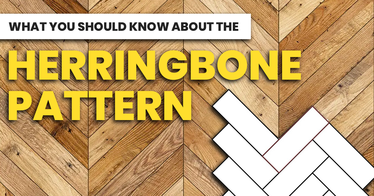
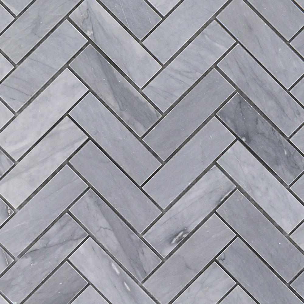
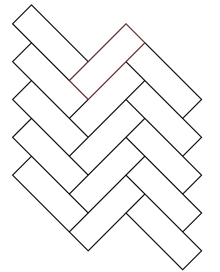
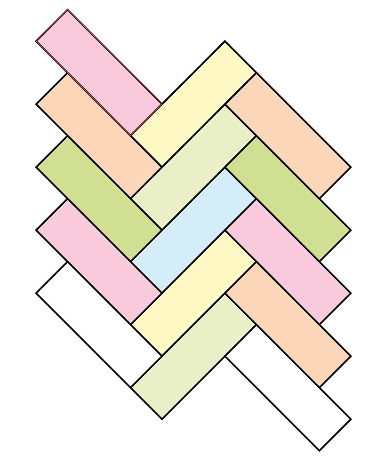
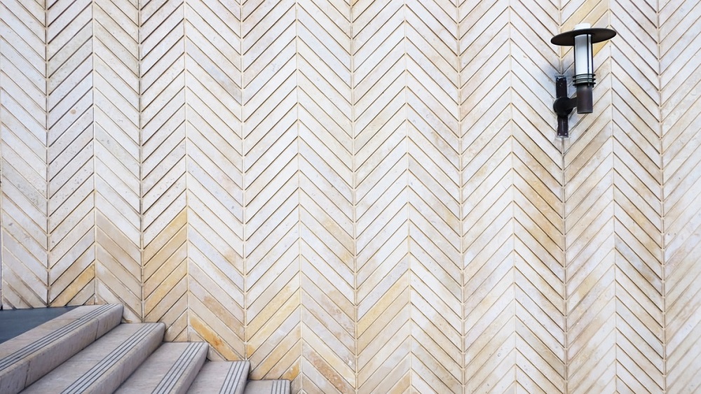
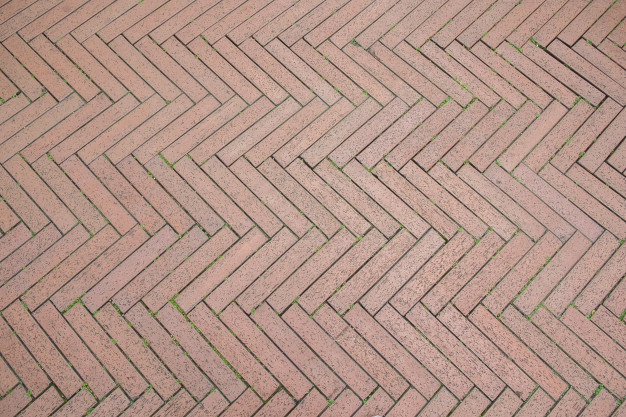
The herringbone pattern is an organization of rectangles arranged in a way that the pattern looks like a skeleton of a herring fish. That is why the pattern got the name herringbone pattern. It is because of the unique resemblance to the herring fish. The angle variation can be 45 or 90 degrees, and that is why the pattern can look differently depending on the angle you look on it and the perspective.
Here’s how the herringbone pattern looks.
Where do people use this herringbone pattern? Even if you haven’t heard about herringbone pattern in the context of website design, you may have heard about it from the sphere of cloth weaving, building construction, or home renovation. This pattern is frequently used in the home interior for tiling in kitchens, bathrooms, as well as in pavement tiling.
Why do we talk about the herringbone pattern in the area of website design when it is used so often in another sphere? Because recently, the pattern of this kind and other similar ones began to be used in website design for website backgrounds, or on the other separate parts of a website.
So, now you know what the herringbone pattern is, what it looks like, and where it is used, so we can now talk about it in more detail.
How do you make the herringbone pattern?
Even if you are not skillful in drawing some graphics, with the help of some apps made for website design, you can draw the herringbone pattern by yourself! All that you need for this is some kind of an application like Adobe Illustrator and the instructions which you already have here. Simply follow the next steps.
Step 1
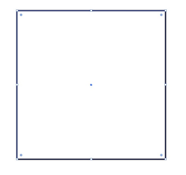
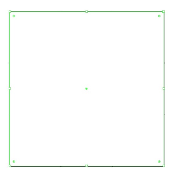
First, open the app and create a new file. Set the Fill and Stroke. Using the Rectangle Tool, draw a square. It must be with equal sides.
Step 2
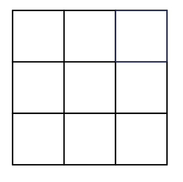
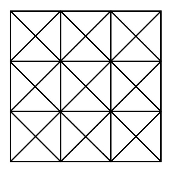
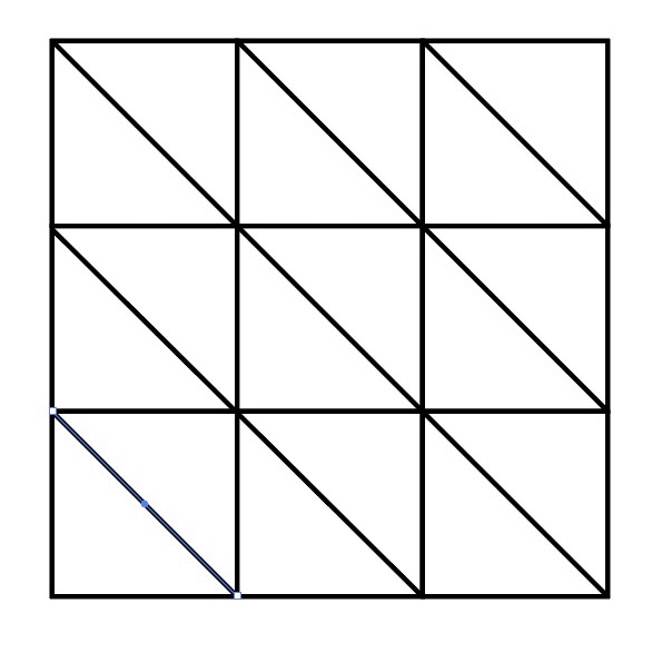
Now, choose the option Object, go to Path, choose Split Into Grid and make 3 Rows and 3 Columns. You will get the following figure:
Step 3
Choose the Line Segment Tool and draw diagonal lines from the left and from the right sides creating the following figures. Don’t forget to match the beginning and the end of the lines with anchor points.
Step 4
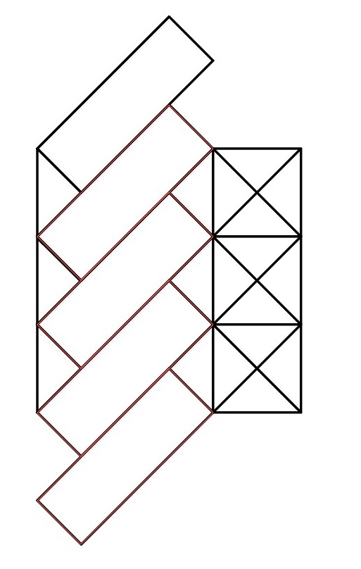
Next, you should lock the layer and create another one. Choose the Pen Tool and set the Fill and Stroke. Using the Rectangle Tool draw a sloping rectangle just like on the picture:
Step 5
Copy this rectangle element and paste it according to the pattern. Be careful in placing the rectangle exactly with the lines.
Step 6
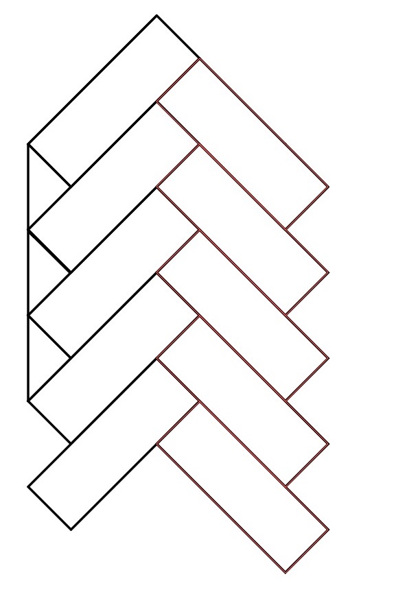
Now select the whole set of the rectangles and choose the option Object, go to the section Transform, then to Reflect. Here in the Axis section choose Vertical and click Copy. Now you have the copy of rectangles set but in mirror image. Drag this copy to stick it to the left side of the rectangles, achieving the following:
Step 7
Now, copy the right side of the rectangles set and paste it on the left side from the main figure. Don’t forget that the sets must stick to each other in the right way:
Step 8
At this point, hide this layer and create another one (now you have three layers). Using the old Rectangle Tool, draw one more square over the first one. Move away the Stroke.
Step 9
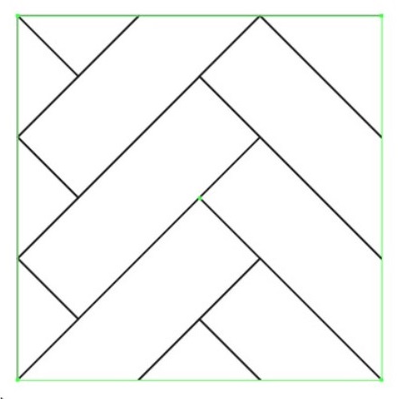
Now show the lower layer (in the Layer section) and Select All. Choose Object, go to Clipping Mask and press Make. Now you have a little piece of a herringbone pattern in this square:
Step 10
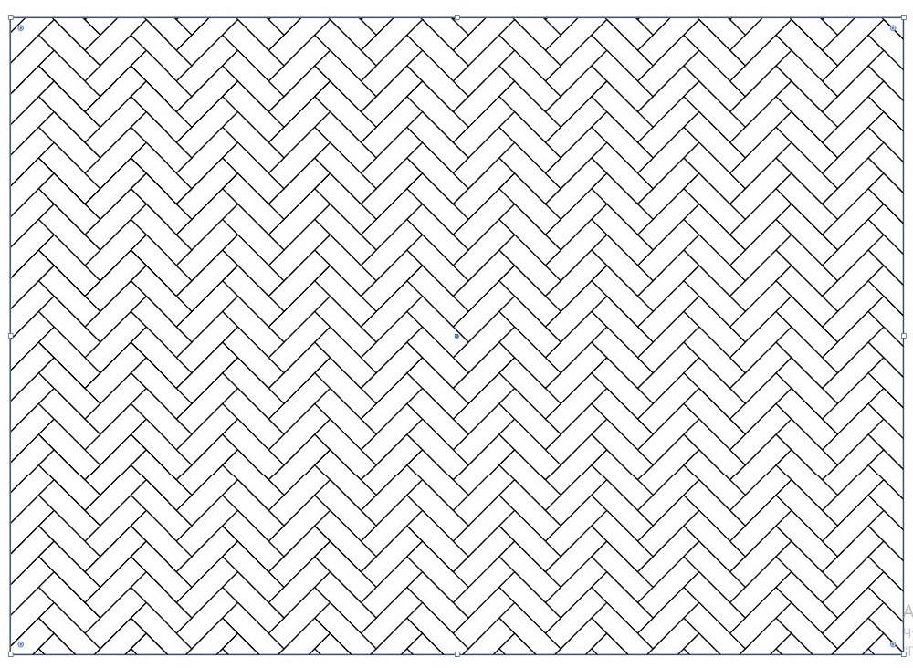
In order to create a pattern in this app, select this whole figure and drag it to the Swatches panel (it’s located near Brushes and Symbols). To create a seamless pattern, you need to click twice on the pattern, then in the Pattern Options section tick Size Tile to Art. Click the option Done which is located above. Now you have your own herringbone pattern in Illustrator! If you want to apply it, simply choose the object, click on your pattern and voila! You have the object with your pattern!
Some tricky tips.
If you want your herringbone pattern to be colored, return to the seventh step and simply fill your little rectangles with any colors you would like to and do the same steps again. But remember that this pattern is seamless and be careful while filling the rectangles with colors.
Voila! And you have the colored seamless herringbone pattern done by yourself! Congrats!
Now, you already know how to draw a seamless herringbone pattern by yourself using Adobe Illustrator. It’s not as hard as it looks and you can even make it colored!
Which websites use patterns?
As already mentioned above, a lot of websites use patterns in the background or on the other parts of their site. It is always interesting to use a pattern in website design because the look of your site becomes more eye-catching and you can attract more visitors to your website. There are more chances that people will see your content, and more chances that search engines will see your website. Moreover, it is always convenient to use patterns because you will not suffer from the thought of which background to choose. So, let’s look at some of the examples of websites which use patterns.
Kelli Anderson’s Blog
As you can see, the makers of the blog for Kelli Anderson used a pattern on the background of this website. This pattern looks a little bit like the herringbone pattern and is done in one grey color scheme. This color scheme has the same shade at the top and at the bottom of the site and that makes the background smooth. Also, when you are scrolling this website, you have a feeling that this website has a parallax effect and moves along with your eyes. So, as you can see, this website uses the pattern on the background and it is really convenient and doesn’t distract the visitor’s eyes from the content.
Alfred App
Such an application as Alfred App for MacOS also uses patterns in the design of the website. But if we compare this site with the previous one, we can see that Alfred uses patterns only at the top and at the bottom of the page. At the top, you can see a very broad strip of violet color and a circle pattern slightly appearing from the top to the bottom of this stripe. At the bottom, you can see the same pattern appearing from the top to the bottom but done on a white stripe. There is no pattern in the middle of the website. So, this Alfred App website uses circle patterns only at the top and the bottom and it creates a so-called frame effect.
They Make Apps
A platform for making and selling mobile apps such as “They Make Apps” also has a background on their website done in a patterned way. Here you can see the white background that is divided into tiny squares together making a pattern. No shades, no colors, without appearing or disappearing patterns. It has just a strict white square pattern that doesn’t distract the viewer’s attention from the content of the website. The pattern can be seen only on the left and the right sides. So, as you can see such a simple and ordinary white square pattern can be also used as the background of the website.
Print Mor
Print Mor is a print shop from New York that has its own website and uses a pattern on its background as well. As you can see, this background resembles the previous one: the same little white squares using dark lines, but the squares of this website are at an angle of 45 degrees (the website of the previous example uses a 90-degree angle). We also see the pattern only from both sides of the site. No pattern is used at the top and only a little stripe exists at the very bottom of the website. Again, use of such a simple pattern on the background is easy and classy enough.
So, as you can see, there are websites that use patterns in their design. Some of them use it in the background; some of them use it on other parts of the website. Anyway, using patterns is quite popular. Let’s take it a step further.
Herringbone pattern backgrounds, vectors, stock photos
Now that you know almost everything about the herringbone pattern, check out some of these herringbone items; for example, backgrounds, vectors, and stock photos. Maybe, some of them you will use and apply to your website or at least, you will know what you like about them.
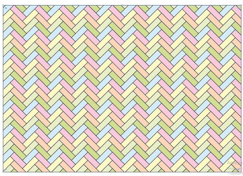
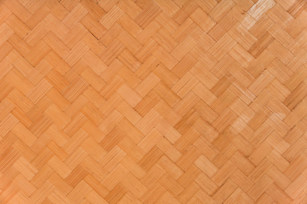
Let’s start with herringbone pattern backgrounds. Check out the following designs and think about how you can use them.
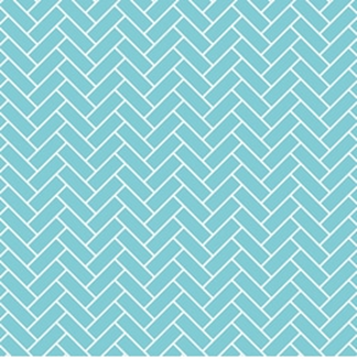
Just look at this bluish background! You can go here to download it.
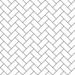
If you like black and white style, check out this herringbone background and download it here.
If you don’t want ordinary herringbone pattern backgrounds, check out this live parquet background and go here to grab it!
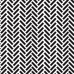
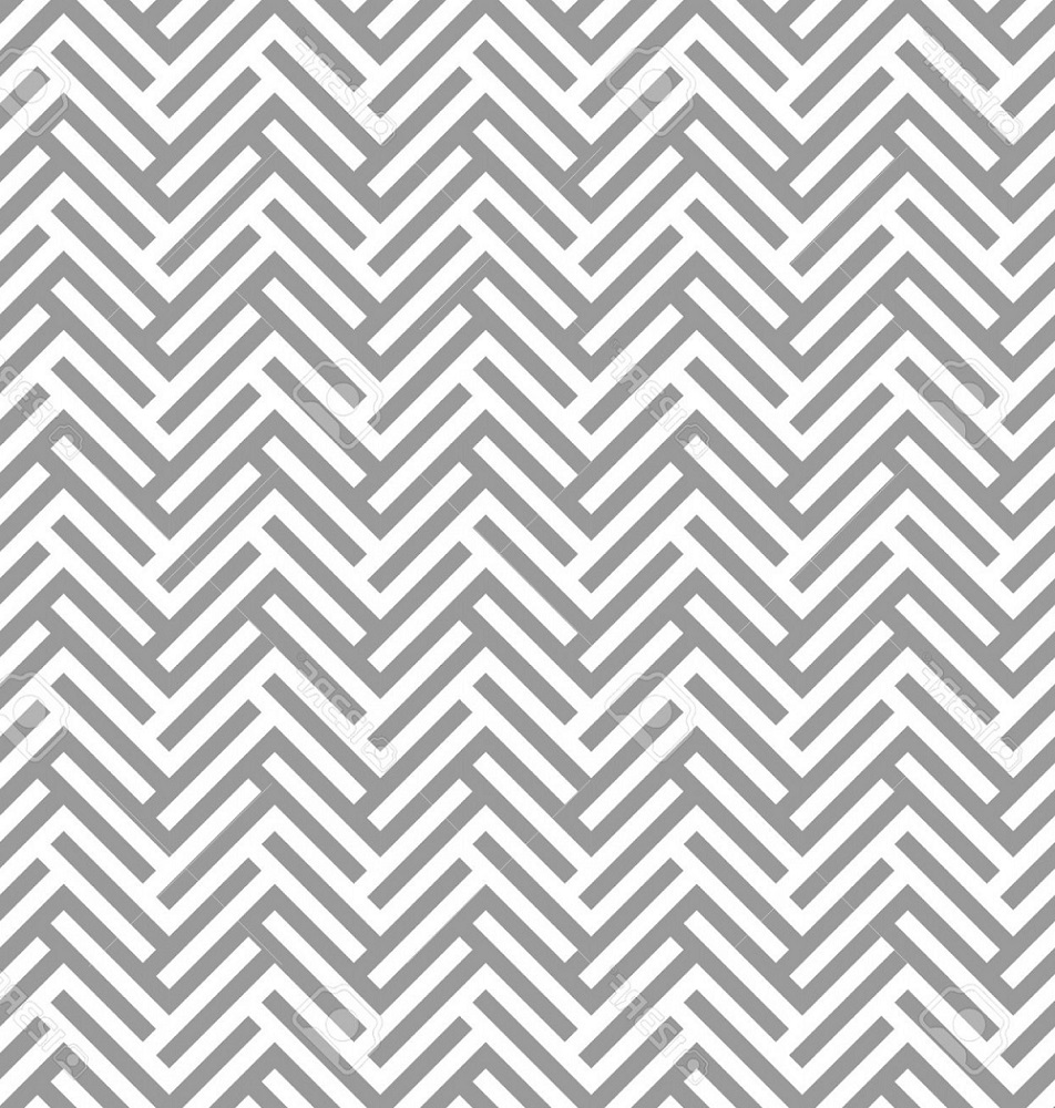
We are moving to herringbone pattern vectors. Check out the following patterns and download them for any purpose.
If you like black and white classy style, download this herringbone pattern vector here.
Use this Christmas vector that looks like a herringbone pattern for any purpose and grab it here.
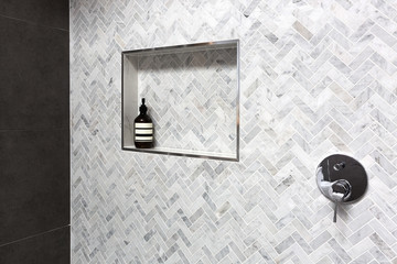
Let’s move to herringbone pattern stock photos. Check out the following photos.
This photo you can use anywhere you would like to. Go here to download it.
Check out this photo with a pattern that looks like the herringbone pattern. You can find it here and use it any way you would like to.
Here’s a stock photo showing pavement tiling. You can get it here.
At this point, you have already seen a lot of herringbone pattern backgrounds, vectors, and stock photos. I guess you now have a desire to use some of the herringbone patterns somewhere in the design of your website. Enjoy the variety of them and stay classy with the herringbone pattern.
So, now you know what the herringbone pattern is. It is a pattern that looks like the skeleton of a herring fish and is often used in website design. Now, after a short tutorial of how to draw a herringbone pattern, you can draw it by yourself simply using an app like Adobe Illustrator. Now, you know which websites use the pattern on their backgrounds or on other parts of the site. And now, you have seen a lot of examples of herringbone pattern backgrounds, vectors, and stock photos and even know where to get them. I think your website or any article there can be more eye-catching with the herringbone pattern!
Read Also
Chevron Pattern in Web Design. How to Create and Use?
Textures and Patterns in Web Design: Wood Pattern
Geometric Design Patterns: Create a Special Atmosphere for Your Website
Honeycomb Patterns, Design, and Website Development
Don’t miss out these all-time favourites
- The best hosting for a WordPress website. Tap our link to get the best price on the market with 82% off. If HostPapa didn’t impress you check out other alternatives.
- Monthly SEO service and On-Page SEO - to increase your website organic traffic.
- Website Installation service - to get your template up and running within just 6 hours without hassle. No minute is wasted and the work is going.
- ONE Membership - to download unlimited number of WordPress themes, plugins, ppt and other products within one license. Since bigger is always better.
Get more to your email
Subscribe to our newsletter and access exclusive content and offers available only to MonsterPost subscribers.




Leave a Reply
You must be logged in to post a comment.