7 Most Important Elements for Any Website Design
Having a well-designed website template should be one of the top priorities of any online business. It is the best indicator that you value your audience and are doing your best to keep them captivated. Although it is very common for new features to be added, certain components of a website will always be constant.
Website design elements have become the cornerstone for design and, frankly, it is very difficult for a site to thrive without them. Let’s take a closer look at these webpage elements, from the footer design to the call-to-action, and see how they can contribute to the overall efficiency of your website.
What Are the Main Elements of a Website Design?
Many designers can come up with their own list of what they consider to be "must-have" features. Regardless of how they would number these features, it is accurate to say that their entire list would include all or most of the following.
1. Great use of space
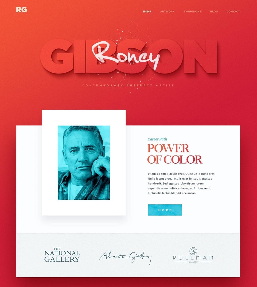
Let us start with one of the most important features of a website - space. This is where all your precious content, background colors, etc., will be displayed for the public to see.
Why is space so important? Well, this is the major indicator of how well your content will be seen (readability). Spacing has now been used in so many ways to improve the overall quality of a webpage.
In fact, it has become a great tool in web page design. Designers can create a focal point of information that the site owner wants the public to see by simply making sure there is adequate spacing.
2. Working navigation
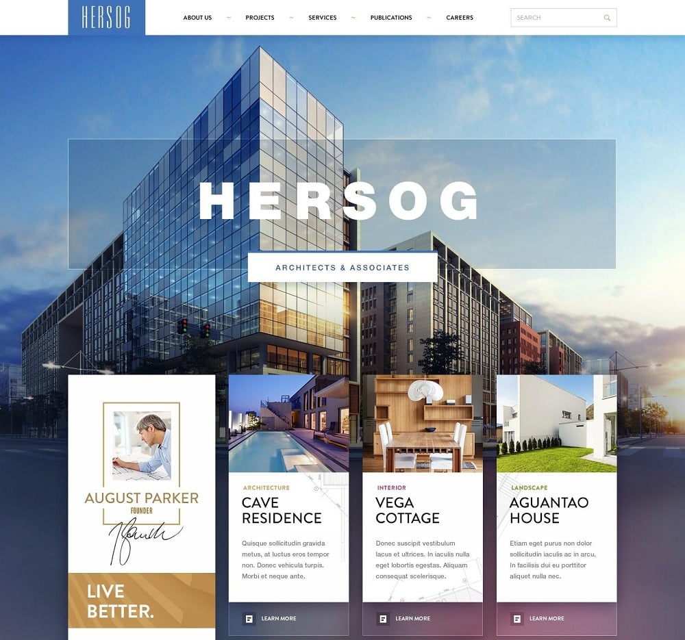
It is very important that the navigation of a website be as simple as possible. Remember, your goal should be to enable the user to perform actions as quickly and hassle-free as possible.
The main idea is to make user interactions as satisfactory as you can. With the introduction of various mobile devices and a wide range of screen sizes, the focus on navigation has never been more important. Therefore, make sure you account for certain actions such as:
- Scrolling down and zooming in and out of the page.
- Adding directional arrows to your page which will be very helpful to any user.
- Keeping features at a minimum - don’t add too many features to the navigation because it can have a bad effect on the overall user experience.
3. Information about your business
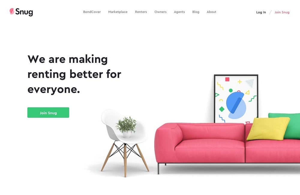
Start-ups usually find it difficult to get recognition or popularity with larger audiences because they fail to acknowledge the “About Us” information. This usually includes the services you produce and how you set up your business.
It is logical that people will be curious about who you are and why they need to do business with you. Therefore, adding some basic information about your business will help potential clients or users understand why you have set up your business and why they should pay attention to you.
4. Contact info

The world has never been more connected than it is today. This means there are even more ways to reach an individual or a company than there were before. Social media has made it possible to make communication simple and even faster, regardless of distance. Businesses have thrived because of this.
Every website needs a section dedicated to providing the contact information for the business. This information is generally added to the footer of the website, and includes, email, social media account icons, and physical addresses, if applicable.
5. Call-to-action
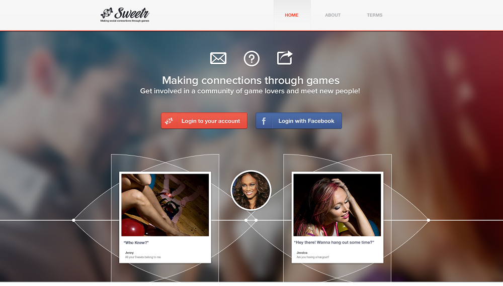
Your call-to-action is one of the most important website elements. This feature will enable you to convince the reader to take an action you require them to. For example:
- Make a purchase
- Read the information
- Click on a button
- Check promo ads
Your call-to-action (CTA) should be effective enough to provoke activities. In order to make CTA effective, make sure you know why you are setting up your website. Also, you need to make sure the action is obvious, something that your design should easily reflect.
This means that the call-to-action should be easily seen. For example, you can add a colorful button that enables users to download content or create a well-placed sign-up form.
6. Search tool
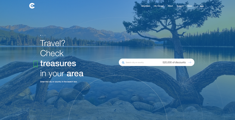
The search tool is a must-have for every website. Many users usually look for particular information they might have forgotten when previously visiting your website.
In order to enable them to retrieve this information as quickly as possible, web designers add a search tool. When designing this feature, make sure that the search box is not too small, and ensure it can be seen by the user.
Many websites have this feature at the top right corner to make it even more identifiable. Remember, the search tool adds quality to your site by improving the user experience.
7. Responsive footer
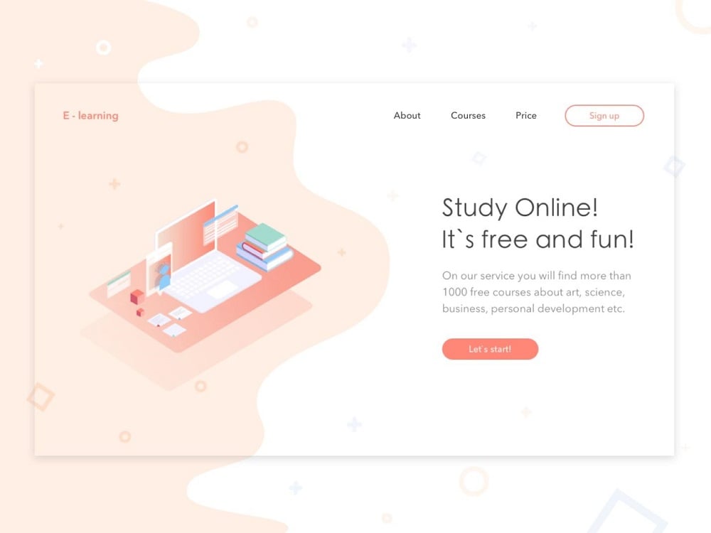
A responsive informational footer should be placed at the bottom of every webpage. It always includes important information such as:
- Contact info (mentioned earlier)
- The context for your site
- Several links
An important part of the footer is the copyright. In order to have an efficient footer, make sure you create a design that is clean and simple. Choosing what kind of information to add is also up to you. For example, you could choose to either add logos or links to the design. Whatever design choices you make, aim to give your footer a minimalistic feel. The goal is to make sure users can see all of your content.
Conclusion
Website design takes a team of people to execute properly. It requires a head designer to create the look and feel of the website. Therefore, try to pay more attention to your website design elements and hire professionals, as your project has to be treated with enthusiasm and expertise to get outstanding results.

Read Also
7 Web Design Lessons You Can Learn By Watching Star Wars
Let Your Profession be Your Passion! [30+ Funny Web Design Puns]
6 Ways to be a Better B2B Website Designer
These 50 Best Website Designs For 2018 Will Help You Make a Corporate Website
Get more to your email
Subscribe to our newsletter and access exclusive content and offers available only to MonsterPost subscribers.

Leave a Reply
You must be logged in to post a comment.