Logo That’ll Survive the Test of Time [5 Logo Design Rules]
We live in times, where sight is the most important sense. We believe in love at first sight and that we eat with eyes first. It’s a good idea to spend some time and energy so that the symbol of our company is best-grade graphics. But what does that really mean?
What makes a good logo?
There is no single template for a good logo. And that is fine because otherwise, all company symbols would be similar, which means boring and difficult to differentiate.
Also, despite listening to the best experts on the subject, it is impossible to create a logotype that could serve our corporation until the end of days.
It is possible though, basing on empirical experiences of many company owners, to create such a type of visual identity that, although not timeless, will be easy to modify for the ever-changing needs of customers.
What characterizes a good logo?
The graphic symbol has to be adequate to the offered services
If you aren’t providing ‘retro’ services, then don’t use symbols associated with meanings from the past. An old washing machine won’t be a good logo choice for a company specializing in modern, best quality laundry machines. Avoid a too broad or too narrow theme choice. Film tape may be a great icon for a cinema or movie rental, but won’t necessarily work as a symbol for a spot selling DVDs along with books. Nobody will be looking for fantasy books in a place like this.Logo has to be original
It’s not about some crazy, over-the-top design, but avoiding adapting mundane designs found everywhere to the needs of your business. In that case, it can also turn out to be quite dangerous in the eyes of the law. Plagiarism is strictly punished in most countries around the world. Still, copyright laws aren’t always respected.
Here are a few examples
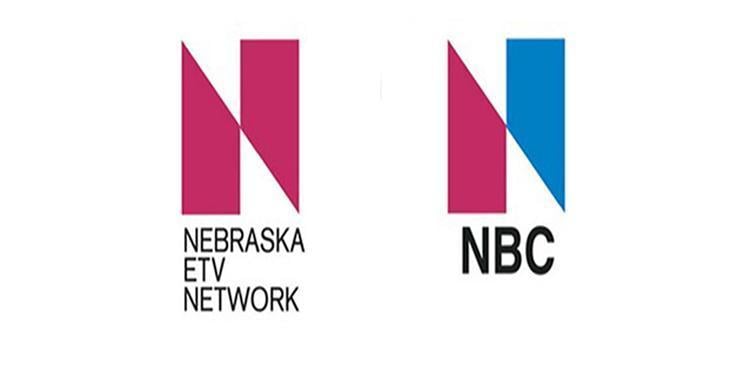
No, changing the color of one element won’t make the logo original.
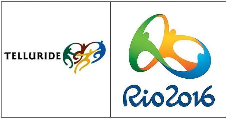
This case is quite controversial, but who knows, the designer of Rio 2016 Olympic games might have taken some inspiration from the logo of Telluride.
Using distinctive characteristics of known companies, even if the design is not strictly copied, can evoke controversy.
Logo has to be easy to remember
It might be the color, the shape or the associated slogan – but at least one of them has to be eye-catching. Remember that in case of logos, the saying ‘It doesn’t matter what the media says, as long as they spell your name right’ proves to be incorrect. If your logo is the topic of people’s conversations because of how ugly it is or because of some negative association, then that is not good. Do you want to be treated seriously, right?
Common features of the most recognized logotypes
Though detailed tips on how a perfect logo should look like don’t exist, comparing symbols of the most prominent companies on the global market can lead to discovering some common characteristics. The rules described below don’t always mean the same in a detailed kind of way, but in a broader spectrum, they are like siblings.
Minimalism

Two completely different designs connected by one characteristic – minimalism. A simple form based on a metaphorical representation of the product guarantees a quick imprint in the brain. A perfect logo can be drawn in a notebook during an exceptionally boring meeting, as in the case of these designs.
Universality
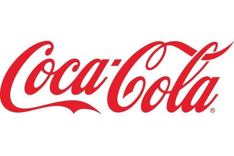
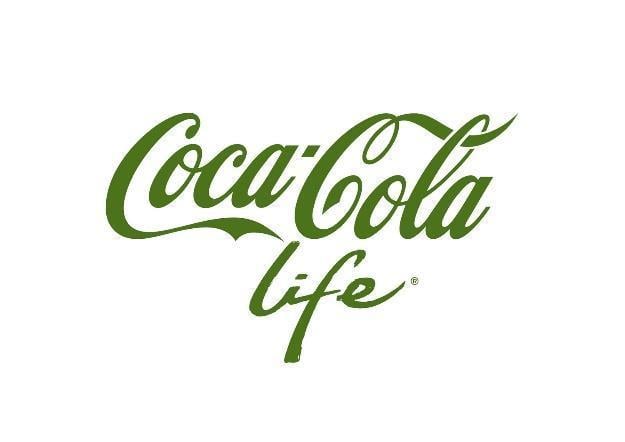
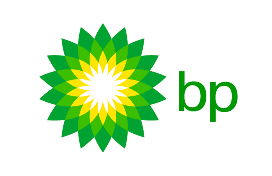
The biggest companies can be proud of owning a logo that can be tuned to suit the developing brand. Swapping colors, for example, is not an issue here. In the case of green Coca-Cola, we still know what we’re talking about.
Being characteristic
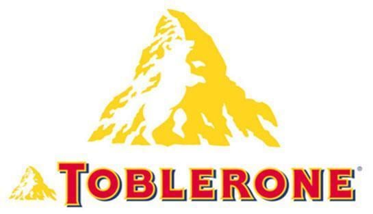
Just like writers who create secrets in their books, so that the readers can solve them by themselves or those who use hidden references to be discovered by the readers, the designers take advantage of human liking for solving puzzles. A simple logo, which also brings fun, will be remembered much better. Just like the two above. Have you noticed the bear hidden in Toblerone design?
This feature of logotypes is especially important in saturated markets, like fitness or photography. When you can find a wedding photographer just around every corner, a bland logo can put you at a severe disadvantage.
5 characteristics of a well-done logo
Despite the warnings saying that there are no step-by-step rules for designing a perfect logo, it’s worth following something more specific than the enigmatic: minimalism, universality, and recognizability. These codewords aren’t really arbitrary or prone to interpretation.
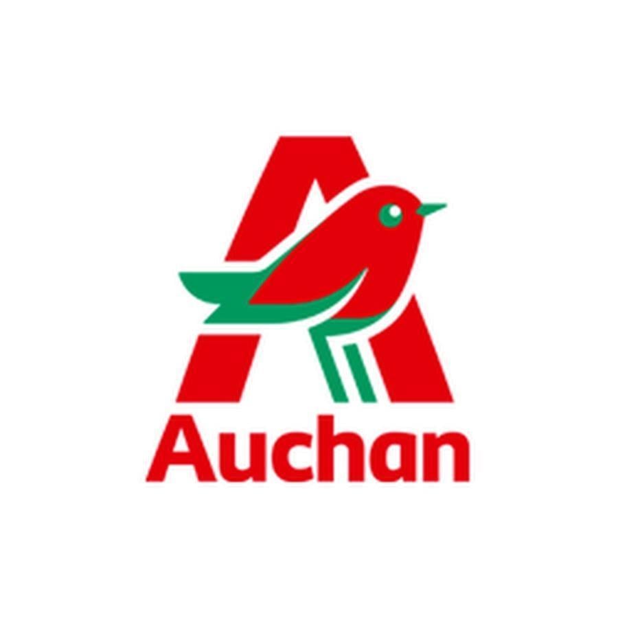
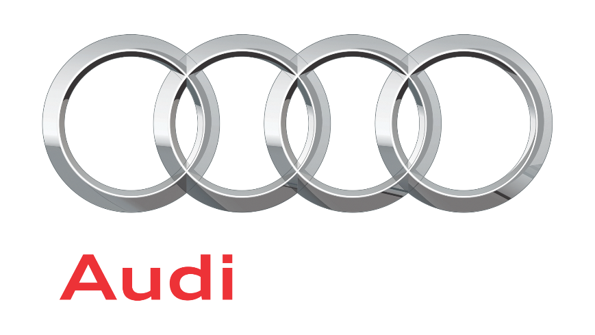
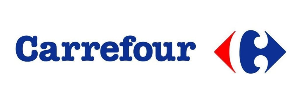
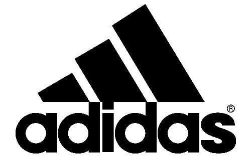
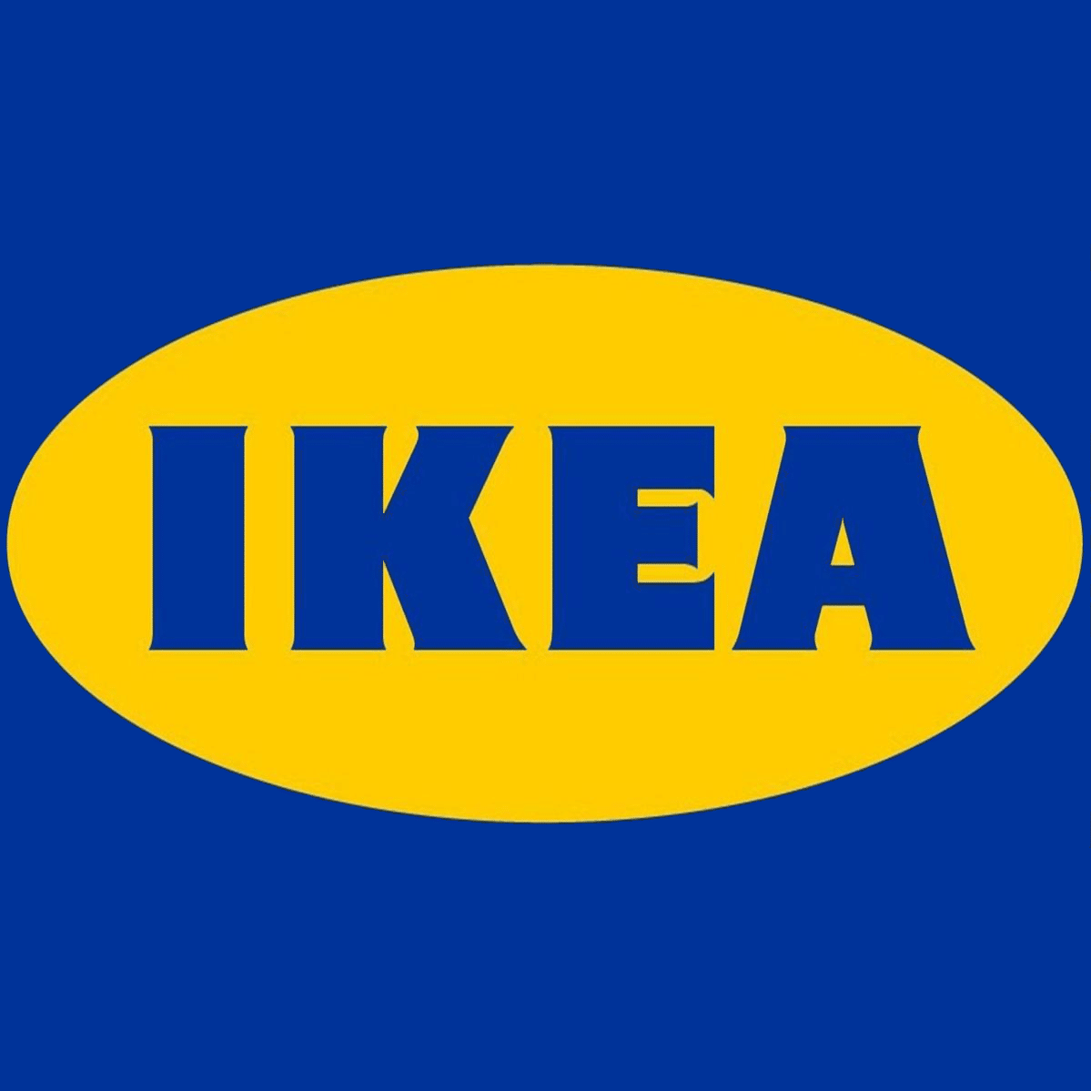
No more than three colors
If after seeing this point you’ve started to rebel and shout that Google and NBC and… And what? A colorful logo works out very rarely. Most examples from leading brands stick strictly to the magic trinity. The rule holds true not only for graphic design but also for interior design.These are the three examples that came to my mind at first. Though they represent three different types of business, they have two things in common – an established position on the market and no more than three colors in the logo.
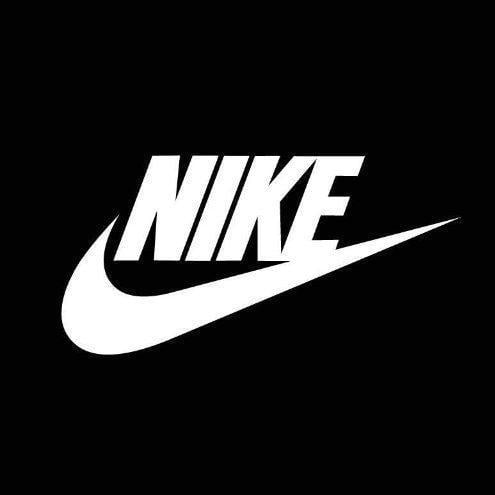
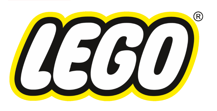
No more than two fonts
I hope I don’t have to remind you that some fonts, like Comic Sans, are prohibited, right? Using more than two styles of letters is also inadvisable. It brings chaos and makes the logo look unprofessional.


More random examples. There aren’t many recognizable brands in the world uses more than two fonts.
Only one element
Chaos may be created by a clutter of too many details. A perfect logo is not about a number of different elements, but about the presence of a catchy one. Such that when found, it lights up a light in the customer's head - ‘that’s the one.’

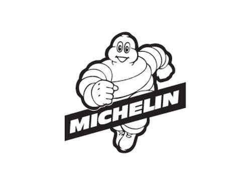

Would you be able to recognize the symbols above, even without the captions? Well-thought-out and simple designs are not only easy to remember, but also become a part of everyday life. How many times have you heard things like: “He looks like the Michelin guy” or “She could be a Playboy bunny”?
Take care of clarity
It seems obvious, but some logo elements should not be too small. They have to be recognizable in any format. In case of major size differences between certain elements, it may occur that the smallest element may not be visible on pens, for example. That’s why the best keep track of size congruence.

The examples above show that the size differences between the name and the graphic identity are so minor, that they will be clear in any format (unless we go crazy with minimalism).

Scalability is a must
There are certain graphical elements that lose their attributes during scaling. It is essential to know the purpose of the symbol during the design stage. If it’s supposed to show up on all the available types of advertisements then it’s better to avoid features like tiny dots, shading or lines – they are difficult to scale and often look unattractive after the change.
Rather than a subtle differentiation, a distinct design is a better choice. The example above show decisive lines, contrasting colors and vibrant symbols split by an equally intensive and opposing color choice. With symbols like this, there most likely are no issues when scaling.
5 biggest logo mistakes
Spotting the best logos is just as easy as finding some of the worst. Don’t be surprised if you don’t recognize the companies below. With these logos, they weren’t destined to succeed.
Bad associations
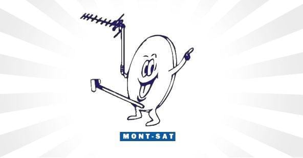
Everyone knows what an antenna looks like. There is nothing disturbing about it until you try to personify it. The question is: are these associations desirable, and what are the client’s expectations if he decides to use this company’s services? Before you choose to use a symbol, examine it thoroughly and take a second to think if that’s exactly what you wanted. Some logos cannot be unseen and starting a company all over is a lot of work.
Low resolution
An unprofessional project is most often of poor resolution – it may look okay on a business card, but on a big format advertising banner it looks more like a sad parody than a serious company’s logo. It’s worth knowing if our contractor works with professional software. You should probably give up on making a logo yourself unless you have the proper education to do so.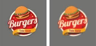
Avoiding pixelation when changing format guarantees vector graphics in a design.
Going with a trend
There’s nothing wrong with following the up-to-date graphic design trends and using them unless they are very recognizable things. Especially colorful and expressive design trends come and go, but the mentioned before minimalism, which also seems to be trendy recently, can’t be named a passing fad. It’s worth taking a moment and think about how the logo is going to look like in 10 years. Will it still be pleasing to the eye, or will it begin to sting as time passes?
Just like WordArt used to be the number one, today it only causes laughs (and maybe some melancholic memories from childhood). A logo designed with little thought may share the same fate in a few years.The danger of trendy design can be seen in case of fashion logos. After all, a clothing brand should be fashionable… Yet, the biggest brands tend to stick to very minimalistic, mostly typeface-based logotypes, which are guaranteed to stay in good taste for many, many years. Being too distinctive poses the danger of astronomical costs in case of rebranding.
Using ‘stock’ footage or buying a shared logo from an online store

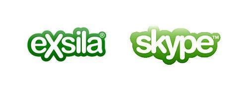
Sure, such a choice will save you money and time, but will immediately pigeonhole your company as ‘unprofessional.’ Having a shared logo may not be a crime, but the golden rule of logo design states: ‘exclusive,’ and that is something that shared logos cannot guarantee. If you succeed, you won’t even be able to blame anyone for copying your logo.Would you be able to differentiate these logos from each other if they weren’t placed next to each other?
Too much going on
Too many colors, fonts, and elements – basically chaos instead of attention to detail.
The worst logo is a set of random elements put together.

Can you imagine these symbols on a flyer, business card or a pen? Can you figure out what the designer’s idea for the second design was? No? Me neither.
Summary
Getting your hands on a perfect logo is actually extremely easy and utilizes an experienced specialist. A real designer is going to explain why and how he does things, he will help with choosing the best type of graphic identity and will listen to your expectations carefully.
Most importantly, above all else, don’t forget to proofread your design before it goes to print for any of the mistakes outlined above. Having a second pair of eyes should definitely be part of your design process, alternatively, you can also explore digital proofreading using the prepress software as part of your quality control process.
Remember that a good logo is not a small investment, but its costs bring long-lasting profits. A low-quality design will sooner or later evoke more costs.
Related Posts
Just Do It! Or How a Logo for $35 Can Rock Worldwide
30 Top Creative Logo Design Ideas
How to Design a Logo: 40+ Tutorials from Zero to Hero
Why Having a Great Corporate Logo Design Matters?
History of Logo Design: from Ancient Times to Modern Era
P.S. Check out our Logo Templates.

ist Expert für Online-Marketing und digitale Kommunikation. Er teilt sein Wissen auf den Fachblogs und in Marketing-Magazinen. Krzysztof auf LinkedIn.
Get more to your email
Subscribe to our newsletter and access exclusive content and offers available only to MonsterPost subscribers.

Leave a Reply
You must be logged in to post a comment.