Meet New Features in Elementor 2.5 [Review]
If you’re about to build a website and you're thinking on how to do this the most convenient way, I'd recommend you to use the Elementor page builder. Especially since it was updated and got some cool features added.
Still, I’m pretty sure that if you are reading this article, you already know about Elementor and it's highly likely you have some of the Elementor plugins on your website.
I’ll talk for me and my team. TemplateMonster uses Elementor to create its best WordPress themes. It’s a powerful and convenient builder that makes the lives of developers easier.
Let’s take Monstroid2 as an example. This WordPress theme has proved its quality and reliability to its users. With Elementor it’s extremely easy to customize any WordPress theme since it provides any kind of solution for the design of your dream.
If you are thrilled to know what’s new in Elementor keep on reading.

Place Widgets Anywhere You Want
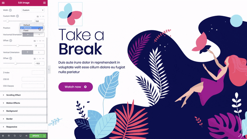
The first feature we’re going to talk about is Position: Absolute.
What is it for? This is a new feature now allows you to design outside of the grid on WordPress. You'll be able to grab any element, drag it around and position it at any spot of your page.
- Click on a widget,
- go to advanced,
- choose custom positioning,
- in the "position" option choose "absolute",
- drag a widget around.
You can do the same with other elements of your page as well.
But there’s an issue. If you want the page to be responsive and look properly on tablets and mobile devices you can’t just leave the page as is after using this feature. The element may float away to some inappropriate spot since it’s not tied to the entire page structure anymore.
Now you have to correct the position of the elements you’ve moved. Switch to the tablet or mobile mode. There you will have the vertical and horizontal values to control the offset of the element. These values alter element's position on the page. You can see how they’re changing while you are dragging the element around. You can set different values for desktop, tablet, and mobile layouts.
Make a Stalker out of Your Widget
This feature will be in handy if you want to fix a widget in front of the visitor’s eyes so when someone is scrolling the page up or down, the widget will be following or “stalking” them. All you need is to grab a widget and stick it to the viewport.
Here we have the same issue as with Position: Absolute. Make sure you’ve adjusted everything to look decent via a tablet or on a mobile screen.
Last Tab Memory
You’ll be happy to know that now Elementor has become even more convenient to work with. From now on it remembers the last tab you’ve been working with and it sends you to the exact place where you’ve stopped last time. You don’t have waste your time trying to memorize and recall where you were the last time. No needless annoying clicks anymore, no “startovers”!
Compact Widgets
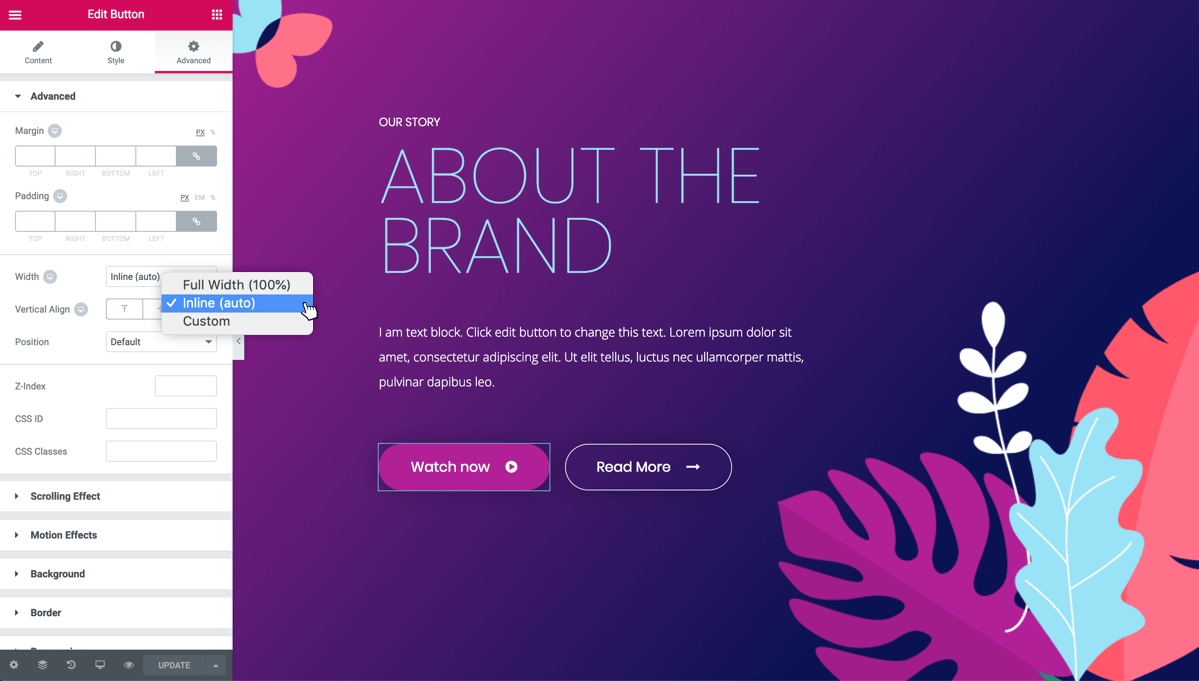
Previously in Elementor, a widget took 100% width of the column. A little button widget takes up the entire space, and you can’t put anything else next to it, unless you're using columns. Now there is the solution: create more than one column. How exactly?
- Go to "advanced",
- "custom positioning",
- go to "width",
- choose "inline".
Now you have your column cropped to the exact size the button takes. Duplicate it and you have two buttons. Add the text and voila! You can place as many buttons next to each other as you want now. That easy.
Flex Alignment
Now let's have a look at another feature - the flex alignment: horizontal and vertical. First, let’s find out where to find it:
- go to the column settings,
- click on it and you see a "Layout" tab,
- find "vertical-align" and "horizontal-align" options.
Choose the one. It works pretty much the same for both horizontal and vertical alignments. Now you see the six options to align the elements. Let’s learn about each of them one by one using the horizontal align example.
Start
In this case “start” means “left” (the place where your eyes start reading). So the elements will be aligned to the left side of the column.
Center
I think you can guess. That’s right. The elements will be at the center of the column.
End
Here “end” means “right” (by analogy with “start” alignment). The elements will be aligned to the right side of the column.
Space between
These are going to be more tricky.
This option allows you to separate the elements with space between them. So the first and last element in a row will be stuck to the left and right side of the column. Unlike the case which we have with the next option.
Space around
Space is added to both sides of an element: no matter what it's position in the row is. This feature adds space to both sides of an element.
Space evenly
If you tried out the previous way of alignment you may have noticed that visually the amount of space between the elements exceeds the one on the edges of the column. If you’re not okay with your elements alignment: make even spaces. It also divides them with spaces but visually there will be equal amount of space along the entire length of the column.
Now you know how it works. As for the vertical align, it works the same way as the horizontal one. Unless instead of “start”, “center” and “end” there are “top”, “middle” and “bottom”.
Hide the Column with the New Hiding Function
As you could have noticed earlier, the latest update aims to give a user more possibilities to make their site even more user-friendly. You can work with the displaying on different devices separately.
From now on you can hide a particular column so it won’t be displayed on a device you don’t want it to. For instance, you have an info-box with an image. And you don’t want the image to be displayed on a mobile screen. But you need the information left. Before you had to hide the whole section. But now you can hide only the particular column and leave rest part of a section, like the info itself. Pretty convenient, huh?
How to do that?
- Go to "section",
- "advanced",
- "responsive",
- hide a column.
Please note, these settings are not displayed while you are working in the editor. You have to go to the live preview to see the changes.

Create Multiple Columns
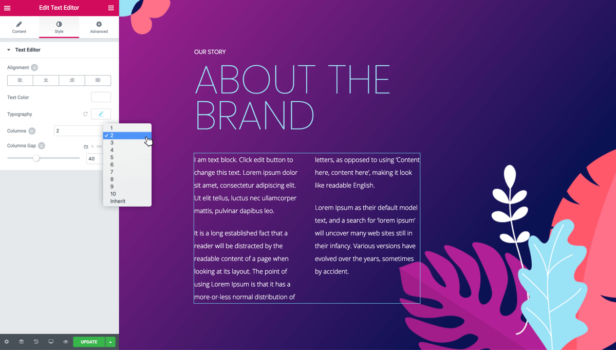
The last new feature for today is arranging text in multiple columns.
- Add some text in the text editor,
- Go to the "style" tab,
- In the "columns" option choose the number of columns.
You can change the space between columns if you want.
The function allows you to create up to 10 columns and, of course, you can set different options for different devices.
So if you haven't checked the latest Elementor features - update Elementor and check them all out. For a detailed review watch the video below to see everything with your own eyes. Have fun!
Read Also
Elementor Button vs. JetElements Button Widget
How to display Progress Bar and Circle Progress with Elementor – Tutorial
How to Add an Attractive Headline with an Image Inside the Text with JetElements
How to Add a Price List to the Page with Elementor
How to Add Contact Form 7 Using JetElements Add-on for Elementor – Tutorial
Don’t miss out these all-time favourites
- The best hosting for a WordPress website. Tap our link to get the best price on the market with 82% off. If HostPapa didn’t impress you check out other alternatives.
- Monthly SEO service and On-Page SEO - to increase your website organic traffic.
- Website Installation service - to get your template up and running within just 6 hours without hassle. No minute is wasted and the work is going.
- ONE Membership - to download unlimited number of WordPress themes, plugins, ppt and other products within one license. Since bigger is always better.

A creative writer and web designer, with experience in the creation of professional landing pages, personal websites, portfolio websites, corporate websites, business cards, and more. Follow her on Quora.
Get more to your email
Subscribe to our newsletter and access exclusive content and offers available only to MonsterPost subscribers.

Leave a Reply
You must be logged in to post a comment.