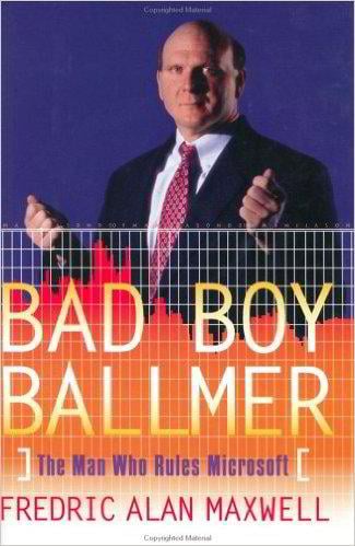
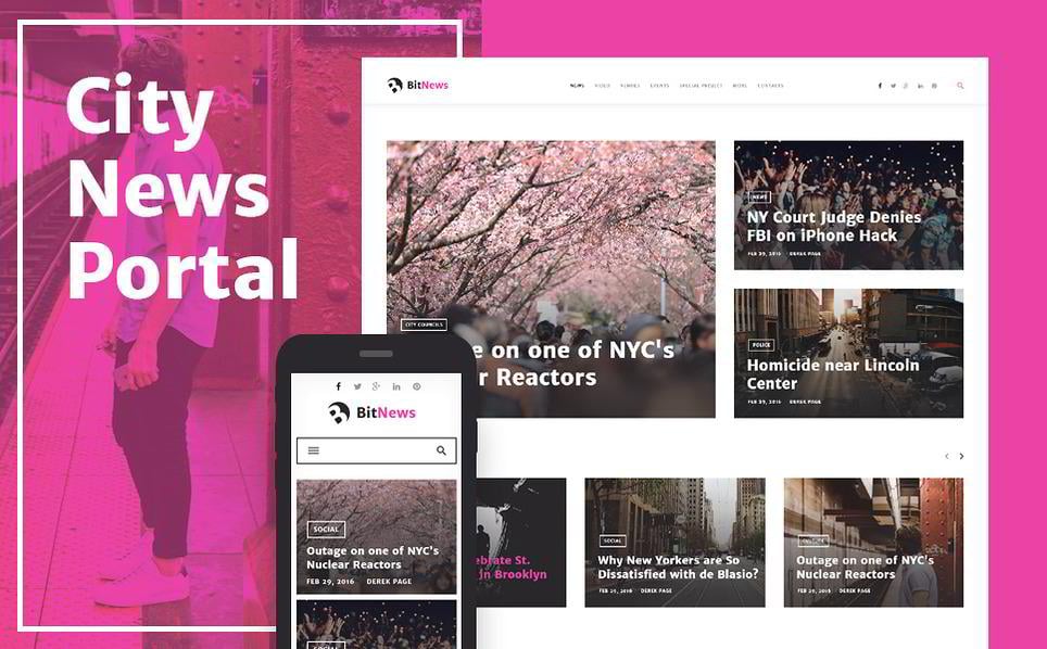
25 Billionaires’ Websites: How ‘The Filthy Rich’ Like The Color Red On Their Sites
The next time you hear a name of a world-famous billionaire, check out his website or the website of his business. Most likely, it will have red in it.
This post is fully dedicated to the color Red - the color of royalty, success, and blood. 25 websites of world billionaires will be studied. To be more precise, we'll study red color for website design, using their websites as examples. Here you’ll see the websites of Lego, Red Bull, Virgin, Toyota and many more. Some web designs are more up-to-date, some of them crave for a good web designer to work on them.
Some of them have red as their major web design color (like Virgin or Lego) and some of them only include red as a complementary color in their logo (the Heineken company, for instance). Nevertheless, all of them contain red - the color of success. Have a look at them and get some ideas on how you might create a successful red color scheme website.
P.S. A bonus - some billionaires have also written books, so you may find links here to books they have authored. Success stories inspire, so, get inspired!
The Red Basics
The color red is a controversial one, and it’s always hard to pick the right shade.
Women know it when they need to choose a red lipstick - they need to pick the right shade with the precision of a surgeon, otherwise the whole look will be spoiled.
Men know it when they decide to choose a red car - if they select one, they automatically become a focal point in the street/party and, sometimes, life.
Do all people like red? Of course not. Many of them literally avoid red, fearing that it’ll attract too much attention and they will look tacky. Interior designers prefer to use red in kitchens only - it stimulates appetite, but irritates you if a whole place is painted red. Some people use red a little, and that, perhaps, is the wisest decision. One true fact remains - red does attract attention. It evokes aggressiveness, passion, anger, appetite, but it never leaves you indifferent.
And when you are creating a design, what is one of the aims that you pursue? Attracting attention and making the design memorable. In this blog post you’ll see how the websites which somehow relate to the world’s billionaires (or the websites of the projects they are related to, like those where they are the main shareholders) use the color red.
Study a Brilliant Red Color Infographic
Before we continue to the list of the websites, there are some basics about the color red which you need to know in order to understand the principle of how red works on our perception. There is a superb infographic on TemplateMonster about red.
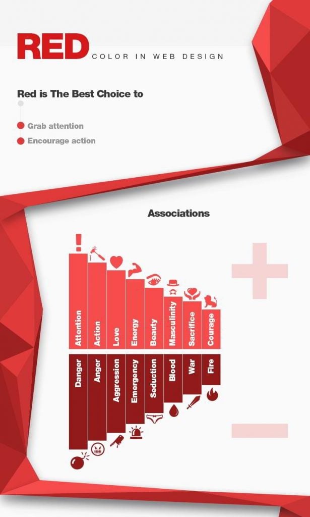
Do you want to see more of the infographic? Click here.
Learn About “Salt-Principle” for Using Red
What’s the main principle of using red? Use it like salt, if it is combined with other colors.
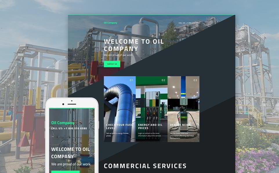
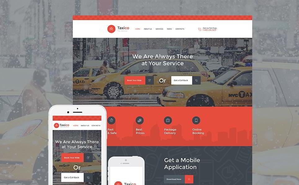
Sure, there are websites which may be colored red from the bottom to the top. But you need to know that your customer is ready for that. Not all project subjects are suitable for red or its shades. Your customer should be ready to see a red website - that happens when he visits a project which is related to food, cars, transportation or entertainment. Business websites don't use the color red often, and, knowing this, designers of the business templates tend to use different color schemes. Remember to make sure that you don’t make a red website when it needs to be more neutral.
[tweet_box]Use red like salt, if it is combined with other colors. #webdesign #red[/tweet_box]How do you know if you can use the color red color in a web design?
Determine the “emotional message” which you need your website to convey.
If this is one of the following, start thinking about which shade of red you should use.
-
-
- Attention
- Immediate action
- Energy
- Love & Romance
- Courage
- Joy
- Danger & Anger
- Aggression
- Fire
-
Red can be used both for a positive and a negative message. The one that you prefer, depends solely on you.
See The List of the Billionaires’ Websites
Surprisingly, we won’t see modern web design everywhere. Apparently, some of their companies are already too successful to remember that they may need a proper website, or else their projects are already widely known within a narrow circle of people. Well, joking aside - there may be various reasons why not all billionaire’s websites represent the power and might that they could have, but we aren’t interested in that particularly. What we are interested in is the use of red in their web design and logos.
In the websites you’ll see different shades of red, different proportions of red, different placement and targeting of red, but it’s still all about red.
Red may be used...
-
-
- In logos
- CTA buttons
- As a major color of the design
- As a complementary feature to the overall design
-
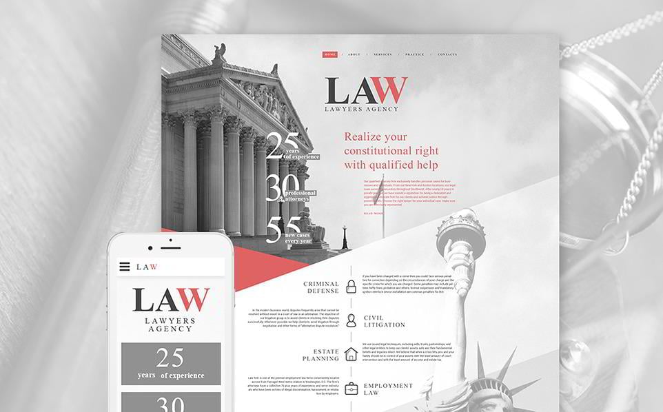
Richard Branson

The Project: Virgin
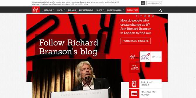
Even after leaving the Virgin website, you still see the red color in your eyes. Supposedly, Branson deliberately chose this color as a primary one not only for his website, but for the whole brand. Daring and bright, this website is a perfect example of a memorable project.
The Books


A Design Which You May Like
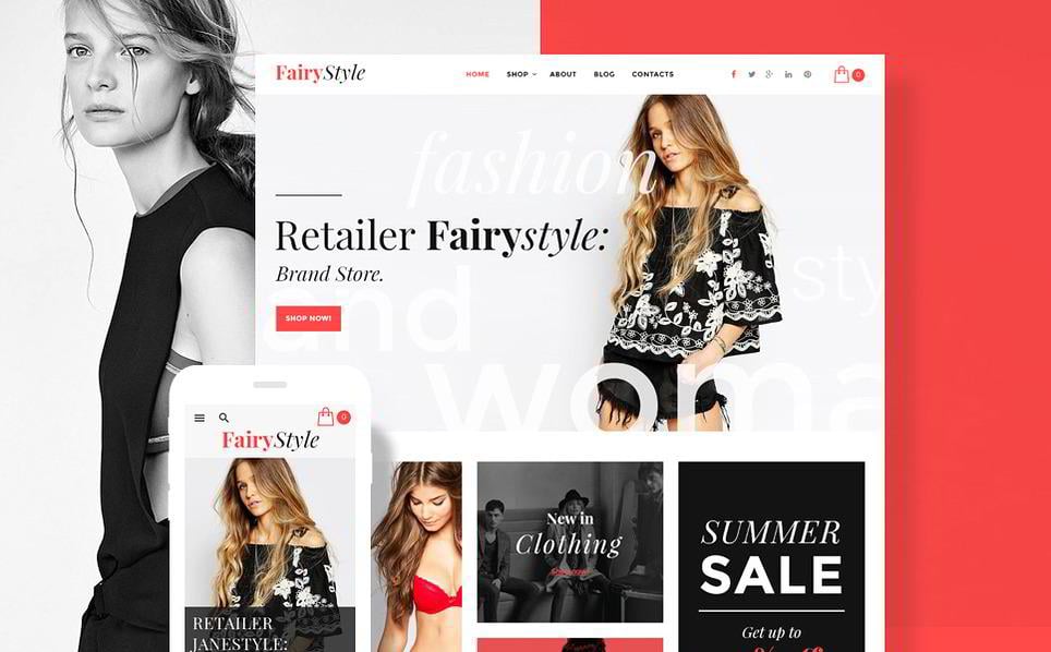
See the Template A combination of red and black gives your visitor a feeling of motion. Also, a feeling of motion will be achieved by video integration and a Parallax effect which makes all websites come to life and provide visual depth.
Charlie Ergen

Image Resource
The Project: DISH
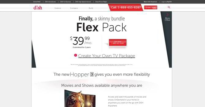
A white and red combination, what can be more attractive? A clean design which creates an airy atmosphere - the website may not be an example of modern web design, but it still works well thanks to the colors and good UX.
A Design Which You May Like
See the Template Speaking of a white and red combination, do not limit yourself to using only clean colors. This design proves to you that using grey and red may be a winning ticket to a memorable website. This happens because business institutions usually employ the color blue, and any color deviation from commonly used palettes may bring you benefit.
Charlene de Carvalho-Heineken

The Project: The Heineken Company
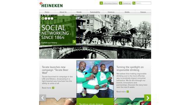
See the Website “It’s not red, it’s green!” you may say. It definitely is, but pay attention to the logo of the brand. See that red star? Now imagine how it would look like without it - looks like something is missing, doesn’t it? This is a perfect example of red color which the designer used like salt.
A Design Which You May Like
See the Template Red CTA-buttons are a must-have in online stores, just as in other projects. Remember that keeping an active and, most importantly, engaging blog is highly important, hence, you should choose a design where your blog will be noticed and appreciated. Have a look at this web design and garner one more idea of how your blog could look.
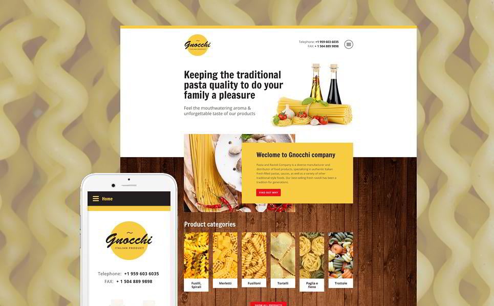
Hans Rausing

Image Resource
The Project: Tetra Pak
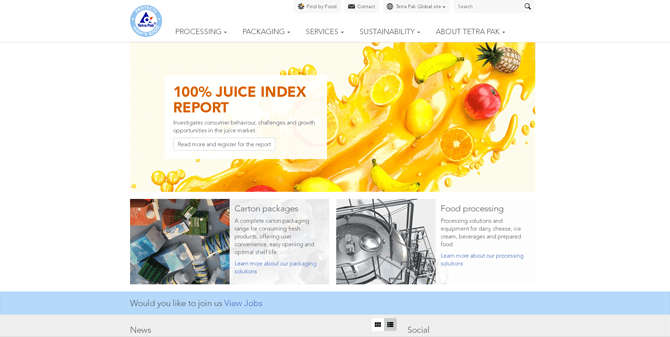
See the Website Just as with the previous one, this website is a great example of how red may be used in a logo. Similar to the Heineken company, the designer used red as a complimentary color, using blue as the dominant choice. Nevertheless, if you take away the red color from the logo, a significant part of its impact will be lost.
A Design Which You May Like
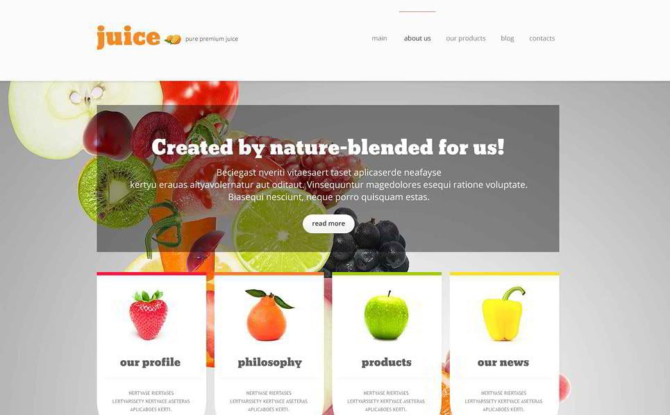
See the Template If your project is somehow related to juice or fruit making or packing, you may enjoy this design. Transparent banners and separate boxes imprint themselves right into your customers’ mind, thus promoting the products and services which you offer.
Marcel Herrmann Telles

The Project: ABinBev
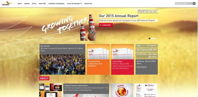
Visit the Website If you think of beer, the first color which comes to your mind is yellow or golden. Beverage companies choose it for a reason. The wheat when harvested is yellow, the beer when served is yellow, then why not choose yellow as a major color for a beverage company? And why not complement it with red, which is a winning color when it comes to food or drinks? The beverage company ABinBev uses both of these colors in their website.
The Book

A Design Which You May Like
See the Template Gold and yellow not only symbolize wheat, but they are also associated with the colors of success. Not surprisingly, they are bright, daring and they attract the attention of a viewer in the first place. If your project is somehow connected with food and something that is made of wheat - put your hesitations aside and use a web design that would look similar to this one.
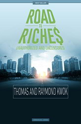
Thomas & Raymond Kwok

Image Resource
Project: SHKP
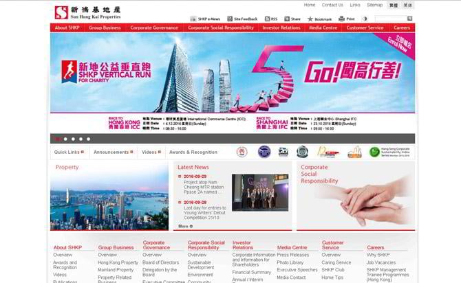
Visit the Website Even before you start reading the content, the red color catches your eye and you already feel cozy being on this website.
The Book
A Design Which You May Like
See the Template Placing a lot of text on the website may be challenging, and a design like this may make this task easier for you.
Kjeld Kirk Kristiansen

Image Resource
The Project: LEGO
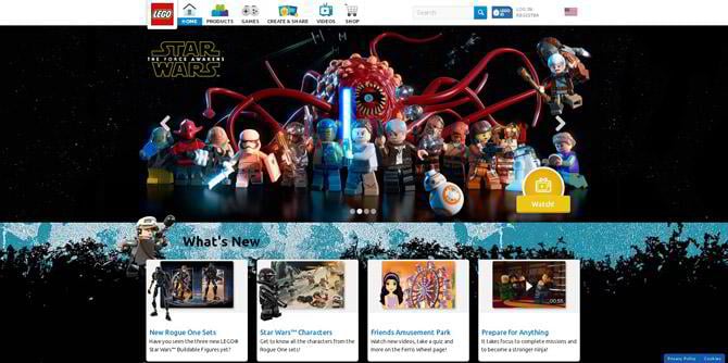
Visit the Website There probably isn’t a person on Earth who wouldn’t recognize this logo. Red, joyful and representing a really fun time, this logo has become a real legend.
The Book
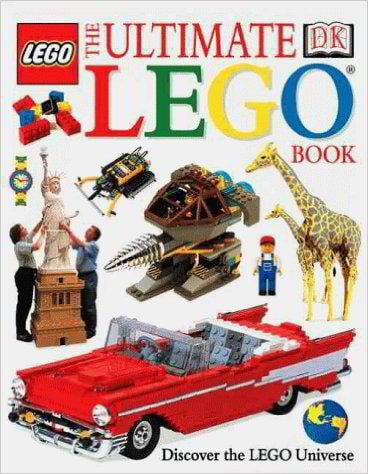
A Design Which You May Like
See the Template Making a website for games may be a pure delight, if you have a design which already meets all your requirements. Hover effects and proper placement of the banners only makes it more engaging.
Abigail Johnson

Project: Fidelity
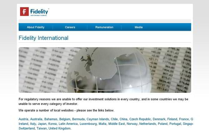
Visit the Website Many designers argue about which color should be the preferred choice for business - blue or red. Here you can see a combination of both, which looks great, despite the fact that the actual web design is not modern.
A Design Which You May Like
See the Template Speaking of a more modern design, yet quite minimalistic - check out a template which would look great, if used for a business project.
Dietrich Mateschitz

Image Resource
The Project: Red Bull
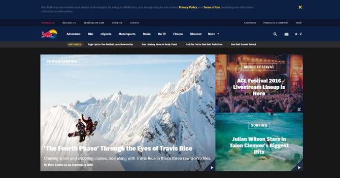
The Book

A Design Which You May Like
See the Template This template may inspire you to create an unusual design for a company website. Visual asymmetry, overlapping banners, the rule of third - these things make this design really memorable.
Mikhail Fridman

Image Resource
The Project: AlfaBank
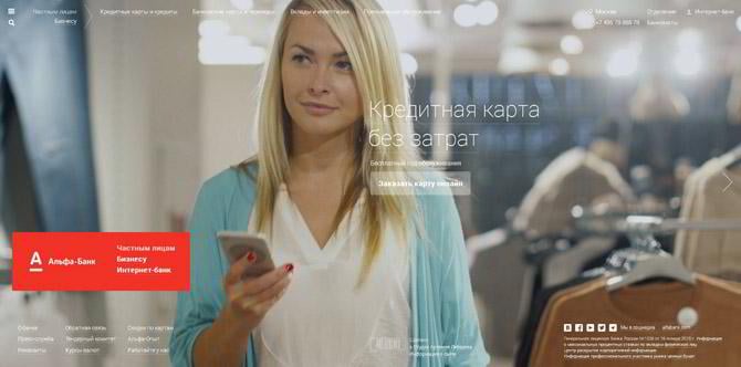
Visit the Website The designers made a red sticky button, which you see while scrolling the website. By the way, while scrolling it you can see beautiful full-width images which represent dynamics. They did a really great job by picking these particular photos.
A Design Which You May Like
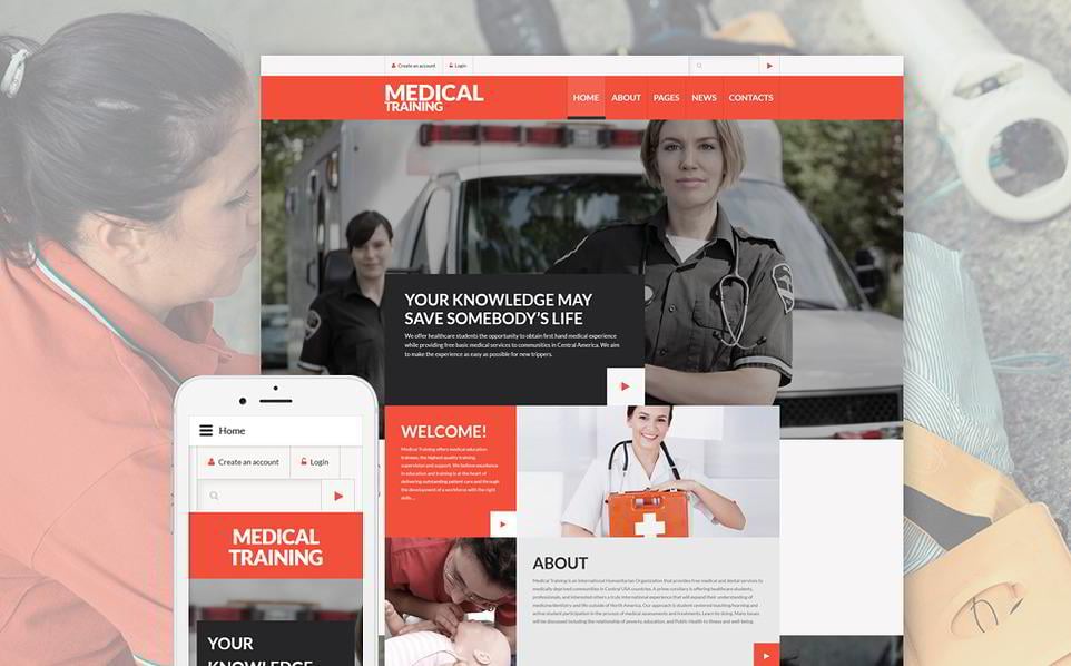
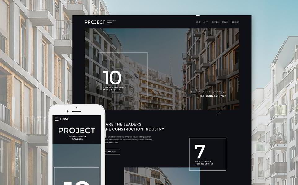
See the Template For many corporate websites a design like this would be just the job. If you are looking for a design which would combine a large amount of text with images without visual overloading, this medical training site may serve you as a great inspiration.
Leonid Mikhelson

Image Resource
Project: SIBUR
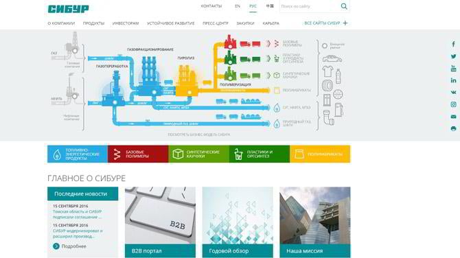
Visit the Website It’s a great schematic which is the first thing you notice when you open this website. Several bright colors are used there, and red is one of them.
Design Which You May Like
See the Template Even when red is not in the web design, it can still be used in the images.Take a look at this factory landing page template and see what an almost unnoticeable, yet significant impact it has on the overall design.
Tadashi Yanai

Image Resource
The Project: Fast Retailing
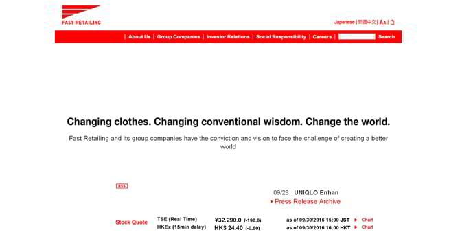
Visit the Website We’ve already viewed a website which includes only red, white and black, and this is yet another example of this color combination. By the way, you can often see the color red in projects related to sales.
The Book

A Design Which You May Like
See the Template If you want your website to have a flat design and neat widgets, check out this template.
Michael Otto

Image Resource
Project: Otto Group
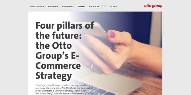
Visit the Website There’s not much to say about this website, but pay attention to the logo color, it’s red, again. Take a close look at it and then close the tab. Now recall the logo. You may remember not only the color, but the font also. This is how a good logo color impacts our perception.
A Design Which You May Like
See the Template As already said, you don’t need to make the whole design red to make a website look beautiful. You may use it only on the edges, just like in this template.
Aliko Dangote

Image Resource
Project: Dangote Group
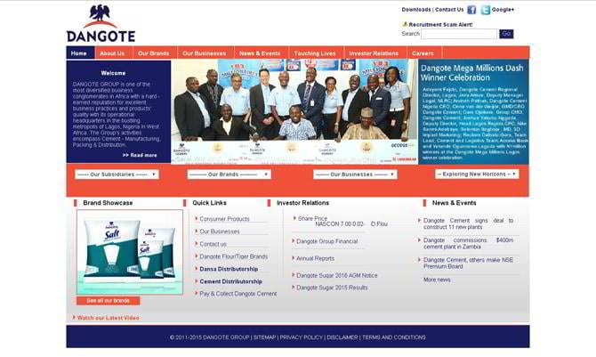
Visit the Website Again, we are facing a combination of blue and red. If the website had another color instead of red, it might be detrimental to the design.
A Design Which You May Like
See the Template For any news-related project the number one task would be combining engaging images alongside a readable amount of text. In this website template you may find a good example of how these two things may co-exist on one page.
Dieter Schwarz

Image Resource
Project: Kaufland
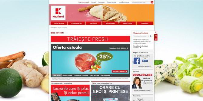
There are no exact statistics, but the food business is very likely to be the one business which uses red the most. Not surprisingly, as red tends to stimulate the appetite.
Design Which You May Like
See the Template This web design is another example of the previous statement: the food industry uses red a lot, maybe even more than other types of business.
Jim Walton

Image Resource
Project: Toyota
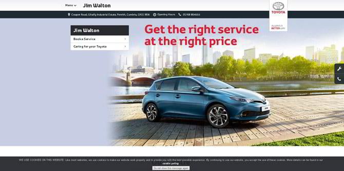
Visit the Website They say, a human perception doesn’t take in more than 3 colors, and TOYOTA website designers know it. Here the main colors are black, grey/white and red. Looks very clean, doesn’t it?
A Design Which You May Like
Making car-related projects provides a field for your imagination. There are so many car designs available which are so different from each other. All you have to do is choose the one which you like the most.
Steve Ballmer

Image Resource
Project: LA Clippers
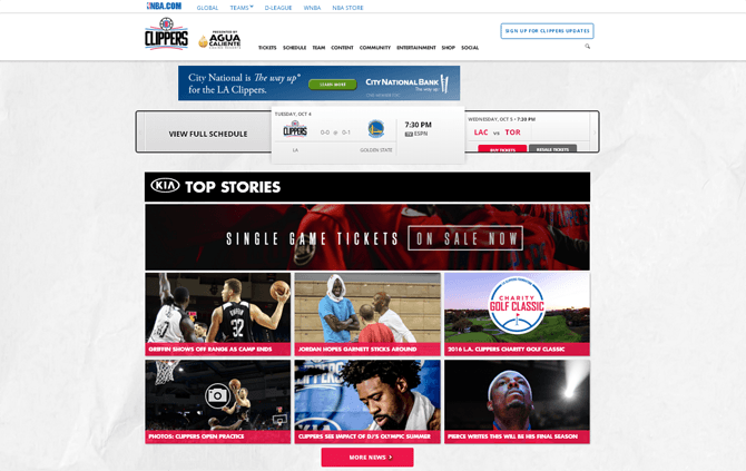
Visit the Website How about a sports website which would keep its readers updated on the latest events? This is a nice example of how it might look. Although the design is outdated, the way of presenting the content is great.
The Book
A Design Which You May Like
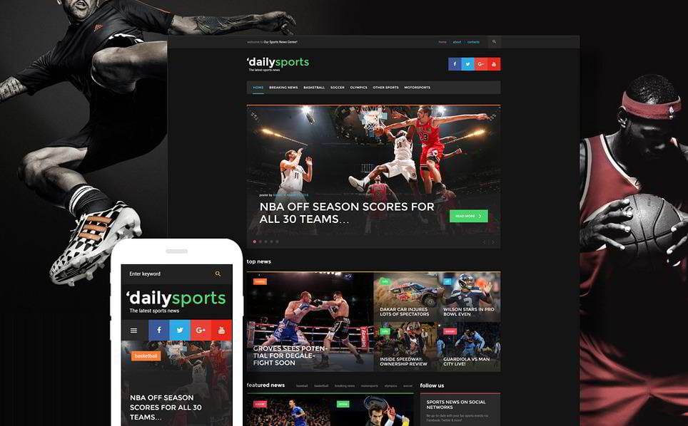
See the Template This template is a great example of what a modern design with good content presentation looks like. Besides, dark colors make it more dramatic and they serve as a great background for images.
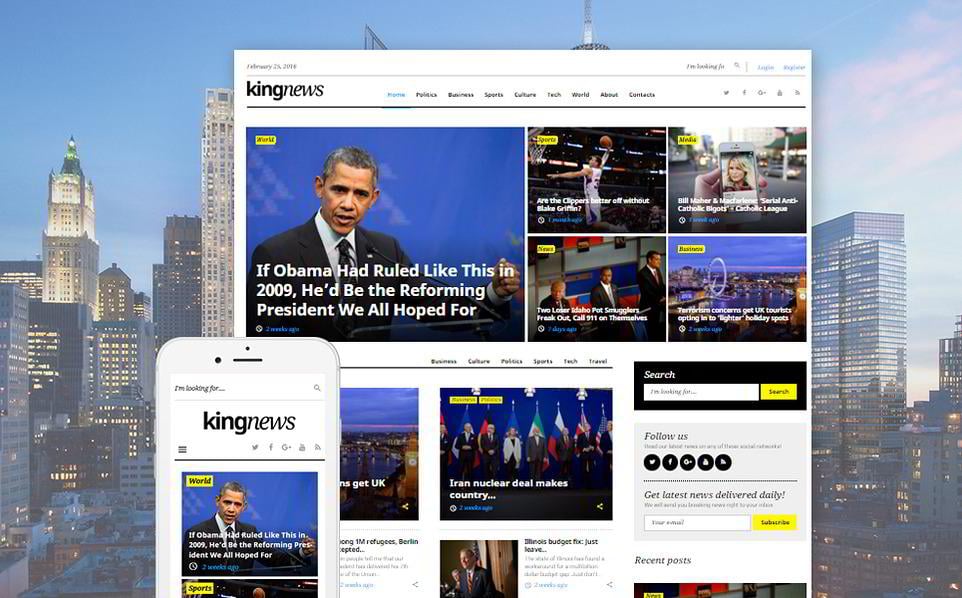
Ma Huateng

Image Resource
Project: QQ
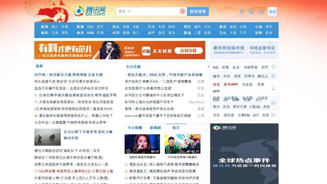
Visit the Website Warm colors make web designs more welcoming and cozy, as we have already seen in the previous examples. On the Web you may stumble upon many foreign websites with a language which you don’t understand, and this is when you become an especially attentive critic of the design. Unless you are familiar with Chinese characters, you may notice what a significant part of the design function red has.
A Design Which You May Like
See the Template Speaking of news portals, you may find this design interesting. Big banners, logically structured hierarchy of the posts, everything is aimed at giving the visitor the pieces of information that a reader needs and keeping him on your website for longer.
Larry Page

Image Resource
Project: Alphabet
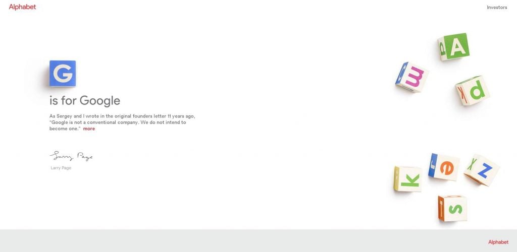
Visit Website Minimalistic to the very core of the website, this is the first characteristic which comes to mind when seeing it for the first, the second and even for the third time. Yet, red is present here – see how playfully it is employed.
The Book

A Design Which You May Like

See the Template If you are in a search of an unusual design, this corporate Joomla template may be of interest to you. Make an outstanding website with a rhombus as a major figure.
George Soros

Image Resource
Project: George Soros
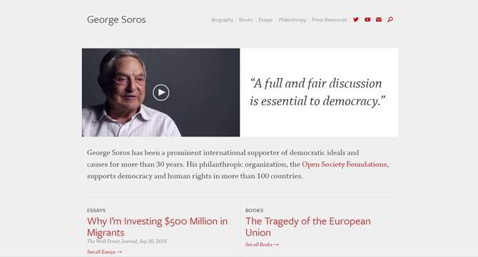
Visit the Website The website is aimed specifically at publishing the content. There’s not much of a design here, but still, do you see red used in it? This color makes a difference.
The Books
A Design Which You May Like
See the Template In case you need to create a political website or a blog, you could use a design like this. It’s simple and elegant at the same time.
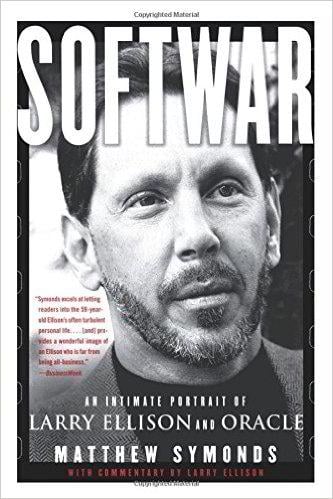
Larry Ellison

Image Resource
Project: ORACLE

Visit the Website “The less red used in the web design, the more red you may use in the logo” this is what one may think when looking at the ORACLE website. Well, that would be a true statement. We’d also add: “and it looks great!”
The Book
A Design Which You May Like
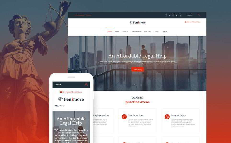
See the Template Apart from the logo, other design elements may also be red. Have a look at the call-to-action buttons, widgets and small pieces of text in this template.
Amancio Ortega

Image Resource
Project: Fundación Amancio Ortega
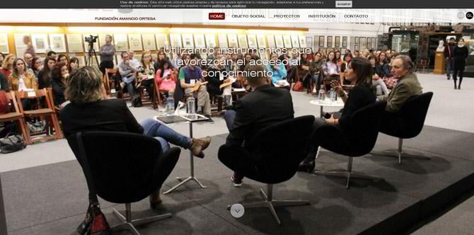
Visit the Website In some websites (like this one, for example), full-size images should grab the major part of a viewer’s attention. In those instances, red isn’t used much.
The Book

A Design Which You May Like
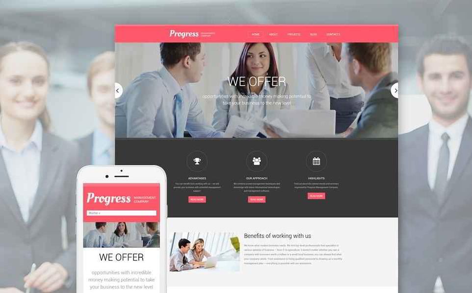
See the Template A neat corporate Drupal template that would fit many business projects which need to have a very clean look. The colors seem to be a little bit muted, nevertheless, the soft red, used for the upper banner and buttons, grabs your attention immediately.
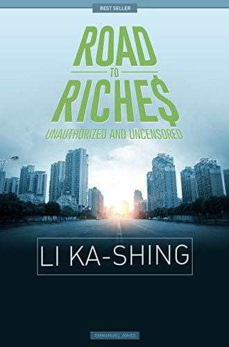
Li Ka Shing

Image Resource
Project: Li Ka Shing Foundation

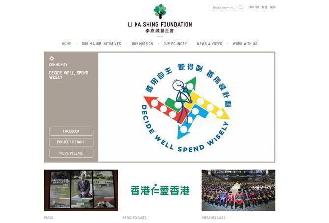
Visit the Website Even without reading about this project, you might understand that it is somehow connected with philanthropy. And when we start reading more about it… so it is. This is how a proper image, colors and design talk to you, even without words.
The Book
A Design Which You May Like
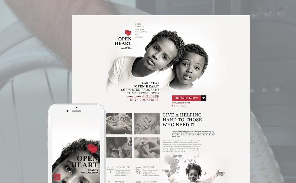
See the Template If you need to create a philanthropy project, a design like this could help you. Thanks to its layout, this template would be quite suitable for charity projects and even regular blogs.
Susanne Klatten
Image Resource
Project: BMW Group
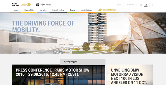
This and the next website don’t exactly have the color red in them, but they have orange colors. It was impossible to write about red without mentioning colors which are close to it. Besides, a BMW group website looks so engaging that it was impossible not to mention it. By the way, it has a Parallax effect which is worthy of attention - have a look.
A Design Which You May Like
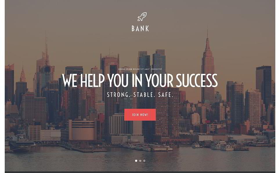
A bank WordPress theme with a full-width image and a soft-red CTA-button is a great option for a corporate website. Get your visitor hooked by a sleek Parallax effect - motion and depth is always appreciated in web design.
Jack Ma

Project: Alibaba
Visit Website The Alibaba project is also one of the websites worth mentioning, even though they include orange and not red. The designer kept this color in the image, too. Orange represents joy, and in web design emotions play a big part.
A Design Which You May Like
This would be a design which included both yellow and a shade of red, and, in addition to that, a light green color. If you need to create a corporate website, don’t limit yourself to a strict design only - have a look at this template and be inspired by the bright colors implied in it.
To Sum It Up
Despite the age of the website (many of the billionaires’ websites are quite outdated), most of them include red color or its shades in the design. So, the next time you see the name of a billionaire, check his website or the website of his business. Most likely, it will have red in it.
Don’t miss out these all-time favourites
- The best hosting for a WordPress website. Tap our link to get the best price on the market with 82% off. If HostPapa didn’t impress you check out other alternatives.
- Monthly SEO service and On-Page SEO - to increase your website organic traffic.
- Website Installation service - to get your template up and running within just 6 hours without hassle. No minute is wasted and the work is going.
- ONE Membership - to download unlimited number of WordPress themes, plugins, ppt and other products within one license. Since bigger is always better.

I like putting things in order and sorting stuff to make it easier to find something useful. That's why I like creating template listings. Besides that, I do researches on different interesting topics on web design and seek topics that could inspire readers. LinkedIn
Get more to your email
Subscribe to our newsletter and access exclusive content and offers available only to MonsterPost subscribers.

Leave a Reply
You must be logged in to post a comment.