4 Ways to Integrate Email List Building into a Great UX
When you’re running an e-commerce business, there are literally millions of things to think about, from your core business to the little details on the fringe.
However, if there’s one thing you shouldn’t skimp on really hammering out, it’s your user experience. Your UX is going to make the difference between a customer purchasing from you again and again, or leaving in frustration to the competition.
And without a doubt, email marketing is likely high on your list of priorities. Earning nearly $40 for every $1 invested, it’s not hard to see why email marketing is so important. A great email marketing strategy starts from building a great email list.
In this piece, I’m going to go over ways you can capture emails that won’t break that smooth UX you’ve been working so hard on.
No lag, no irritating popups, only smooth email capture methods that integrate perfectly with your native store.

#1. Create a Static Opt-In Form
The most basic form in e-commerce email marketing: the standard opt-in form. Often underestimated, this form offers a lot in terms of keeping your UX clean and smooth.
This is a method used almost by default. The static opt-in form is usually found on the right side of a page, or in the bottom footer.
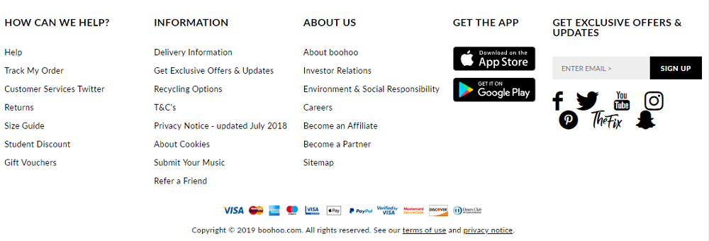
Screenshot from Boohoo.com
There’s also a possibility of hiding your opt-in form with a sticky tab:

This way you can be sure you’ll not have anything that disrupts your UX, but will also be a bit more visible.
The default opt-in form is far from faulty though. While passive, yes, it’s also UX friendly in that it doesn’t take extra time to load, and it won’t irritate your customer.
In fact, the very problem with these kinds of opt-in forms is that your customer may not even notice it.
In that case, we want to use something a bit more dynamic.
#2. Use Popups Wisely
I know what you’re thinking.
You told us we weren’t going to rely on irritating popups! I’ve been bamboozled!
Not true. Popups get a bad rap, but there are ways to make a popup that integrates seamlessly with your UX without irritating your customer.
What we need to consider is that there are a few different popups to choose from:
- Time-based popups
- Scroll-based popups
- Exit-Intent popups
A time-based popup is set to appear after a certain number of seconds on a page. For example, a customer is browsing your site, and gets a popup 15 seconds into their browsing session.
While this certainly captures a customer’s attention, it’s the popup that probably disrupts your UX the most. While a good incentive for email capture can help smooth things over, if UX is your biggest concern, it might be better to opt for a different kind of popup.
A scroll-based popup will appear after a certain percentage of the page has been scrolled. While this might be slightly less frustrating for a customer, it’s probably still a popup to avoid for a smooth UX.
However, exit-intent popups are your ticket. Unlike time-based and scroll-based popups, these don’t break the user’s experience because they were planning on leaving anyway. They’re not in the middle of checking out a product, they’re moving their mouse towards the X on the side of your tab.
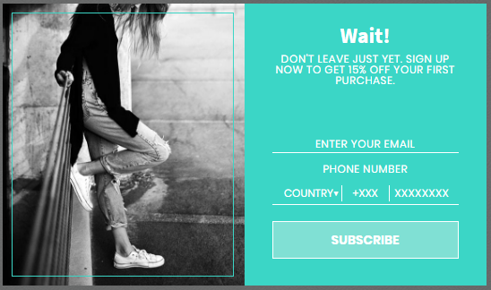
A great exit-intent popup with a good incentive will mesh well with your UX and potentially get you the email sign up you were looking for.
Pro tips:
- If you use one kind of popup, disable the other kinds. There’s nothing worse than three different popups on three different pages of the same site.
- Disable popups for customers who have already signed up or opted-out.
- Make sure the images, background, and tone of your popups correspond to your brand. This makes the popup more seamless.
#3. Interactive Sign up Forms
We already know that more dynamic sign up forms work better for our customers.
Why not make it fun too?
An interactive sign up form is more interesting for your customers because humans love to play. We’ll do absolutely anything to play a game, and if we get a sweet incentive to purchase, then all the better.
What’s more, gamified sign up forms are pretty rare. Most merchants opt for a popup, so using a game makes you, and your UX stand out even more.
For example, a Wheel of Fortune can really be a game changer for sign ups. A customer simply enters their email address to spin for a discount off of their purchase.
You can customize this to offer as many discounts as you like, with what percentage of discount you want to offer, or different prizes like giveaways.
#4. Landing Pages
If you have something particularly interesting going on, like a contest, giveaway, or huge sale, it might be interesting to integrate a landing page for email capture.
Landing pages are best used when you have a clear, specific offer to propose. They don’t work too well for your entire site, but when you have something a little extra special happening, landing pages are great ways to divert a certain part of your sales funnel without messing with your UX.
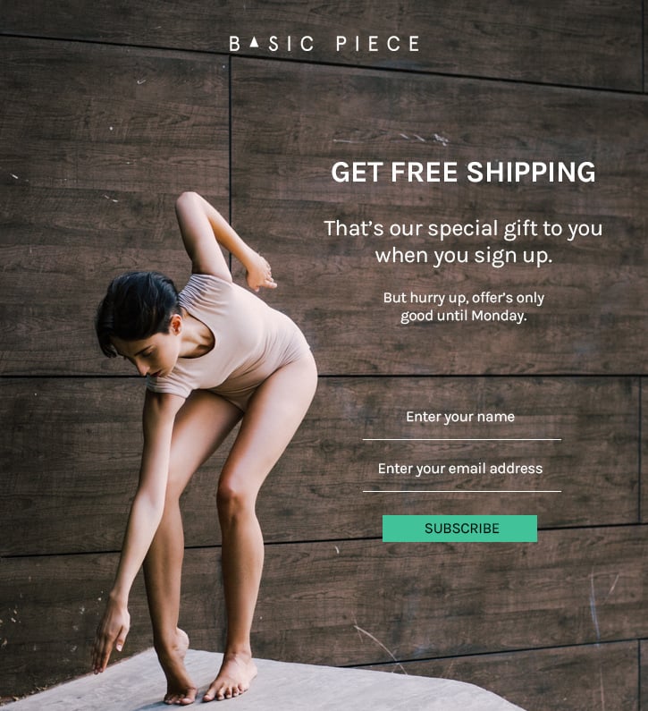
The rule of thumb for landing pages is to keep them streamlined.
You want to incorporate simple elements from your site so the landing page stays within your brand’s look and feel, but you don’t want messy distractions that could pull your customer away from the goal.
Creating a great UX takes time, and it’s important to get every aspect right. With the amount of saturation in the e-commerce market today, it doesn’t take much to send a customer straight to the competition.
Email list building is important too, and it’s critical that the methods you use to capture and build your amazing customer base don’t prevent your customers from converting.
Au contraire, these methods will not only help you reach that goal, but you’ll be able to cultivate a great email list that makes sales again and again.

Top 10 Newsletter Templates
| Template Name | Theme Provider | Template Category | Price |
| Marketing - Responsive Newsletter Template | PennyBlackTemplates | Marketing Agency Templates | $17 |
| TopShop - Responsive Email Newsletter Template | evethemes | Fashion Templates | $17 |
| Travel - Responsive Email Newsletter Template | PennyBlackTemplates | Travel Templates | $17 |
| SYNERGY - Responsive Newsletter Template | PennyBlackTemplates | Marketing Agency Templates | $14 |
| Tego - Responsive Email Template Newsletter Template | PennyBlackTemplates | Email Services Templates | $14 |
| RKMail - Responsive Multipurpose Email Template + Stampready Builder Newsletter Template | rkarim247 | Marketing Agency Templates | $17 |
| BigSale Newsletter Template | evethemes | Beauty Templates | $17 |
| Communications Responsive Newsletter Template | WT | Communications Templates | $14 |
| Cafe and Restaurant Responsive Newsletter Template | WT | Cafe and Restaurant Templates | $14 |
| Insurance Responsive Newsletter Template | WT | Insurance Templates | $14 |
Read Also
How to Make a Professional Email Signature. 9 Great Tips and Templates Provided
How to Write an Effective Follow-Up Email After No Response
45 Best Promotion Email Templates For Your Business

Posting contributed articles about the major web design highlights and novelties. Come across a handful of useful tutorials and guides shared by experts in the web design and online marketing fields.
Get more to your email
Subscribe to our newsletter and access exclusive content and offers available only to MonsterPost subscribers.

Leave a Reply
You must be logged in to post a comment.