How to Make a Professional Email Signature. 9 Great Tips and Templates Provided
Business does not have small and unimportant things. To be precise, a SUCCESSFUL business does not have small and unimportant things. Even the tiniest details play a vital role in achieving specific financial and prosperity goals.
Plenty of entrepreneurs working “online” pay more attention to global challenges while missing out on subtle instruments that can make a significant influence on your target audience. One of those is an email signature.
So how come most of the users are still ignoring this substantial detail???
Apparently, even if they stop working on their business marketing strategies but leave out a powerful email signature, they WILL get somewhere. Imagine what levels the project can reach if all your online business instruments achieve their maximal efficiency. Your results can impress!
Creating an email signature takes only a few minutes, but this is more than enough to stimulate your old customers and attract potential ones. By creating an efficient email signature, I, of course, mean a high-quality signature and not an ordinary and empty phrase like "Yours, John Smith".
An email signature is a part of your personal business branding. Since this is a strategic marketing tool, it must be noticeable. Having one not only contributes to maintaining the formal tone of any business correspondence but also influences the recipient. Unbelievably, professionally-made signatures help recipients build a loyal attitude toward the sender.
Before I share with you some useful tips on how to create a correct email signature, let me show you two examples of how NOT to do.
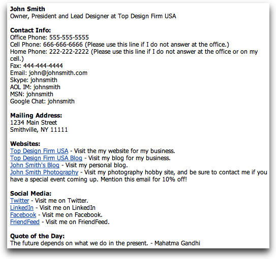

What is wrong with these two email signatures? Both authors wanted to include as much information but ended up with a wrong strategy. They forgot that an email signature is just a laconic add-on to the main message and not a flashy handout of their websites and social media links.
Speaking of what is necessary for your email signature.
Must-Have Elements:
- Your name, position and the name of the company that tells the reader who sent the email and which company you represent;
- Contact info that includes your business website and at least one phone number. You can also specify your email address.
- Links to social media profiles as those have become important lately. Select those social networks with the minimal personal content (a good example is LinkedIn). Respectively, avoid referring to frivolous or inappropriate social networks like Pinterest, Tumblr or your personal Instagram page. Nobody cares!
- Logo. This is an optional thing but if you do have a creative company logo, why not?
- Your photo, which is as optional as your company's logo. Nonetheless, if you feel like people need to know you face-to-face, feel free to put your headshot. This helps the audience build your image based on the name and the photo.
- Responsive design. 2017 was a year when mobile browsing finally outreached the desktop one. Most likely, your recipients will open the email on their mobile devices rather than a PC. A responsive design will customize your email signature to each electronic gadget for their better browsing experience.
- Legal requirements. Some countries might have a specific set of must-follow legal requirements during a business communication. Contact your lawyer and find out whether your country residents have to obey specific rules of business correspondence including email signatures.
Prohibited Elements:
- Links to personal social media profiles that can be a threat to your reputation;
- Home address and home phone (unless you would want to receive calls or expect visitors on an early Sunday morning at home);
- Doubtful expressions or quotes that might offend a particular group of people;
- Too many phone numbers and other contact data (the optimal solution is to provide three ways of feedback - one phone number, one email and one home address);
- Bright animations, complex images, “heavy” fonts that are too hard for perception, acid colors, etc.
So, how should a proper, high-quality email signature look like?
Finally, TemplateMonster and I are ready to give you nine useful tips on how to compose an excellent email signature that works.
A Guide To Building Your First Email List [Free Ebook]
9 Tips for Writing a Powerful Email Signature
Bring in Colors
Adding colors to your email template signature is a great idea. Such a colorful marketing solution will give one individuality and highlight your signatures from thousands of same ones. Choose the colors that match each other and follow their sequence. Don’t use too bright, acid or faded background colors - they are looking “tough.”
Try to stick to 1-2 colors that match each other in tone. This seems basic but is enough to make a bright accent. Use a sophisticated but not so prominent signature style that matches your brand and a logo.
Here's a great example:

Stick to a Design Hierarchy
The design is everything! Once you choose the colors, it’s time to build a highly-efficient design to increase the level of your text readability. Remember that email signatures aren’t just a trivial information list but rather an excellent opportunity to tell a story.
First, you need to prioritize all the information you want to include in a signature. In other words, you create a hierarchy of data and decide what exactly you want people to read in the first place.
Most business owners want to put their name or the company’s title in focus. Their size is usually 2-3 times larger from regular text. Based on what information goes next on your priority list, use the other ways to highlight text (bold or cursive). Finally, use smaller fonts for the least relevant data.
See the example:

Use Call to Action (change them occasionally)
A Call to Action is an excellent add-on to supplement your email signature. They should be simple, relevant, and unobtrusive. To make a smooth transition from the email to your target, a Call to Action should adhere to the general style of your signature.

So, what exactly do we refer to such kind of a call to action? It can be either an offer to subscribe to your blog, visit your site or follow your social media profile. Most importantly, every call to action has to pursue the same goal as you. For instance, you want to promote your Twitter page, so you add the appropriate caption like: "Hey, have you yet seen me on Twitter? Here I am!”
As your goals will be changing occasionally, don’t forget to change your call to action as well. Let’s say, you have just created a YouTube channel, and you want people to subscribe to one. What to do? Leave the Twitter profile for now and insert a YouTube link instead. Done!
This is an example:
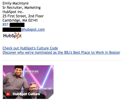
But what if you want people to watch your YouTube video right here and right now? Your wish is easy to come true because technologies allow embedding multimedia content in your email signature whether it’s a video or a graphic image. For instance, Gmail service makes such files especially noticeable (check the example above).
Once Gmail sees the YouTube link, it immediately pulls up the video preview and inserts one in your email signature. What is more convenient than this?
Add a Photo Content
Noticed that most of the provided email signature layouts include either the company’s logo or the person’s photo? Just because you have no idea what kind of a photo to put doesn’t mean you should avoid one in your signature. Follow the requirements, and you’ll be good to go.
So, my first advice - choose the photo wisely. The picture has to look professional, which means no selfies or a cutout picture of yours. Think of your photo as a professional headshot for some document but slightly more informal. The image shouldn’t be too small or too big to take half of your layout’s space.
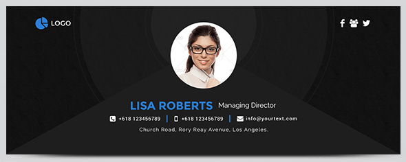
One-color background, professional look, smiling face looking right at the camera - this is what makes every headshot a perfect photo for an email signature.
All these requirements were followed in the example below. Use one as a standard of an email signature with a strong focus on photo content.
Insert Social Media Icons
Social networks are an integral part of your brand. It is a wonderful tool to increase your popularity and an excellent platform for communication and sharing your ideas and thoughts to all kinds of different people. One can say a lot about a person from what he posts and how he presents oneself in front of the big audience.
But let’s not forget that too many social media buttons will only create a mess. Stick to no more than 5-6 icons of your most professionally-looking social media pages.
Other than that, having some social media icons is a great idea. This way, you demonstrate people that you are always ready for their feedback.
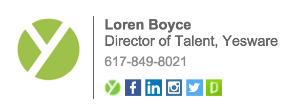
Notice that I specified icons instead of simple links? Icons are easily perceived by readers and are more eye-catching than unattractive links. And links take a lot of precious space.
Use Services to Track Link Clicks
So, you insert all kinds of different links into your email signature, including a call to action and social media icons. But do you even know how clickable they are? To understand what is interesting to people reading your email signature and what they click on, you’d better track those links. This advice would be useful for all links in your letter.
Tracking is easier if you use various mailing services like MailChimp or Mailigen.
Divide Sections of Your Email Signature
You better not overload your signature with an excessive amount of information and turn one into a chaotic text. But some ways help include a lot of data densely without a threat to ruin the overall design. This method works best when separating different types of information like contacts, logo and a call to action. Again, it’s all done for better perception.
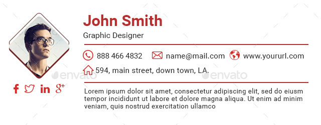
Delimiters, as shown in the example above, are an excellent example of how to divide a significant amount of data without compromising the signature’s usability and the overall email design. Agree?

Add the Country and City Code to Your Phone Number
If your business works internationally and includes customers from all over the world, you might want to specify your location by adding the country code to your full phone number. Surprisingly, most people forget this and leave their local number. I am here to remind you of this important detail that helps you keep in touch with international contacts and customers.
Make a Fully-Responsive Design
According to 2016 Litmus analytical report that analyzed more than half a billion emails, 56% of ones were opened from mobile devices. This year, the percentage has increased to 64%, which means the mobile browsing tendency is gaining its momentum rapidly.
Hence, adapting your email signature layout to mobile devices is necessary. It increases their readability level in times.
Here is a perfect example of a fully-responsive email signature:

Top 4 Email Signature Generators
WiseStamp
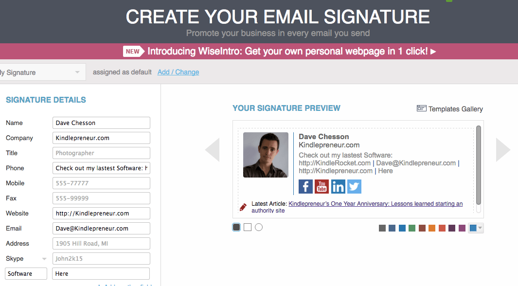
WiseStamp is one of the most famous email signature services that has a Free and a Pro version for $4 per month. The last one allows you to remove the Gmail installation by default, get three templates sets (Professional, Vertical and Minimalistic) and other design tools, as well as create your own social media icons.
WiseStamp also has a Business version with a free trial period of 14 days. This one allows you to create a one-style email signature for all your employees. So, none of your employees has to register separately and pay their own money. The Google Analytics integration helps to track the effectiveness of links in the signature and how they influence the traffic growth of your website.
The site has a clear and an easy to use interface. On the left, you fill in the information boxes; on the right, you set up the design. Even the basic free version editor allows you to change almost everything, up to the size and color of your social media icons.
In general, WiseStamp has the most extensive opportunities regarding design.
NewOldStamp
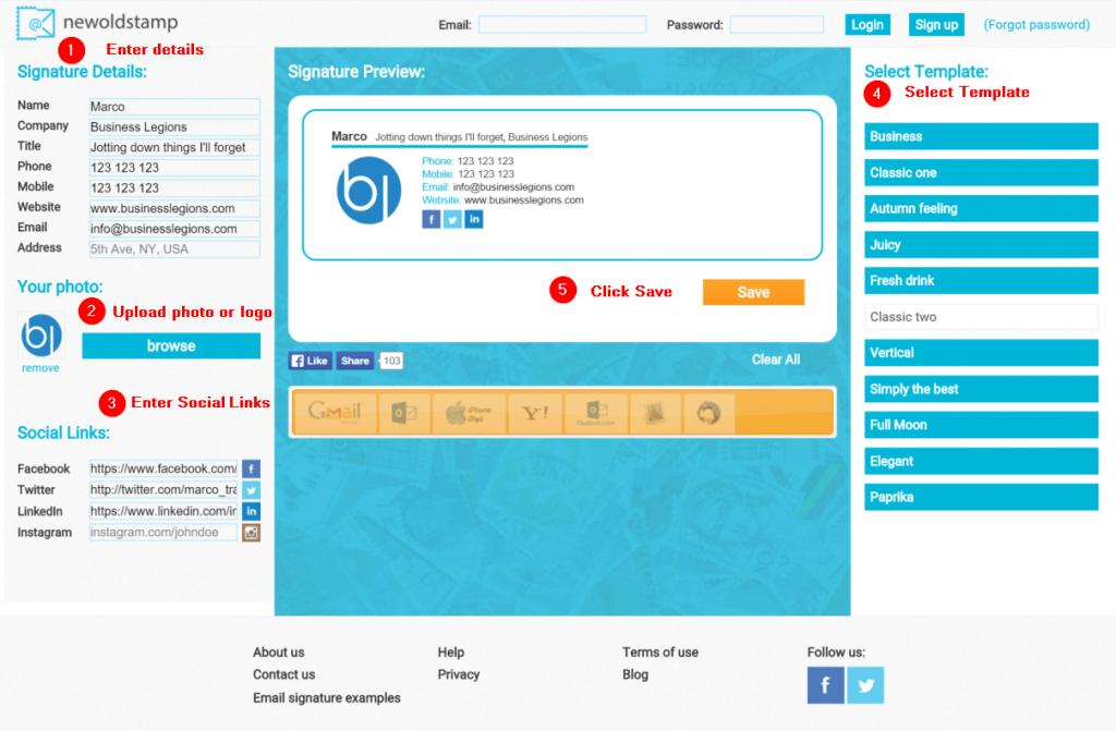
As told by the generator’s developer, NewOldStamp is considered to be "the easiest email signature creation tool in the world."
Just like WiseStamp, this service offers two versions: Free and Premium. The price per one signature is $2. The Premium version has a more expanded circle of editing capabilities, particularly the ability to change the logo and the photo size. Finally, you are open to a broader range of colors and social media icons.
Among the world-known NewOldStamp customers are Apple, Nestle, Opel and many other well-known brands.
The service interface is simple: the left column displays information boxes to fill in, and the right one gives you a space to work on your design.
HTMLsig
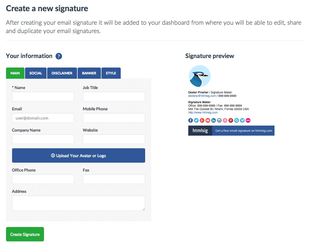
HTMLsig offers a Free, Basic ($5 per month) and Pro ($30 per month) versions. If you choose the Free version, the editing feature will be available for 30 days only right after you create an account. This version supports a limited number of design styles.
With the Basic version, you can create a maximum of 50 signatures. You can also place links to the App Store apps and create one-style business signatures for all the team. And if you wish to have no restrictions at all, you are welcome to buy a Pro version.
Conclusion: HTMLsig is the only service that allows you to add links to apps in App Store, Google Play, and Amazon. Plus, this generator has the most extensive set of social media icons.
Hubspot Signature Generator
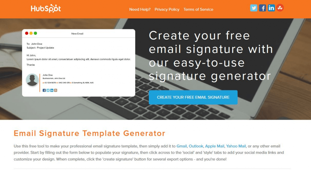
Hubspot Signature Generator is the easiest of the email mentioned above signature creation services and the only one, which is entirely free. For some individuals, a minimal number of functions can be enough to compose a good email signature at no cost at all.
Hubspot has an easy to use interface with the Main tab for your prime information, the Social Tab for your social media account, the Style tab for a design editing, and the so-called CTA (Call To Action) tab. The last Certification tab is responsible for specifying your Hubspot certificates. Want to change the position of the email signature elements? No problem! Click “Choose a theme for your signature” and select a different style.
Done!
After you create an email signature in any of the mentioned generators, there will come a window with a ready-made result. Now you only need to put a signature on your email and get to work!
Finish line!
Once you follow all my advice and develop a high-quality email signature, DO NOT stop at this point. Go on and create several more options for your signature. Use the new drafts for another target audience or when you need a completely different call to action.
Think of your email signature as a significant brick to building a successful business. Once you put the brick, you can finally build a mutually beneficial relationship with each customer.
Apparently, your email signature is only a supplemental element to strengthen the influential effect of your main message.
And not just a message, but a high-quality marketing newsletter with a high response.
See the difference? Memorize what TemplateMonster taught you, and get to work!
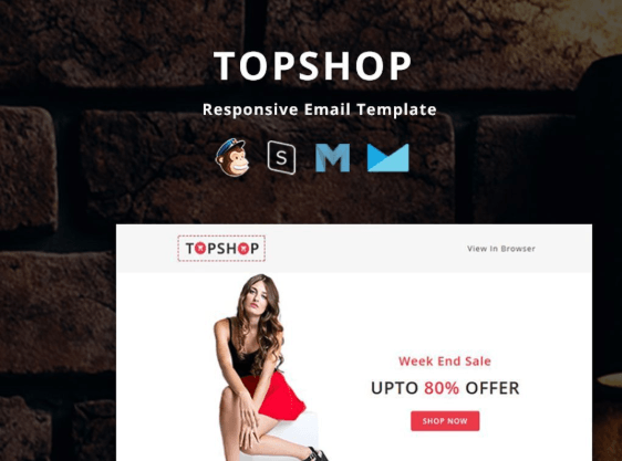
TopShop - Responsive Email Newsletter Template
Travel - Responsive Email Newsletter Template
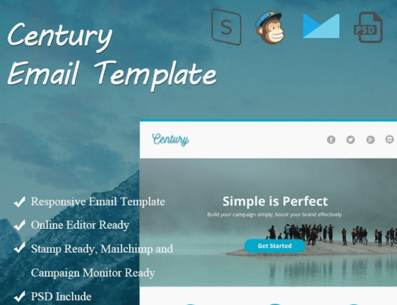
Century Email Newsletter Template
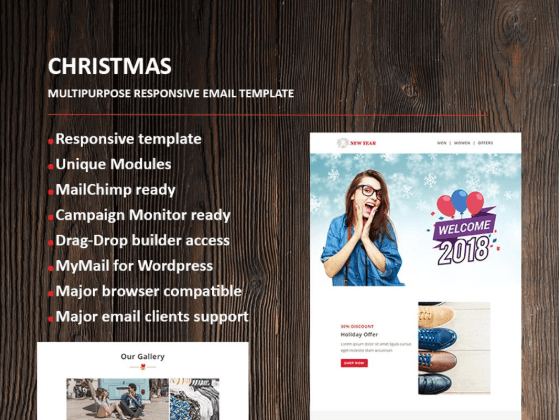
New Year Email Newsletter Template
Conference - Responsive Newsletter Template
TOP 5 Professional Email Newsletter Templates 2018
| Template Name | Theme Provider | Template Category | Price |
| TopShop - Responsive Email Newsletter Template | evathemes | Fashion Templates | $17 |
| Travel - Responsive Email Newsletter Template | PennyBlackTemplates | Travel Templates | $17 |
| Century Email Newsletter Template | Muklas | Animals & Pets | $17 |
| New Year Email Newsletter Template | fourdinos | Business & Services | $15 |
| Conference - Responsive Newsletter Template | PennyBlackTemplates | Consulting Templates | $15 |
Read Also
Email Signature Design Tips: the Edge of Creativity and Reputation
The 10 Best [Free] Email Service Providers for Your Business
9 Essentials of the Effective Email UX Design
Get more to your email
Subscribe to our newsletter and access exclusive content and offers available only to MonsterPost subscribers.




Leave a Reply
You must be logged in to post a comment.