Successful Blogging Equation: How Not to Get Your Readers Bored to Death
There's one thing that has bugged me for quite a long time. To be exact from those days when the whole world found out about Unsplash.com
So listen, people! You’re not supposed to take images from Unsplash.com and add them as is to your blog posts.
Most importantly this concerns guest writers. I’ve noticed that people engaged with guest posting don’t bother adding any decent visuals to their posts. They seem to be treating it like they don’t give a toss about what are they publishing.
I wonder why you are doing this?
Do you think that your post will become more shareable?
Do you think that Unsplash.com pictures will make your posts look cool?
Unsplash’s pictures do look cool, but when you’re casually inserting them into your piece of writing, it’s not getting better.
So here are the answers to these two questions:
No.
and
No.
If your text leaves much to be desired, the beautiful imagery will not improve it.
So before you start cramming every second passage with a huge photo of a girl typing on a MacBook [with turned off screen], be so kind as to think twice before you do this, or just ask yourself a question:
“I’m doing a horrible thing, aren’t I?”
After asking this, you will understand that an image “as is” is not an option.
Still, there’s something way bigger than a stock image; it’s your text.
#GoodTextMatters
Being a huge fan of a good read I’ve bookmarked some Medium writers whose stories I’m digesting on my way to work.
Luckily I came across the story by Niko Ryan where he shares his secrets on how to become a proficient writer - 5 Strategies for Becoming a Better Writer That Actually Work.
This is an excellent piece of content that everyone [who thinks he’s a writer] should "consume."
I insist that you spend another 30 minutes reading his story.
#WhatShouldYouDo?
Finding imagery, getting traffic and funneling it to your post is only a part of the blogging equation.
Let’s add some math and put in the perspective of a three-unknown equation. The most important variable in your equation would be an idea for your blog post.
As a basis, we can use Einstein’s formula of success. That’s the most impressive three-unknown equation I’ve ever seen 🙂
x + y + z = а
In his equation X - stands for work, Y - for play, Z - for mouth shut, by summing these things up you will get your success rate - A.
Judging by the variable Z Einstein had a perfect sense of humor.

Damn, he's right...
In your case these variables will stand for the following values:
- X - your article idea;
- Y - imagery;
- Z - traffic acquisition.
We can simplify values of unknowns to zeros and ones, like this:
- if your article idea is vague that’s a 0;
- if your imagery is dull it’s also a 0;
- if the traffic you received is way lower than you estimated, that’s the third 0.
0 + 0 + 0 = 0
An overall success of your blog post is 0, congratulations.
So if you want your post to work for you, you have to engage your audience and create value for them, giving you a 1 for the value X.
This simple equation can help you measure an overall success of your writings. A result 3 will make you a good boy, 0 a bad boy.
Which do you want to be?
Even though it’s a relative notion of success [just like Einstein's most famous theory], you can keep your mouth shut and make your daily blogging tasks a little bit more fun.
#APictureIsWorthAThousandShares
There are a couple of different ways you can look at blog images.
You can see them as a necessary component and rely on stock photos that everyone has already seen, or you can view images and visual content as the key to engaging and converting visitors.
While the first viewpoint is pervasive, it’s the latter one that yields the healthiest return.
If you aren’t a graphic designer or photographer by trade, the thought of creating compelling visual content for your post can seem overwhelming - but it doesn’t have to be!
Here are some suggestions to help you get along.
#UsetheRuleofThirds
In photography, there’s something called the Rule of Thirds.
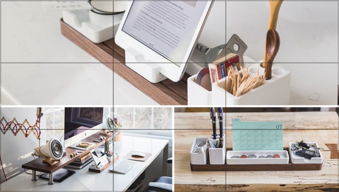
This principle states that people tend to focus on one of four central points of an image. If you were to divide a picture into thirds - both horizontally and vertically - the focal points are the intersections of the dividing lines.
Let’s consider your favorite photo of a girl with a MacBook photo.
This is a good use of the rule of thirds
This is a bad use of the rule of thirds
When choosing photos for your blog post, you want the most important elements to be centered on one of these intersection points; this means that you need to crop the photo focusing users’ attention on the screen, but not the bag.
#LeverageWhiteSpace
Grabbing and holding your visitors’ attention is a major challenge you need to address.
There are so many different stimuli competing for your audience’s attention, and you have only have a few seconds to get them to latch onto your blog. To avoid overwhelming your audience, try leveraging white space around images.
It draws the visitor’s eyes to the image and provides an opportunity to focus. The My car needs this blog is a good example where this trick is applied.
Notice how the clean, white border around each image draws you in and puts your mind at ease.
#FilterBackgrounds
When choosing images, you have to think about the background just as much as the foreground.
While the item or product in the foreground might be the focal point of an image, a distracting background will draw attention away from it and will hurt your ability to convert.
Make sure you clean up your background, which may require filtering out individual components.
#ProvideMultipleAngles
If you’re publishing a blog post about a particular product, one of the best things you can do is provide multiple angles.
With each additional vantage point, you’re giving your audience a better chance to understand what the product looks like in real life.
This increases trust between you and your audience, while also making it more likely that readers will be moved to action.
#AimForConsistency
If you browse some of the top Instagram accounts, you’ll notice that the content in their feeds is always consistent.
I bet chicks will love this example, The Men and Coffee. The owner of this account uses the same filters and style to establish a cohesive look that resonates with followers.
You should be doing the same thing with your blog images. Aim for consistency, and you’ll see better results.
#MakeScreenshots
Another awesome way to add value to your blog is to include screenshots.
Whenever you’re explaining a complicated or lengthy process – particularly one that takes place online. Screenshots are easy to capture, and you can annotate them relatively quickly. This post from Social Media Examiner is a good example.
“People will not only appreciate your ability to illustrate your points clearly, but you’ll also get requests from others who want to share your annotated screenshots,” blogger Kristi Hines notes. “Use those requests to get your name in front of new audiences without any additional work.”
You can easily create animated screenshots using gyazo.com app.
#DesignInfographics
Infographics are awesome, but they’re also complicated to design…right?
Not so fast, my friend. Thanks to some free or paid online tools, infographics have never been easier to design and publish. Even without graphic design skills, you can turn data and statistics into strong visuals with just a few minutes of your time.
Here’s a good guide on how to get started designing infographics.
#GiveYourBlogSomeBoost
Even though the written word may account for the majority of your blog’s content, but this doesn’t mean you can take shortcuts with visual content.
The images you use on your blog convey a particular message to your audience and will either engage and move them to action or turn them off. Using these tips and techniques, you should be able to turn images into an asset for your blog.
Related posts
How to Use TemplateMonster Pop-ups and Boost Conversion 27,9%
How to Boost Your Online Store Business
7 Studies That Prove Live Chat Boosts Your Conversion Rate
Boost Your SERP Ranking with These WordPress SEO Plugins
P.S. Just to make sure you will get the right template, your WordPress blog theme is here.
Get more to your email
Subscribe to our newsletter and access exclusive content and offers available only to MonsterPost subscribers.


Leave a Reply
You must be logged in to post a comment.