What’s a Slider and How Do You Add One to Your Website?
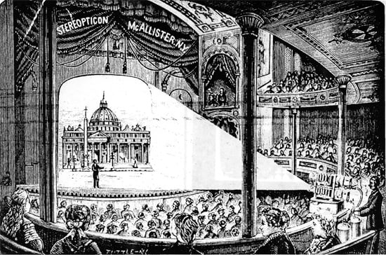
It could be surprising, but the history of a slider starts in the times when there were no computers and even no electric light. In the early 1600s a distant ancestor of a slider, hand-painted images on glass that were projected onto the wall with the help of a lantern, became popular in Europe.
The slideshow has come a long way from that time to land as a website element, but its essence remains almost the same. The slider is a set of pictures projected to a screen that replace each other automatically or manually by the user.
Why do you need it on your site?

It is attractive. Everybody likes sharp and beautiful illustrations, so a slideshow will make your website look more up to date. Besides that, pictures that rotate automatically make the design more dynamic and thus more eye-catching.
It is convenient. You can place, literally, everything to the slides; not only gorgeous pictures but also photos of your products or team, videos, text, buttons, and animation effects. Any content is good enough to make a good first impression and interest the visitor.
It is useful. The slider is usually the first thing the user sees on a website. The top products, placed in the slider, will attract more attention and the offers you make an accent at have more chances to fall into customer’s eye.
It is illustrative. A short text with an appealing image will relay your message to the user much more effectively than a long read article. It is always better to see something once than to read it a thousand times.
It can’t hurt… Or can it?

The most popular content for the slider are pictures and the sharper they are, the faster the downloading speed. There are tons of plugins that add a slider to the page and some of them are built on JavaScript. That means they are loaded separately, as a script. However, a gorgeous slider could harm your website if you use an unreliable hosting company.
One more issue is website responsiveness. Most modern websites are mobile ready, but some of the slider plugins are not. If there is such a clash between your software – the users who enter your website from their smartphones will be disappointed with the quality of the picture and are likely to leave immediately. To avoid this problem, watch out carefully for what instruments are used for site creation.

The easiest way to add a slider to your website
As I mentioned previously – there are tons of different plugins that help you add a slider to the page (for example Smart Slider 3, MetaSlider, Smooth Slider or WOW Slider). However, I don’t use those. To ease and fasten the website building process I downloaded Elementor Page Builder (if you have no idea what that is, go through this article) and there is a magnificent tool for that builder – JetElements. With its help, you will be able to add and customize a slider (and a big bunch of other elements) in just a few clicks. C’mon, I’ll show you!
I assume that you already have Elementor Page Builder and JetElements installed. Open Elementor customization window, search for the JetElements tab in the menu, and find the slider widget.
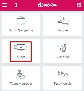
Drag and drop it to the work field. Pay attention to the color of the dashed frame – it will become blue if you are doing everything correctly. Here’s what the result will look like:
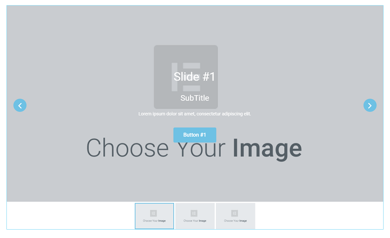
You can customize all the elements from the editing menu at the left side of the screen. The “Items” section of the “Content” menu tab allows you to change the number of tabs, rename them, and add different content to the slides. To add a picture, click on one of the items on the list. Here you can choose images for your slides, edit titles and descriptions, and create up to two buttons per item.

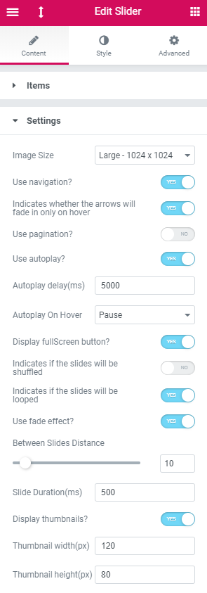
The “Settings” section of the “Content” tab gives you an opportunity to change some details of the slider’s look and image rotation. You can make the pictures slide or fade, decide what it should act like on hover, and set the thumbnails features.
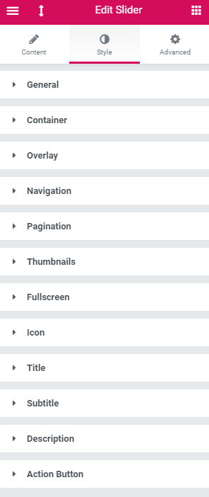
The “Style” tab contains a section that will help you polish your slider’s appearance. Every section customizes an element of the slider and you will be able to change colors, fonts, paddings, margins, and alignment. Play around until you feel the look is perfect.
My result looks like this:

The text and pictures are good for understanding how it works, but what could be better than a video tutorial? Here is the video we shot about the slider creation via JetElements Elementor plugin:
Elementor has so many features that you can change. Literally, every inch of the page allows edits to make it look perfect. The page builder is a real treasure for control-lovers and nitpickers. By the way, if you are an Elementor fan (or maybe you became one after reading this article), TemplateMonster has a template built especially for that page builder - Monstroid 2. The theme package includes not only the Elementor plugin itself but also all the Jet plugins! That’s all the tools you may need in one offer!
The slider look you can see on the last picture was created in less than 15 minutes. I’m pretty sure you will be able to create much prettier sliders and attract lots of visitors with them. If you would like to share your thoughts (or print screens of your website), you are welcome to do so in the comment section below.

Read Also
How to Style and Customize Contact Forms with Elementor Page Builder
How to Create Testimonials Using Elementor Page Builder
Get more to your email
Subscribe to our newsletter and access exclusive content and offers available only to MonsterPost subscribers.

Leave a Reply
You must be logged in to post a comment.